
EXCITEMENT GALORE!!!!
SPLITCOASTSTAMPERS BEST OF 2016 FAVORITES
I am over the moon! I have just been notified that my vintage-style BETTY BOOP card that I made for my daughter Michele's birthday this year at the end of June and was a Splitcoaststampers' Weekly Favorites for the week ending July 3, 2016, has now been chosen as one of their Best of 2016 Favorites!! I can not even tell you how surprised I am. . .I did not even know that they had this award. I just assumed, "Okay, how marvelous, my card was a Splitcoaststampers Weekly Favorite." Can I say again, I'm over the MOON!
So, I thought I would repost this little beauty to refresh your memory if you read my blog often or to bring it to your attention if you missed its original posting and are now reading this one. (See below.) I am also posting a link CLICK HERE back to that post as there is a story why the title of the post is, HAPPY CELEBRATIONS FOR "BETTY!" when my daughter's name is actually Michele.
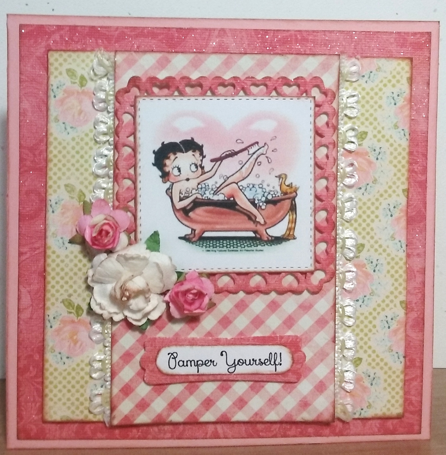

Ingredients: SU cardstock: Blushing Bride. DCWV Old World Stack (glitter applied). Authentique: Promise collection/ Six (floral). My Mind's Eye: The Sweetest Thing collection/ Honey "Love" Fond (check). Dies: Spellbinder's-Heart Squares; MFT-Stitched Squares STAX. SU punches: Modern Label; Word Window (both retired). Recollections flowers. Elmer's Craft Adhesive Spray. Martha Stewart Glitter: Crystal Fine. EK punch: Basketweave Corner. Computer-made sentiment and verse. Size: 5-1/2" square. (Splitcoaster Thread: Weed Ending 7-3-16/ #142).


.JPG)