Showing posts with label SCS Favorite. Show all posts

Wednesday, September 20, 2017

A Peek at Fall!

GOOD NEWS!  

THIS CARD IS NAMED A

SPLITCOASTSTAMPERS FAVORITE OF THE

WEEK ENDING - SEPTEMBER 23, 2017!!


I have been mulling over creative ideas in order to use my Adirondack chairs, which is part of the new die set in Stampin' Up's annual catalog named, "Seasonal Layers."  It a great set with many different dies besides the chair, and it coordinates with the "Colorful Seasons" stamp set.  I went to a card class in June and made several cards using both items, but I have not cracked the seal on my own set, and I was anxious to do so.

I had an idea for an anniversary card, which was my focus when I started this card, with the sentiment inside..."Life is better when there are two," thus the reason for using two Airdondack chairs, but I am undecided, and may use it for one of the many October birthdays on my "To Do" list.

I also wanted to enter the card in several Splitcoaststamper challenges, which helped me come up with my color scheme and making it a fall card.  Take a peek to see how my Adirondack chair card turned out.  Unfortunately, the colors are a bit washed out.  They are much more vibrant in RIL!


Ingredients:  Stampin' Up products:  Cardstock--Old Olive, Cherry Cobbler, Gold Glimmer.  Stamps--Hardwood, Happy Scenes (retired).  Inks--Crumb Cake, Daffodil Yellow, Pumpkin Pie, Cherry Cobbler.  Dies--Leaflets Framelits, Seasonal Layers Thinlits.  Embossing Folder: Woodgrain.  Linen Thread.  Dazzling Diamonds Glitter.  Glitter Enamel Dots (colored).  Other products:  Inks--Encore Gold Metallic, Memento Tuxedo Black, Colorbox Chestnut Roan.  Copic markers.  Offray Burlap Weave.  Techniques:  Stamping, Sponging, Coloring.  Size: 4-3/4" x 6".  (Woodgrain stamped bg  and the chairs are also Woodgrain embossed to add texture.  Chairs are popped up).

Thursday, August 31, 2017

A Whirl of a Birthday!

MORE GOOD NEWS!  

THIS CARD IS NAMED A

SPLITCOASTSTAMPERS FAVORITE OF THE

WEEK ENDING - SEPTEMBER 2, 2017!!


One of my favorite sister-in-laws is having a birthday at the end of the week.  Our birthdays are just one day apart, and I really needed to get busy and get a card made and mailed to California!  


I found several card parts and paper pieces in my scrap box that I had made several years ago, but not used: two pinwheel heads and a glittery cloud.  I decided it was high time these cute little items move from the scrap bin to center stage on a card front!


I liked niece's card of several years ago so well that I decided to CASE my own creation.  
 I knew the theme of this card would remind June of fun times we had together with our brother spouses at the California State Fair.  Another bonus that it would save me time so I could get her card in the next day's mail.  All I would have to do was finish the pinwheels, cut some new cardstock layers, and create a new sentiment and inside verse with my sister-in-law in mind. 


While putting the card together, ideas were simmering about the birthday verse and a sentiment that would keep the verse's theme in focus.  Therefore, when I finished the card, I was ready to move to my computer.  Once I finished composing the verse and sentiment, chose the font, and printed both, I put together an inside design that complimented the card front.  


Voila...I was done and off to the mailbox it went.  I think it will put a smile of pleasure on June's face when she sees her perky little card made from some things old and some things new that will take her for a walk down memory lane.  Meanwhile, please take a peek below at her card inside and out:


Just a note that I plan to enter June's card into the Alphabet Challenge, Round 7 - DD7ABC23D for Letter D = Double Bow/ Double Pinwheels and DD7ABC24C  for Letter C = Cloud.


Ingredients:  Stampin' Up products:  Cardstock--Island Indigo.  Patterned paper: Sycamore Street dsp (2013 SAB). Clouds Embossing Folder.  Punches: Modern Label, Word Window.  Pool Party Baker’s Twine.  Dazzling Details (glitter glue).  Other products:  Recollections cs:  Cool Water pack.    Spellbinders Big Scallop Ovals SM.  Sizzilits Pinwheel die.  WRMK Corner Chomper: Deco.  Offray double-sided satin ribbon,.  Recollections mini gold brads.  Toothpicks.  Size: 5-1/4" square.
Monday, July 31, 2017

An Anniversary Twosome Sail With the Breeze!

I'M SMILING AGAIN!  

THIS CARD IS NAMED A

SPLITCOASTSTAMPERS FAVORITE OF THE

WEEK ENDING - AUGUST 6, 2017!!


We are celebrating our youngest's eleventh anniversary this year!  WOW! is it difficult to realize it has been that many years since this lovely couple married.  But, these two also celebrated the birth of their first child just a few months ago, so now it is easier to recognize that they've been married a few more years than five or so!  I wanted to make them a special card celebrating their first anniversary with Miss Callie Page in attendance as well.  Take a peek below at the finished card front and inside with my composed verse via the computer: 


THE BACK STORY!

I recently purchased this whimsical die-cut from Spellbinder, named Dandylion, which depicts the dandelion's seed head after flowering.  I thought I'd use it as an anniversary card with the two little seedlings sailing off in the breeze as a couple to begin their own family.  I dare say my imagination is a bit whimsical today!


My background is made with Stampin' Up re-inkers in Tempting Turquoise, Wild Wasabi, Daffodil Delights, and a touch of Lemon-Lime Twist, and the Danylion die-cut is made using black glitter paper.  I made the sentiment using my computer and printing directly onto my finished watercolor background.  I decided to add a perky little sheer ribbon and bow, and pop the watercolor front and its black mat up off the Tempting Turquoise cardbase.  I'm pretty happy with my watercolored background since I have not used this technique much, and I'm not totally comfortable with it yet.


Splitcoaststamper's is also hosting their annual Dare to Get Dirty Challenges for their members who are SCS Fan Clubbers.  Since we are not supposed to mentioned what the basis of the challenge is, I will just say this one is for the very first challenge initiated by *Understanding  Blue (*the hostess' SCS nickname).  There is a color challenge going on as well, which requires the use of the three colors I chose for my card, so it will be entered that challenge as well.


Ingredients:  Stampin' Up products: Cardstock--Tempting Turquoise, Basic Black, Watercolor paper; Inks--Tempting Turquoise, Wild Wasabi, Daffodil Delight, Lemon-Lime Twist.  Darice core'dinations Glitter Silk-black.  Die: Spellbinders Dandylion.  Ribbon: Stash-3/8" Offray.  Computer sentiment.  Size: 4-3/4" x 6".  Inside: EK Medium Scallop Photo Corner punch; SU: Daffodil Delight cs; Computer verse.  Technique: Watercolor...Let It Run.

Wednesday, July 19, 2017

Celebrating Father's Day Late!

WHAT A PLEASURE!  

THIS CARD IS NAMED A

SPLITCOASTSTAMPERS FAVORITE OF THE

WEEK ENDING - JULY 23, 2017!!


My husband was away on Father's Day, so the children decided they would just wait and celebrate him belatedly.  I went to a card class while he was away, and I decided right then and there that one of the design ideas available to created would be perfect for hubby.  It reminded me of a family reunion vacation that hubby and I took, where most of his brothers, sisters, and their spouses were there.  We all pooled together and rented a beautiful three-story home on the Outer Banks of North Carolina right on the ocean...lovely, lovely.  Take a peek below...my husband will loved his card.


While making my card, our hostess ran out of the ombre-shaded paper from Stampin' Up's Color Theory dsp stack, so I thought sponging would do the trick just as well using Dapper Denim ink.  One other pattern in the same paper stack was used as the ocean waves by applying the torn paper technique.  The darker blue part of the paper was also in short supply, but when we checked the opposite side we felt this side would work just as well.  Personally, I like it better than the original suggestion.  I wanted my card to be a Father's Day card, so I took my card home and applied my own sentiment.  Such a fun card to make.  Thanks Dar Peterson for the design idea to CASE.


Ingredients:  Stamp;in' Up products:  Cardstocks--Whisper White, Dapper Denim, Crumb Cake;  Pattern dsp: Color Theory DSP Stack; Stamps--High Tide(birds, sand), Colorful Seasons (Adirondack chair), Delightful Dozen (sentiment - retired); Inks--Dapper Denim (ombre sponged sky), Crumb Cake, Soft Suede (distressing chair), Always Artichoke (grass).  Size: 4-1/4" x 5-1/2".

Friday, July 14, 2017

Tweeting a Belated Happy Birthday to a Dear Sister-in-Law!

WOW!  I'M EVEN MORE GIDDY!  

THIS CARD IS NAMED A

SPLITCOASTSTAMPERS FAVORITE OF THE

WEEK ENDING - JULY 16, 2017!!


Take a peek below at the card that I designed and sent off as a belated birthday for one of my sister-in-laws on my husband's side of the family.  Also included below is the verse and complimentary design I created as well.  Then, follows The Story behind the creation.


The Story

With the slow recovery from my knee replacement surgery, I am so far behind, and I have missed so many birthdays and other events with my inability to climb stairs to my craft room.  Some are so far back, I will just have to let them go this year and concentrate on keeping up to date in the future.  Yet, I have several sister-in-laws' birthdays that I've missed, and I would really like to send them belated wishes if I can without getting behind with upcoming celebrations.

My sister-in-law, Dianne, is the wife of one of my husband's younger brothers.  They were married within a year of our marriage, and we spent a lot of time together as couples in the early years of our marriages.  This was before we each began a round of transfers around the country due to career promotions, etc.  We have never ended up residing in the same state in more than 30 years.  Just a few years ago, this younger brother passed away from a heart attack, but Dianne is still very much a part of the family, and she is always included in every reunion and get-together!

Since I have a new goal in cardmaking to try to enter more Splitcoaststampers' challenges, I thought I would focus my card design around at least one challenge's requirements.  I chose the Inspiration Challenge IC605 - Dessert Bies: Macaroons & Meringues, but ended up being able to use it in the Alphabet Challenge as well from its tag.   For the Inspiration Challenge, I went to the Pinterest inspiration board set up for the challenge.  Oh my, I learned a lot about macaroons.  While my stomach realized it was hungry and began growling loudly the longer I looked over those delicious-looking, beautifully, colorful morsels that can be any color in God’s Earth from soft pastels to bold and vibrant dark splashes of color!!  Below are the three particular pictures that inspired my card:


When I first start creating a card design, if I don't have a particular idea already in my mind, I check out my leftover, partial card pieces to see if there is anything that inspiring me to use it.  I found a yellow tag with pink ribbon and an uncolored birdie stamp tacked to a patterned dsp.  It was pretty bright and cheerful, but had a thanks sentiment stamped at the bottom of the birdies, which was actually part of the original stamp.  I thought...hmmm...trim off the sentiment and make the tag shorter to fit the shorter image.  Then, I separate sentiment tag with belated birthday might fit below the tag...I was in business and started rolling right along!

The little dsp attached had a bit of navy in the flowers; therefore, navy had to be the cardbase after seeing those lovely navy macarons (see above).  I switched out the pink tag ribbon for navy, and then I chose mat layer colors to add to the tag and dsp and layers to add to my cardbase.  Daffodil yellow would be my top layer and I decided embossing it would dress it up and make it more interesting and even better, crop the layer corners with my WRMK Deco Corner Chomper.  

When I began assembling, I popped up the tag and its layers on the yellow layer,  and then decided to pop up the yellow and Melon Mambo on the cardbase.  Before reattaching the stamped birdies to the tag, I colored them with Copic markers and finished with Clear Wink of Stella to add sparkle.  Because my tag was pretty small, I decided to use the Washi punch (SU retired) and modify it by shortening it and only used a one-word sentiment to keep its size in balance with the tag.  I'm pretty satisfied with my card for Dianne...take another peek above!


Ingredients:  Stampin' Up products: Cardstocks-Night of Navy, Melon Mamo, Daffodil Yellow.  DP: Gingham Garden.  Stamp-For the Birds (retired), Happy Birthday Gorgeous (sentiment).  Ink: Memento-Tuxedo Black, Wink of Stella-Clear.  Embossing Folder: Perfect Polka Dots (retired).  Punches: Washi Label,    1/4" Circle punch.  Ribbon: 3/8" Denim.  White Baker's Twine.  Other products:  Copic Markers; Darice: Foam Sheets.  Computer-verse.  Size: 4-3/4" x 6".

Tuesday, July 11, 2017

Fly with Me...Splitcoaststampers Challenges!

WOW!  I'M GIDDY!  THIS CARD IS NAMED A

SPLITCOASTSTAMPERS FAVORITE OF THE

WEEK ENDING - JULY 16, 2017!!


Lately, I have been getting more and more involved in trying out challenges on Splitcoaststampers (aka SCS).  If you're unfamiliar with SCS, it is  an online community of paper crafters from all over the world: primarily rubber stamping, cardmaking, but scrapbooking as well.  It started online in 2003, with its primarily focus on Stampin' Up product users, to give them a place to go for stamping-related resources and inspiration.  Over the years, the SU focus has changed to encompass all types of companies and their products.   Although, there is a separate access area for Stampin' Up demonstrators with a way to place your card entries into the SU area if it is SUO or SUM (Stampin' Up only or mostly).

Personally, I started visiting SCS at least eight years before I even started using Stampin' Up products, and I had no idea of its original focus until about two years ago!  It was a total surprise to me, because it so thoroughly covers most other companies.  There are also areas where you can go to see cards made using almost only My Favorite Things, Taylored Expressions, Cottage Cutz, etc. products.  So, Splitcoaststampers is now a site for those who use any products available on the market.  If you are unfamiliar, go take a look at: www.splitcoaststampers.com.

So, onto my challenge entries.  The Technique Lovers Challenge of 7/10/17 is Cardboard Roll Album,  and it asks that you make at least the cover for a mini album using cardboard rolls as its base, i.e., toilet paper rolls, paper towel rolls, etc.  There is a tutorial link showing exactly how to do that.  Now, I made a similar album about eight years ago when my sister, Heidi, owned a paper crafting store in northern California.  I still have her instructions from this class; therefore, I decided to make another little book using her instructions, because you do not have to use book rings to keep the pages together, as the pages are attached to one another in a spine-like manner.

Other challenges my little book will fit are: Technique Lovers Challenge from several week ago, named Spell It Out.  With it in mind, and the "rule" was to use a sentiment different than those we normall use, like happy birthday, etc., I made my sentiment "FLY."  Another challenge I have been looking at trying is the Featured Stamper Challenge, where a member of SCS is chosen to be the featured stamper of the week.  This week, it is Ann Greenspan's (SCS nickname: yaleann7), and we were to go to her gallery and choose one of her cards to CASE.  CASE means to be inspired by something about the card and incorporate into yours.  After choosing one of Ann's card, I designed my cover with these ideas from her card: her dragonfly, but mine is a butterfly; the die-cut shape, and lace from the lacy die-cut.  To view Anns card, click on the link below: www.splitcoaststampers.com/gallery/photo/2792811&cat=500&ppuser=340325
Take a peek below at my finished mini album cover below:


Ingredients:  Cardboard rolls (page stabilizers) (i.e., rolls: toilet paper, paper towel, gift wrap, etc.).  Patterned paper: stash and scraps.  Stamp: Stampin' Up: Labeler Alphabet.  Die: Spellbinders: Labels Small.  Wood Butterfly: Michaels.  Acrylic Paint: Americana-True Red; Folk Art-Alizarin Crimson.  Prima Cameo Roses.  Offray 1/2" Lace.  Button: Stash.  Ivory crochet thread.  Distressed edges: Colorbox--Chestnut Roan Cat-Eye.  Size: 4-1/2" x 3".

Friday, July 7, 2017

Lights, Action, Shine...A Son-in-Law's Birthday Celebration!

I'M GLEEFUL!  THIS CARD IS NAMED A

SPLITCOASTSTAMPERS FAVORITE OF THE

WEEK ENDING - JULY 9, 2017!!


My oldest daughter's husband is have a milestone birthday this month...the pressure is on!  I wanted to make something really different, and I had just the thing.  I recently bought a darling Lantern die from SugarPeas, and I have been dying to use it.  Since Don and Michele like to camp a lot, I thought the lantern would be perfect for Don.


In addition, I wanted to try and meet some of the challenge requirements on Splitcoaststampers.  As it turns out, I will be able to meet three different challenges with the card I designed for Don.  It will meet the July 6th - Ways To Use It: utilizing stars in your card, the Alphabet Round 7 Challenge: Letter L...some type of light, and the Gallery Monthly Theme for April 2017: #1 - Background Check requiring focusing on the card's background by using a background technique, special paper, etc.


For my background, I decided to make a watercolor background with a night sky and lantern light.  This will be only the third time that I've actually watercolored a background, but this time it will have a totally different style as it is not at all random.  I wanted a light burst of yellows and oranges to represent the lantern light and a night sky with stars.  


I watercolored all over with Crushed Curry ink and then darkened the yellow in the area where the lantern light would be shining using upward brush strokes.  My next color for the lantern light was an streaked application of Strawberry Slush in upward brush strokes as well.  My next step was to make my galaxy-type night sky around the lantern light.  Once again, I used flicked brush strokes, but smaller, toward my lantern light.  The colors and the order I applied them over the yellow base was: Old Olive, Island Indigo, and lots of Night of Navy to finish.  I added stars to the night sky by using a paint brush and flicking it with finger snaps to sprinkle my stars in random sizes, but all very small, using White Pearl Metallic Folk Art acrylic paint watered down.  


I must say it was a challenge.  I had to do a trial run and then re-make my final piece to get my lantern light in exactly the right area without the night sky bleeding to far into it.  All in all, I'm happy I challenged myself, and I'm pretty pleased with my result.  I think Don will be pleased as well.  Take a peek below at my finished card inside and out!


Ingredients:  Stampin' Up supplies:  Papers--Basic Black cs, Gold Foil, Watercolor paper;  Stamps--Balloon Adventures (verse); High Tide ("Shine" masked); Inks--Crushed Curry, Strawberry Slush, Old Olive, Island Indigo, Night of Navy; AquaPainter.  Other supplies:  Stamps-MFT/ At the Movies; Die-Sugar Pea/ Lantern; Wink of Stella-Clear (lantern light + sentiment words). Folk Art-White Pearl Metallic Acrylic paint.  Techniques:  Watercolor background; Paint Flicking (stars); Stamped Verse.  Size:  4-3/4" x 6".

Thursday, June 29, 2017

Flowers for Daughter's Birthday

OH SO JOYFUL!  THIS CARD IS NAMED A

SPLITCOASTSTAMPERS FAVORITE OF THE

WEEK ENDING - JULY 2, 2017!!


My daughter, Michele, is having a birthday at the end of this month.  I wanted to make her a special birthday card, and two challenges on SplitcoastStampers (SCS) gave me some ideas on which to focus.  The Ways to Use It challenge asked that you use strips of paper to create your card, the Inspiration Challenge asked that you make a card using patterned paper, and the Alphabet--Round 7-Red challenge asked that you use a splash of RED.  When checking out ideas presented for the Ways to Use It challenge, I was inspired to use the Herringbone Technique, because I felt it fit the Inspiration Challenge perfectly as well.  I decided to create the background of Michele's card using this technique.

Getting into my creative mojo mode, I pictured the Herringbone pattern being very striking in black and white patterned papers.  Then, I wanted to use flowers in some way, and settled on SU's Botanical Blooms stamps/ Botanical Builder dies.  I thought a vivid contrasting red would be very effective.  Then, I had to find a transition between the herringbone pattern and the red flowers, and the red, black, and white die cuts were born, thus fulfilling the need to use red as well.

I assembled my herringbone bone pattern first, adhering it to a piece of black cardstock cut 5" x 6" because I knew this could be cut to fit the front of my white cardbase, which would be 4-3/4" x 6" finished.  I chose the red pattern for the base die-cut in a simple patterned paper as I needed something calming after the busyness of the herringbone, and finished it by distressing the edges with white craft ink.  I chose to repeat one of my blackish background patterns and white for my two circle die cuts.  I layered them onto my cardbase, and thought spritzing them with my Bath & Body Works Magic in the Air Diamond Shimmer Mist would make them very pretty and sparkly.  I also decided I needed to pop-up my red die-cut upon which the circle die-cuts and flowers would rest.  Assembly complete and I was very pleased with the result, and I think Michele will love it!  Take a peek below:


Ingredients:  Stampin' Up cardstocks:  Whisper White, Real Red, Cucumber Crush, Basic Black.  Patterned papers:  Crate Paper-Paper Heart/ Delicate 2 (red); Bazzill Basics-Licorice; My Mind's Eye: Everyday Basics; DCWV: Jet Black Stack.  Stamps: SU-Botantical Blooms (leaf pattern); Stampendous-Birthday Wishes (sentiment).  Ink: SU-Wild Wasabi, White Craft; Memento-Tuxedo. Black.  Dies:  SU-Botanical Builder Framelits (flowers, leaves), Top Note (retired); Cottage Cutz-Pierced Circles, Double-Stitched Circles; MFT-Photo Corners (inside).  Bath & Body Works: Magic in the Air Diamond Shimmer Mist.  Computer verse. Size:  4-3/4" x 6".

Thursday, June 15, 2017

Graduation with Total Honors!

I'M GIDDY!  THIS CARD NAMED AS A

SPLITCOASTSTAMPERS CAS FAVORITE

WEEK ENDING - JUNE 18, 2017!!

Boy, you can't ask for much more!  Daughter Jackie just graduated today from the University of Washington with her Bachelors of Science Nursing and with summa cum laude 4.0 honors throughtout her journey to complete her B.S.N.  We are soooooo proud of her...I'm about to bust!

I decided to make Jackie's graduation card in UW colors...purple and gold...unfortunately, the picture shows it up more blue than purple...but really it is purple.  As I did not have any purple papers that were remotely appropriate, I went on Etsy and found some digital paper that I like in purples and gold.  Even though the paper looked purple and gold on the computer screen, they were navy blue and with white fleur de lis.  My next task was to move the two pieces into my PaintShop Pro program and re-color them to the appropriate colors,  That was finally achieve and I resized the papers in Word so the fleur de lis were smaller and the crown in the gold paper were also smaller.

After printing them, I decided to try something I've been thinking I should try.  About three months ago, when I was in Bath & Body Works, I saw a body mist named Magic in the Air, a diamond shimmer mist.  When I sprayed it on the paper sample piece, it put a beautiful shimmery mist all over the paper (and smelled good as well), and I thought, "Wow!  That would be great to use on cardmaking papers."  Now was the time to try it out, and it worked beautifully.  I sprayed it over all the papers and stamped images, except the graduation hat and the gold glimmer stars and tassel.  Unfortunately, the photo shot of the card does not show it off, but it's truly wonderful.  I see I will never have to buy Shimmer White cardstock again, because I can make my own!!!!  Take a peak at Jackie's finished grad card inside and out...I think she will love it.


Ingredients:  Cardstocks: Recollections Cardstock Essentials-purple; Stampin' Up Gold Glimmer (stars/ tassel), Naturals Ivory (retired); Clair Tales Purple & Gold Damask 06 & 07 (color-enchanced); DCWV Glitter Stack-golden yellow.  Stamps: Stampin' Up--Bravo (colored w/Copics).  Inks: Memento-Grape Jelly, Paris Dusk (two-step stamping).   Dies:  MFT-Stitched Star; Stampin' Up-Balloon Framelits (tassel); Impression Obsession-Instant Photo Corners.  Punch: Stampin' Up-IB Accents/ Star.  Bath & Body Works-Magic in the Air/ Diamond Shimmer Mist.  Computer-verse.  Size:  4-7/8" x 6".

Friday, February 10, 2017

Valentine for My Hubby!

MORE HAPPINESS!  ANOTHER CARD NAMED AS

SPLITCOASTSTAMPERS FAVORITE OF THE

WEEK ENDING - FEBRUARY 19, 2017!!


Valentine's Day is in a few days, and I finally finished my husband's card.  He is getting a second hot air balloon card in a matter of just a few weeks to make sure this Bucket List item is complete.  I made his first air balloon card for his birthday just a few week's, which shows just how versatile this new stamp/die bundle, "Lift Me Up," from Stampin' Up is. 

I wanted my color combination to be black, red, and white.  I had in mind to make my night sky in black, and I also wanted it to be a bit glossy so I tired something I was not sure was going to work, but it worked wonderfully.  I covered the entire black cardstock layer with Versamark ink, making sure is was thoroughly and evenly cover by pressing the stamp pad down over the entire area of the cardstock and then wiping the pad in long strokes over the entire surface again..  I sprinkled it with clear embossing powder and heat set it, making it glossy.  I pressed it overnight in a cardstock paper stack with several few books on top to make sure it was flat and level.


I envisioned puffy clouds in my night sky and decided to use the retired SU embossing folder Cloudy Day, because it has tiny embossing dots that make the cloud forms.  For some reason, this folder has the clouds positioned vertically rather than horizontally on the folder.  As I wanted to cover the entire paper with clouds, I placed the paper in the folder so the clouds would cover from side to side.  This left the bottom half of the paper outside the folder, so I made sure it didn't run all the way through the rollers and over the edge of the folder, which would cause the folder edge to crease my paper midway cross.  Next, I turned my black paper and re-positioned the unembossed side into the folder.  I tried to match the cloud impressions as closely as I could to those already embossed, and then I ran it through the Big Shop, again, just to the edge of the folder, but not over it to prevent a crease.  It turned out surprisingly well, and as my air balloon would cover a great deal of the mid-section of the embossed clouds, I did not feel it would show at all where the clouds were not formed quite right!

I decided on a patterned paper for my red color.  I chose a white mini dot on a red background, and I decided on Shimmery White for my card base.  I dressed up the corners with rounded corners and used the eyelet Curvy Corners punch on my black glossy top piece for the red to peek through.  I used the same papers for the balloon colors under the black patterned balloon die-cut overlay.  I colored the black balloon die-cut with Black Wink of Stella to give it a bit of sparkle. 


After roughly laying out my pieces, I decided to add some vellum clouds.  With my chosen sentiment being "love is in the air," I thought a large red glitter heart on my air balloon and smaller ones on each vellum cloud would finish off my card very nicely.


Take a peek below at my finished Valentine air balloon card, both inside and out.  I think my husband will be well pleased.


Ingredients:  Stampin' Up products:  Cardstocks--Shimmery White (cardbase), Basic Black, Real Red, Vellum.  DSP Stack-Brights.  Stamps-Lift Me Up (front sentiment), Sealed with Love (inside sentiment), Valentine's Love (hearts-inside/ retired).  Die:  Up & Away framelits (balloon, clouds). Punch: Curvy Corners (retired). Embossing Folder: Cloudy Day (retired). Embossing Powder: Real Red Glitter.  Other:  Zutter Corner Rounder punch.  Recollections: Foam Glitter Hearts; Charcoal Anthracite Embossing Powder,  Dies:  Papertrey Ink-Clouds/ Hero Arts-Cloud.

Thursday, January 26, 2017

A Husband's Birthday is Soon!

FEELING GIDDY!  THIS CARD IS NAMED A

SPLITCOASTSTAMPERS FAVORITE OF THE

WEEK ENDING - FEBRUARY 5, 2017!!


My husband will be celebrating his birthday soon, so it is time I started thinking about his card.  One of the items on his "Bucket List" is take a hot air balloon ride, so using my new Stampin' Up stamp/ die bundle,  Lift Me Up , will be perfect.  


I made my first card using this bundle at a stamp camp hosted by the dynamic duo, Dar Peterson and Luci Kirschbaum.  I thank Luci for the inspiration from her card design as a jumping off point for mine.  


To start my card, I wanted my clouds to be lightly glittered, so I used spray adhesive on white cardstock and sprinkled with ultra fine white glitter, tapped off, and let dry.  Then, I was able to treat it just like any commercial glitter paper.  I used a commercial lightly glitter golden yellow glitter paper for my sun, and used SU's Seaside embossing folder to give my sky some texture.  Then, the "glitter bug" got a hold of me, and I added Wink of Stella-Clear to my clouds, giving them some gray tones, which I loved.  Then, I added "Wink" to  my sun to make it a bit more shiny and to my balloon outline as well!  I think my husband will be pleased with birthday card featuring his very own hot air balloon. 


My traditional final step to completing my cards is to create an inside design that is complimentary to my card front and compose a verse that fits the card's occasion...in this case, a birthday!  Take a peek at my finished inside card design.


Ingredients:  Stampin' Up products:  Cardstock--Dapper Denim, Raspberry Ripple, Pool Party, Island Indigo, Sweet Sugarplum, Whisper White.  DCWV Glitter Stack--yellow glitter.  Stamps--Lift Me Up.  Ink: Island Indigo, Smokey Slate.  Dies--Up & Away.  Punch: 3/4" Circle (sun); Curvy Corners (retired).  Embossing Folder: Seaside.  Dazzling Diamonds Glitter.  Other:  Pretty Pink Posh dies--Camping Friends (sun rays).  My Favorite Things: Essential Sentiments.  Wink of Stella-Clear.  Queen & Co.--Twinkle Goosebumps. Elmer's Spray Adhesive.  Computer verse.  Fishtail Flag: hand-cut.  Size--4-3/4" x 6".  (Thank you to Luci Kirschbaum for the design inspiration.)

Sunday, January 22, 2017

A Grandbaby on the Way!

I'M THRILLED!  THIS CARD IS NAMED A

SPLITCOASTSTAMPERS FAVORITE OF THE

WEEK ENDING - JANUARY 29, 2017!!


I am going to be a Grandma. . .hallelujah, yippee!  My youngest son and his wife are expecting at the end of February, and we are celebrating this new little person, who is on her way, with a baby shower!  The theme for room decorations are woodland animals, and the shower invitation arrived with a darling little white, Arctic baby fox wearing a pompom-laden, knit snow hat.  My creative juices immediately began to whirl and groan, as they were so not use to being accessed.

I have not been to my craft table since the night before Christmas Eve. . .I was just too sick to care. . ., and this went on for four weeks and three days without any noticeable improvement.   Finally, on the 31st day, halfway through the day, I noticed my constant coughing was considerably better, my nose was not running continually, and my sinuses were a little less plugged.  By the end of the day, I was pretty sure I was really on the mend.  It took three days, and I was quickly back to normal with an abundance of energy!  Thank the Lord!


For my card, my original intent was to use the Stampin' Up Foxy Friends stamps and punch set, but after a bit of searching through my digital images, I found a cute little fox that I thought would be perfect sitting on the left lower side of my shaker circle.  Yes...I wanted to make a shaker card.  Once I made my mind up about those two things, my card flew together.  I was able to use several new dies that I had recently acquired, which lend themselves to a woodsy, fox theme.

I finished my little woodland fox card, and then completed the decor and verse for my card interior.  Take a peek below...I'm pretty pleased with the way Ginger's card turned out!  I think she'll love it!


Ingredients:  Stampin” Up products:  Cardstock—Shimmery White – cardbase; Daffodil Yellow; Soft Sky.  Stamps—Weather Together (raindrops); Foxy Friends (tree stump); Baby Bear (sentiment).  Ink--Sahara Sand; Old Olive (mixed).  Punch—Scallop Edge (retired-inside design), Curvy Corners (retired-inside design).  Embossing Powder—White.  Other:  October Afternoon pattern paper—Hide and Seek (floral.  Digital image:  Pixel Paper Prints—Woodland Animals (fox).  Dies—Impression Obsession—Three Trees Background; Reverse Confetti—Edgers Confetti Cuts (scalloped "V"); Cottage Cuts—Stitched Wide Circle Frame, Pierced Ovals; My Favorite Things—Stitched Circle Scallop Frame; Spellbinders—Scalloped Petite Ovals.  Stash:  1/8” Daffodil Yellow Satins ribbon.  Sequins—misc. colors.  Size:  4-3/4" x 6."

Sunday, December 25, 2016

Two More for Santa's Sleigh Ride!

Well, MERRY CHRISTMAS TO ME!
My Black, Gold, & White Glitzy Santa's Sleigh (2nd below) has been chosen as a
SPLITCOASTSTAMPERS WEEKLY FAVORITE FOR THE
WEEK ENDING JANUARY 8, 2017!

My last two Santa's Sleigh bundle cards would be for my youngest two children. Jackie (and her new husband, Josh).  Jackie, my third child, always wanted to make gingerbread cookies, gingerbread houses,  and other Christmas cookies when she was young.  She love to put on the frosting and decorate them with all sorts of candies.  I found the perfect piece of Christmas paper, which was all about those gingerbread men jumping out of the oven saying, "Run, run as fast as you can; you'll never catch me for I'm the gingerbread man!"  Take a peek below at Jackie's card. . .I'm sure she will love it!


My final Santa's Sleigh card would be for my fourth child, Mark and his lovely wife, Ginger.  I thought I'd switch back for whimsical to elegant.  I seems to really love working with black and white on my Christmas cards, and I had purchased a Recollections stack of lovely papers that were all about black and white!  I really wanted to use one of these elegant papers so I selected one from the stack for my focal paper, and I was ready to begin.  Searching for the perfect Christmas three would be my theme for this card. . .a lovely Christmas tree to delivered to their door a wonderful sleigh and cute little reindeer.  Take a look below at this fourth card. . .I'm so pleased with the way it turned out, and I think Mark and Ginger will be equally pleased!


Ingredients:
Gingerbread Sleigh:  Stampin' Up products - Cardstocks: Shimmery White, Burnt Brown Sugar.  Stamp/Die Bundle: Santa's Sleigh; Joyful Christmas (sentiment).  Dies:  Swirly Scribbles thinlits.  Gumball Embossing Powder (retired),  Other - Cardstocks--Recollections: Christmas Green; Darice Core-dinations-Opulent Opal (white glitter); Recollections Foil-Brillant; Pattern: Pinecone Press-Holly Holly.  Gingerbread Men:  Fussy-Cut/ Pinecone Press-Baked with Love.  WRMK Corner Chomper/ Deco.   Size: 4-3/4" x 5-1/2".

Black & White:  Stampin' Up products - Cardstocks: Basic Black, Burnt Brown Sugar, Shimmery White, Copper Foil.  Stamp/Die Bundle: Santa's Sleigh; Joyful Christmas (sentiment).  Dies: Swirly Scribbles thinlits.  Punch: 1-1/4" Circle.  Clear Embossing Powder,  Black & Metallic Thick Baker's Twine.  Other - Ink: Memento Tuxedo Black.  Papers: Darice Core-dinations-Opulent Opal (white glitter); Pattern: Recollections Holiday Glimmer.  Wink of Stella--Clear (on sleigh black).  WRMK Corner Chomper/ Deco.   Size: 4-3/4" x 5-1/2".

Friday, December 23, 2016

Two for Santa's Sleigh Rides!

Yay!  My navy and gold sleigh card has been chosen as a 

SPLITCOASTSTAMPERS FAVORITE FOR  THE 

WEEK ENDING DECEMBER 25, 2015


I recently bought my favorite stamp and die bundle of the entire Stampin' Up 2016 Holiday mini catalog called Santa's Sleigh.  I've seen sooooooo... many cute ideas using it on Pinterest, and I've even made a few cards using the reindeer myself.  But, my very favorite is the Z-Fold cards that use a team of reindeer with a variety of other ideas.  Some ideas I've seen include:  the sleigh with presents being pulled by a team of deer, a Christmas tree in the sleigh pulled by the deer, Santa in the sleigh with the team, and one even had a little Eskimo girl in the sleigh...all were really cute.  A lot of the variations come in the sentiments used, the pieces used, the arrangement of the pieces, and the papers used.  I decided to use this stamp/die bundle to make my children's Christmas cards this year.


I wanted my sleigh cards to be taller than all the sleigh cards that I saw on Pinterest.  These were almost always the A2 size - 4-1/4" x 5-1/2" size, and mine would be 4-3/4" x 5-1/2."  I also decided my cards would feature three layers on each of the three panels.  Many samples included a tutorial with the paper cutting dimensions included, but with mine being larger, I would have to figure out my own dimensions for each of the three layers I planned to use in each of the three panels.


My first try using the Santa's Sleigh bundle is a moonlit night scene with a sleigh full of present pulled by a team of reindeer.  I found a beautiful piece of blue and gold patterned paper by Moxie that I would use as my focal paper.  For each card, there are two views: the first with the card closed, and the second with the card opened up all the way.  Take a looked below at the very first card, which will be earmarked for our first born son, David.  I think he will be very pleased with this first edition.


My second card will be earmarked for our second child, daughter Michele and her husband, because of the color of my chosen focal paper.  Her favorite colors are in the turquoise color range from aqua to teal, and she loves anything made with those color hues included.  I found a Christmas pattern in the medium aqua hues, featuring red cardinals.  Take a peek below at the second card.  I think Michele will love it.


Ingredients:
Moonlit Night:  Stampin' Up products - Cardstocks: Midnight Muse (retired), Burnt Brown Sugar (retired).  Stamp/Die Set: Santa's Sleigh, Joyful Christmas (sentiment). Punch:  1-3/8" Circle  Embossing Powder,  Other: SU Midnight Muse (retired).    DCWV - Shimmery Stack (blue), Glitzy Glitter Stack..  DCWV Glitzy Glitter stack.  Pattern Paper:  Moxie/ Faith.  WRMK Corner Chomper/ Stub.   Size: 4-3/4" x 5-1/2".

Aqua & cardinal:  Papers - Cardstocks: Stampin' Up Shimmery White, Burnt Brown Sugar,  Recollections Foil/ Brilliant,  Darice Core'dinations: Opulent Opal, Fashionesta.  Pattern: Jillibean/ Winter Tortellini & Spinach Soup/ Stewed Tomatoes.  Stampin' Up Stamp/ Die Set: Santa's Sleigh; Joyful Christmas (sentiment).  Embossing Powder: Cherry Cobbler.  WRMK Corner Chomper/ Deco.  Size: 4-3/4" x 5-1/2".

Wednesday, November 2, 2016

Celebrate a Friend With Her Bowling Ball!!

Happy Days!  This card was chosen as a

SPLITCOASTSTAMPERS FAVORITE OF

 WEEK ENDING - NOVEMBER 20, 2016


I have a friend whose birthday I will soon be celebrating by taking her to lunch and sharing a little gifting benevolence.  One of her favorite hobbies is bowling, so I thought I would make her a bowling birthday celebration card, using a little vintage framed image that I came upon a few months ago.  I saved it to my computer's vintage image stash of pictures for future use.


About a month ago, I pulled out the bowling lady image to get a head-start on my card and worked on it a bit to enhance the colors and remove some vintage writing that I did not care to include on my card.  I then re-sized it to fit my die-cut frame I planned to use.  Not having time to begin my card, I put it away for my return from my travels south to Oregon with my daughter.


Today was the day to get started on this bowling card for my friend.  While I was away for over two weeks, I couldn't do any crafting, but that didn't stop my mind from visualizing my vintage bowling picture and how it might look best in a card layout.  With those ideas in mind, I found some papers that would go well with the Fall season and the image colors, and then I worked on finalizing my design layout and got to work.


My bowling card is now done, and in retrospect, I wish I had introduced a bit more red into my card, because of my bowling lady's little red skirt and bow, but all in all, I think I'm pretty satisfied.  I hope my friend likes her card when she finally gets her birthday luncheon!


Take a peak below at my finished inside card design and little verse I concocted for my friend's late birthday card!


Ingredients:  Darice Kraft cardstock.  BasicGrey patterned paper--Pyrus: Cordata (both sides), Pyrus: Regul.  Authenique word paper--Strong: Clever.  DCWV Glitzy Glitter Stack: Antique Gold.  Stamps--My Favorite Things:  Essential Sentiments.  Dies--Spellbinders: Deckled Rectangles LG, Rectangles LG (frame);  My Favorite Things: Chevron Stripes.  Punches--WRMK Deco Corner Chomper; EK Arrow Border.  Recollection Pearls: Dark Red.  Fishtail Flags: hand-cut.  Colorbox: Chestnut Roan (edge distressing).  Size:  5" x 6".  (SplitcoastStampers Thread: November 20, 2016 #43).

Tuesday, October 11, 2016

Have an Epic Birthday!

Happy Days...this card has been chose as a
SPLITCOASTSTAMPERS FAVORITE OF THE WEEK
ENDING OCTOBER 16, 2016

My nephew, Landon, is having a birthday on October 8th.  Hmm. . .where have you heard that date before???  This is card number fourth and final card to make for my October 8th birthdays!  Since Landon is now a teen-ager, I have to change my mojo from boyhood-type cards to teens.  He is the first of my side of the family to have a teen-ager.

Since I know from my two boys, who are now men in the 30s and 40s, video games are still the thing; therefore, I thought I would try out my newly purchased My Favorite Things Game Controller dies and coordinating stamps.  Funny that I just purchased them a few months ago, and then they put them into a retiring sale. . .of course, after I purchased them.

I have some video game, techie-type paper that I thought I'd use for Landon's card.  Though it seems some of this paper is a bit dated (there's even some Space Invaders style), I was able to find a few pieces that are more generic and not specific to a particular game,  This was especially important as he lives so far away, thus I have no idea what games he's interested in or what he actually plays.  My card is bright and cheerful and I'm pretty happy with the outcome.  Take a look below and the finished card inside and out.  I think Landon will be pleased with his one-of-a-kind card made by his Auntie!


Ingredients:  Darice Core'dinations cardstock: Timeless pack.  DCWV Generation Tech Stack.  SU-cardstocks: Basic Blake, Whisper White, Real Red.  My Favorite Things:  Dies--Game Controller, Chevron Stripes; Stamps--Level Up, Chalkboard Greetings.  Impression Obsession dies: Instant Phot Frame corners.  Memento Ink: Tuxedo Black.  SU-Clear Embossing Powder.  Size: 4-3/4" x 6".
Favorite info:  10/16/16...Thread #62).

Saturday, July 2, 2016

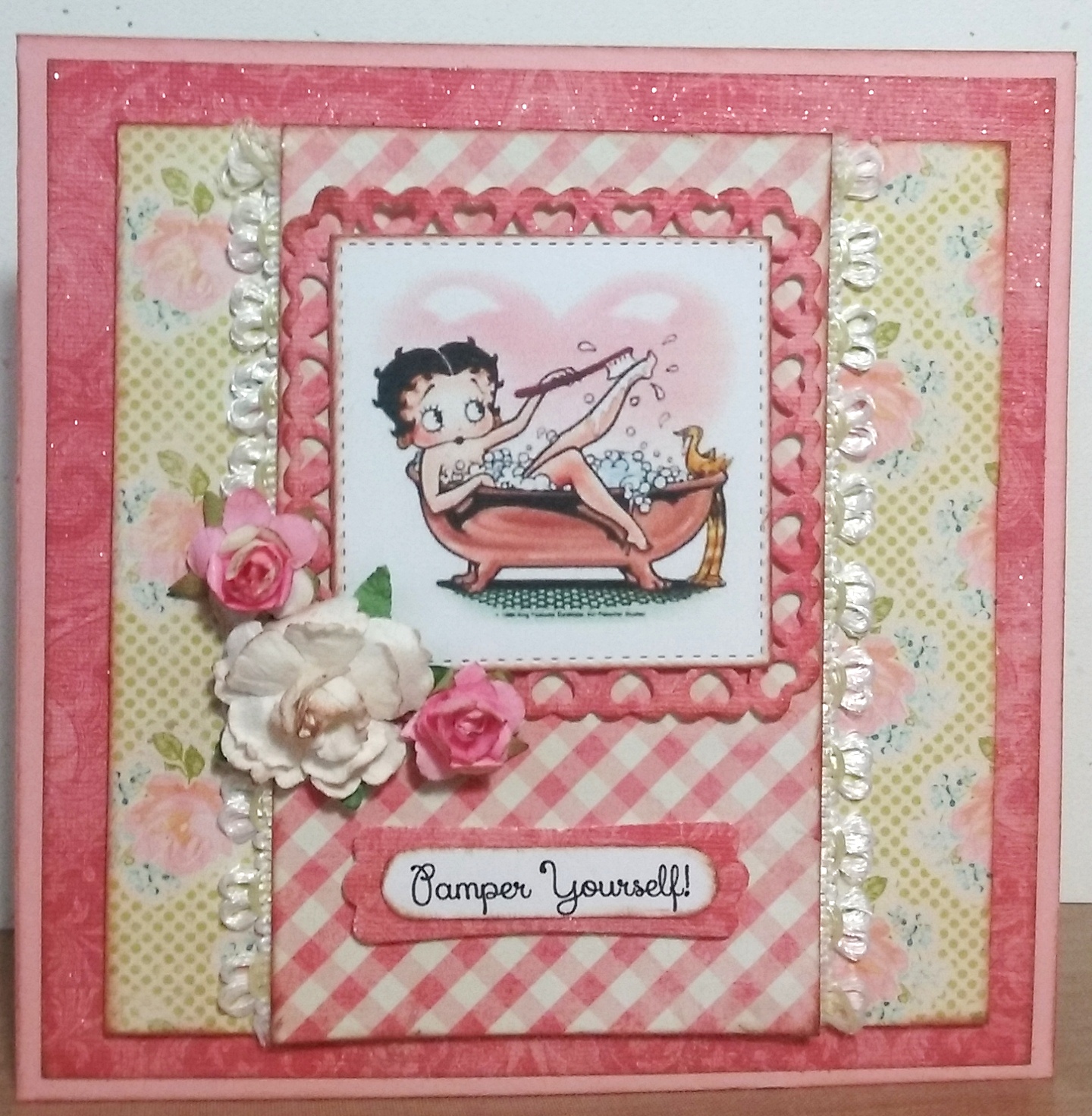
Happy Birthday Celebrations for "Betty"!

Happy Days!  My card has been chosen as a

SPLITCOASTERS FAVORITE OF THE WEEKENDING - JULY 3, 2016


A little vintage Betty Boop card for my daughter, Michele's birthday celebration!


Ingredients:  SU cardstock: Blushing Bride.  DCWV Old World Stack (glitter applied).  Authentique: Promise collection/ Six (floral).  My Mind's Eye: The Sweetest Thing collection/ Honey "Love" Fond (check).  Dies: Spellbinder's-Heart Squares; MFT-Stitched Squares STAX.  SU punches: Modern Label; Word Window (both retired).  Recollections flowers.  Elmer's Craft Adhesive Spray.  Martha Stewart Glitter: Crystal Fine.  EK punch: Basketweave Corner.  Computer-made sentiment and verse.  Size: 5-1/2" square.  (Splitcoaster Thread: Weed Ending 7-3-16/ #142).

The Card's Story & Other Tidbits


My daughters and I are planning  a "Girls' Night Out" date in celebration of the oldest one's birthday!  We are going to enjoy the magic of Teatro Zinzanni's Hotel L'Amour tonight and can't wait for it to start.  We will be all dressed up in colorful attire, with boas, masks, and funny little hats.  You may wonder, "What is Teatro ZinZanni's?"  The best description is:  a three-hour whirlwind of international cirque, comedy, burlesque and cabaret artists all served up with a scrumptious multi-course feast and elegant libations!


Since the family celebrated Michele with a short-notice, pre-birthday get-together last week-end, I had to have a card very quickly, so a pretty one came out of my finished stash.  I was very disappointed that I did not have time to complete my card idea that had been mulling around in my brain for the past several months while vacationing in California and without all my own cardmaking equipment.  Then I thought of a great idea, I would finish up her card this week and give it to her on our "Girls' Night Out."


My idea started with a bubble bath digital image of some sort to color and frame in a sassy, vintage-style card, because Michele loves bubble baths to de-stress after a busy day at work.  I ended up using a Betty Boop vintage, bubble bath image that was already colored rather than a black and white for my coloring.  There is, of course, a story explaining why this bubble bath Betty Boop image was perfect!


Michele's fun-time, nickname from her sister is Betty.  Don't ask me how that all got started, but somehow over five to eight years ago, when they were goofing around Michele became Betty and Jackie becames Roxy, each with a new personna and a new voice.  It can be pretty hilarious to watch them interact together or to listen to a telephone call between Betty and Roxy!  About a year or so ago, Ginger, their sister-in-law, joined in the group and became Felicity, our sister from another mother.  One time, in the not too distant past, when the girls were shopping for stylish sister "night out" garments, I laughingly said Michele fit the Betty Boop look with her dark hair and diva costume.  So, there's the explanation of why a bubble bath Betty Boop was perfect.  


To make my card, I needed the perfect papers to compliment my Betty Boop image.  I wanted a bit of glitter, especially on my image frame.  I decided to be a bit creative with an old piece of muted, mottled, pinkish DCWV Old World damask paper by applying spray adhesive and sprinkling on the glitter, letting it dry, and dusting it off.  Voila, I had created my very own glitter paper!  (Sorry the glitter does not show up well in the photo.)  I decided this would be my first mat layer applied on top of the Blushing Bride cardbase, and I would also use it for the image frame cut from Spellbinder's Nesting Heart Squares.  Once this paper decision was made, I searched for two more complimentary patterns to use with it, and away I went creating the design in my mind's eye.  In reviewing my card when finished, I wish I had used a corner decorator punch on the layers. . .maybe next time!  


My final step as is my tradition in cardmaking, is to create an inside that compliments the card front design, and to make up or find a verse that's just right for the occasion.  I think Michele will enjoy her card on our Teatro's night out when she and Jackie are all dolled up looking like Betty and Roxy, the divas.

Friday, March 11, 2016

The Force is With Him on His Birthday!

Happy Days!  This card was chosen as a

SPLITCOASTSTAMPERS FAVORITE OF

 WEEK ENDING - MARCH 13, 2016


My oldest (son) has a March birthday, so it was time to put on my thinking cap to come up with the perfect card for this year's celebration.  As you know if you've read my blog a bit, I like to make cards that suit each person's personality, hobbies, favorite things to do, etc.  Over the last seven years, I have made him a Space Invaders card, a computer geek card, a movie mania  card, a Game On t-shirt card, a game controller card, and last year depicting one of his favorite foods. . . a pizza card.  What to do this year????

While browsing in Pinterest and on different blogs, I found a challenge blog where one of the cards had a Star Wars theme, using a Star War's character digital image from the challenge sponsor: Sassy Studio Designs.  Stars Wars...OMGosh, one of David's all-time favorite movies!  Like a magnet I was drawn to go to the Sassy Studio Design website, and lo and behold, their new monthly issue of digital images was based all around the Star Wars characters, from R2D2, to Chewy, to Yoda, to Princess Leia, and more. . .just waiting for me to bring them home . . .and home, I did bring!

My choice for my son's card was Yoda, so the search was on to learn Yoda's authentic color shades, which seemed to vary quite alot from gray green to green with tans, etc.  Even with these variations, finding Copic markers along the right hues was a bit of a challenge, because though I have over 300 marker colors, none were exactly along the right greenish to tan color lines that are depicted as Yoda's colors.  I had to select a variety of different shades and combine them to try to come out with the right greenish-tan for his face and hands.  For his robe, I decided it would be a bit more colorful than his regular robe for two reasons:  primarily, I didn't want my card to be totally drab, and I decided he would be dressed up in his best robe for a special occasion. . .David's birthday!  (Whatever works. . .right!)

After I got him all colored, then I went in search of the right cardstock colors and patterns to use for my card.  When I saw the black with gold star patterned paper, I knew I was on the right track.  I wanted some glittery stars, but decided to keep them subdue by using the Stampin' Up retired Brushed Gold for the stars, my planet, and the middle layer between the card front pattern and the cardbase.  Take a look at the crinkled planet surface.  I was able to achieve these crinkles by running my die-cut planet through on my Big Shot on the old crackled sandwich plate and adding a cardboard shim to make a really tight fit with lots of pressure as I rolled it through.  I put it through twice for good measure, and I thought it turned out pretty cool.

After putting my card pieces all together, and adding a touch of Wink of Stella-Clear to my planet, stars, and light-saber to give them a little more sparkle, I decided my card turned out better than I thought it might, and I know David will be thrilled with his Yoda card.  Take a peek below!


My finishing task was to design a creative interior with a birthday verse that coordinates with my card theme.  Take a peek at the finished interior design.


Recipe:  Papers:  Stampin' Up cardstock--Basic Black, Delightful Dijon, Pear Pizzazz (sponged), Very Vanilla (sponged), Brushed Gold (retired); DCWV pattern: Gold Stag Star.  Sassy Studio Designs digital image: Yoda Honey.  Dies:  Spellbinders--Small & Large Classic Circles; MFT--Sun, Moon & Stars, Stitched Snow Drifts; IO--Instant Photo Frame.  Punches:  Stampin' Up--Washi Tape, 1/2" Circle, Itty Bitty Accents/ Star, Itty Bitty Circle, 1/8" Circle.  Wink of Stella-Clear.  ColorBox: Chestnut Roan Ink (distressing/ sponging).  Copic Markers: Face--YG11, E81, Y11, E84; Eyes--YG11; Neck Cravet--E21, E95, E97; Robe Stripes--G99; Robe--E30, E53, E35; Saber--YG11, Y17, T7.  Size: 5-1/2" x 5-3/4".  (SplitcoastStampers Thread: March 13, 2016/ #11).