Monday, June 21, 2021

Batter Up! Father's Day Alternative #2

 My second Father's Day card will be for my son-in-law.  Once again, I will use the May 2021 Paper Pumpkin - Batter Up! card kit, but making my own Alternative #2 card design totally unrelated to those provided in the kit.  I will use the Seattle Mariners as the theme for this card as I did on the card for my son.


I will use papers and inks not provided in the kit for the Seattle Mariners team colors, as the kits was off on another color journey totally unrelated to Mariner colors.  I was able to use the pocket die-cut, baseball, bats, and the stamps provided in the kit.  I also used the SU - Hats Off / Hat Builder stamps for the #1 (stamp) and the baseball hat (a die).  Take a peek at my finished card.  I think Josh will like it.


Ingredients:  Stampin' Up products:  Cardstock--Night of Navy, Tranquil Tide (inside) Smokey Slate (inside). Patterned Paper--Regals 6x6 dsp-Shaded Spruce (2018-19). Stamps/ Dies--Hats Off/ Hat Builder dies (stamp-#1+die-hat). Ink--Tranquil Tide. Paper Pumpkin/June 2021--Batter Up! Kit--stamps, baseball, bats, gray pocket.  Gems--Glitter Enamel Dots (Copic colored Dk. Blue).  Other: Papertrey die--To Die for Sentiments/-Happy Father's Day (inside). EK Punch--Victorian Corners.  Copic Markers.  Wink of Stella--Clear. Size--4-3/4x6 inches.

Wednesday, June 16, 2021

Mother's Day for My Youngest Daughter

Our family decided to celebrate Mothers' Day and Father's Day together for several reasons. . .not everyone's double COVID vaccine would be optimally effective, plus there were so many mothers to celebrate, it just seemed the best solution to make it easier on everyone!  Here's the problem. . .did I remember this particularly important fact when it came to making the cards needed for this celebration?  NO!  I had just finished my third Father's Day card when I realized I should have made three Mother's Day cards as well.  Simultaneously, I also realized that I just had no time to fit them in before the week-end!  


Not the optimum solution, but this is how I solved my dilemma with no time to make three more cards. . .  My  youngest daughter, Jackie, lives the furthest away, and therefore, not as easy to just pop over to make a belated card delivery, which was my plan for the other two.  My oldest daughter and daughter-in-law live within a 10-minute drive from me.  So, I focused on at least getting Jackie's card done and delivered at our family barbeque event.  Another reason I chose her is that Jackie will be celebrating her third Mother's Day, and I have not yet been able to spend this holiday with her as I have with the other two. 


Back in May when we delayed our Mother's Day celebrations, I had already decided to do a flower garden theme for all my family Moms.  I had just bought a new Mother's Day die that I was anxious to incorporate in some manner.  For Jackie's card, I decided to use some papers and florals from Stampin' Up's Made to Bloom card kit from the 2019 Occasions catalog.  One thing that I've noticed is that there haven't been many who have branched out and made other alternative designs than those provided in the original kit.  But, if you've followed me at all, you know that I just can't make the card designs provided in the kits.  I usually make alternative designs before the kit designs, and this card is no exception.


For my card front design, I love layers, so I added a Blackberry Bliss cardbase and a gold foil mat layer before adding a third layer of one of the patterned papers provided in the kit.  I added a gold foil horizontal band to anchor the kit-provided gold-edged floral bouquet, plus I ink-distressed its edges.  My finishing touch was to sprinkle on a few gems for interest.  I decided to incorporate that new Mother's Day die on the inside as the sentiment and "verse" combined...how pretty it is in the gold foil!  Take a look below at the inside and outside finished card.  I think my youngest daughter will enjoy her card.


Ingredients:  Stampin' Up products:  Made to Bloom Card Kit (2019 Occ./ retired)--BG patterned paper, Gold foil-edged flowers.  Cardstocks--Blackberry Bliss, Calypso Coral, Gold Foil.  Ink--Crumb Cake (ink distressing).  Gems--Glitter Enamel Dots.  Punch--Curvy Corner Trio (retired).  Other: Sargent Art--Acrylic Glitter Glaze (flower centers).  Papertrey Ink die--To Die for Sentiments--Happy Mother's Day die.  Size--4-3/4 x 6 inches.

Sunday, June 13, 2021

June Brings a Birthday for Sister-in-Law#2

As mentioned in the past, I have eight sister-in-laws...most from my husband's side of the family.  I keep track of them by numbers based on their birth date in chronological order.  The first sister-in-law birthday of each year is my brother's wife in May, and she is sister-in-law #1.  For June, we celebrate sister-in-law #2 and her birthday is coming soon.  Once again, I decided to use the Made to Bloom kit, making my own design.


From the kit, I used the calypso coral patterned paper, the pink scalloped panel, and part of the floral wreath.  I fussy-cut an arc of flowers off the wreath to use on the sentiment focal oval.  The cardstocks, die, stamp, embellishments, and glitter glaze were all additions I added to make my design alternative.   I used the glitter glaze on the flower centers to add a bit of shine.


It's fun to use kits in ways not provided and see what you can come up with yourself other than the designs provided.  Take a look below at my finished card inside and out for sister-in-law #2.  I think she will like it!


Ingredients:  Stampin' Up products:  Cardstocks--Whisper White, Pretty-in-Pink (ret.).  Made in Bloom kit (2019):  patterned paper layers, floral piece.  Ink--Blackberry Bliss.  Ribbon--1/4" White Crinkled Seam Binding.  Sequins--Artistry in Bloom.  Other: Stamps--Penny Black-Sweet Wishes.  Dies--Spellbinders Floral Ovals; Lawn Fawn Fancy Scallop Rectangle.  EK Punch--Scalloped Corners (inside).  Sargent Art Acrylic Glitter Glaze.  Chatterbox computer verse.  Size: 4-3/4 x 6-inches.

Tuesday, June 8, 2021

Batter Up! Father's Day Alternative #1

When I got my May 2021 Paper Pumpkin - Batter Up!, it was all about baseball.  Right then and there, I decided I needed to use the kit to make my Father's Day cards!   Father's Day will soon be upon us and I have three cards to make, so I'd best get started.


The team in our neighborhood is the Seattle Mariners.  The Mariners colors are: Navy, Metallic Silver (gray), Northwest Green (teal-tone green), and Cream, with the accent color Mariner's Yellow.  Unfortunately, the Paper Pumpkin kit colors are navy, red, golden yellow, pacific blue, gray, kraft, and white; therefore, all three of my card will be my own alternative designs for sure, as the kit designs are sure to use colors that do not fit our team colors!


My first card will be for my youngest son, and he is long-time Mariners baseball fan.  His card is definitely my own design and not even close to a CASE of any kit design.  These are the kit materials that I've used:  four precut die-cuts--the "All Star tag," two bats, and a baseball, plus kit stamps for baseball cap and DAD sentiment.  Added materials are:  navy cardstock, gray cardstock, green teal-tone dsp, wood plank stamp, ink (SU: Tranquil Tide, Balmy Blue), and epoxy stars (Copic colored green).  I'm pretty happy with the results, and I think my son will be pleased...take a peek below:


Ingredients:  Stampin' Up products:  Cardstock--Night of Navy, Smokey Slate, Tranquil Tide (inside). Patterned Paper--Regals 6x6 dsp-Shaded Spruce (2019-20). Ink--Tranquil Tide, Smokey Slate, Balmy Blue (hat stamping). Paper Pumpkin/June 2021--Batter Up! Kit--stamps, baseball, bats, All Star die-cut.  Stars--Itty Bitty Epoxy Accents (Copic colored Dk. Green). Journal Pen-Black (hat markings).  Other: MFT Stamp--6x6 BG--Wood Plank. Papertrey die--To Die for Sentiments/-Happy Father's Day (inside). EK Punch--Victorian Corners.  Colorbox--Chestnut Roan (ink distressing).  Wink of Stella--Clear. Size--4-3/4x6 inches. 

Friday, June 4, 2021

A Ballerina for Amara's Birthday, Too!

My oldest son's fiance has two adult children. Her daughter has a daughter who was born between my granddaughter #2 and granddaughter #3.  She is a wee little thing, and my granddaughter #3, who is five months younger, is at least three inches taller!  We consider Amara our adopted granddaughter #4, and she needed a birthday card for her second birthday in early June.  Needless to say, she needed a ballerina birthday card as well!


To decide what colors her ballerina would feature, I asked what colors of clothing Amara looked the very best in...the answer was turquoise (aqua) and yellow.  So, a two-tone card Amara would get.  I used an SU retired Tempting Turquoise cs and Crushed Curry.  patterned paper I chose was a little pale, so I sponged Daffodil Delight ink over the surface.  Since I made the last ballerina card for Evie, I purchased the body parts that I spoke of in the first ballerina card made (see it here: A Ballerina Birthday for Callie!); therefore, this little girl has real arms and a real torso, and legs, which are hidden below her clothing!  Other than these added body-shaped parts, there is very little difference in construction.  Take a peek below at Ballerina card #4 in light turquoise and yellow:


Ingredients:  Stampin' Up products:  Cardstock--Crushed Curry, Tempting Turquoise (ret.), Whisper White.  Patterned Paper--All Abloom dsp stack (2014-15).  Ink: Daffodil Delight (sponging).  Pearls-mini--Copic colored.  Other:  DCWV Glitter stack--Turquoise-oval frame/ Yellow-skirt.  American Crafts POW--Marine Glitter paper (bodice/ balloon).  Dies--Alina Crafts--Ballerina, Doll Body Set; Spellbinders--Floral Ovals, Petite Ovals Large; Lawn Fawn--Party Balloons; MemoryBox--Varsity Numbers; Autone dies (Amazon): Balloon Message Strings (happy birthday sentiment). EK punch--Victorian Corners (inside).  Ribbon--Offray 1/2" Turquoise Organza (lengthwise 1/2 cut).  Copic Markers.  Wink of Stella: Black   Stash--Balloon strings--Lyon Sparkly Mini Yarn; Glitter Tulle--turquoise/ yellow.  Chatterbox Verse.  Size: 4-3/4" x 6-1/4".

Sunday, May 30, 2021

Magic & Wonder At Christmas!

This is another card fashioned during my January New Year's resolution binge cardmaking marathon.  I was so happy with the end result that I resolved to go back and make more of this design at a later date.  I just finished a total of four more replicas for my card stash, but I still want to make at least three more!  I did add some Copic-colored sequins for the poinsettia stamin to add even more dimension on several versions. 


My card is a modified CASE of a card originally designed by Dar Peterson, a friend and one-half of my Stampin' Up demonstrator duo, plus side-kick Luci Kirschbaum.  Because of COVID-19, they were not able to host card classes for well over 15 months; therefore, they issued card kits from time to time for their friends and followers to purchase and complete in their homes.  This CASE original was from their Christmas kit issued in late October 2020.  Take a peek at the beautiful results of this truly elegant card and read below for the particulars on the modifications that I made.


One of my favorite Christmas card themes is poinsettia blooms that come in a myriad of colors and usually make elegant cards.  This  card uses the Poinsettia Petals and coordinating die set, which is still available in the 2021-22 Annual catalog.  I was so happy with the end results of my January CASE that I just finished a total of seven replicas for my card stash!  I did add some Copic-colored sequins for more dimension of several versions. 


I modified Dar's design by enlarging my card and changing the sizing on the kit papers to fit.  I added two more color layers to the base layering in So Saffron and Garden Green to bring out the beautiful color shades in the Poinsettia Place dsp paper.  Garden Green became my card's new card base and I built the card's layering from this base instead of white as in the original design.   The original design used the gold oval background layer in the sentiment as in my card, but I added it as a background layer behind the horizontal ribbon band as well.  I added some Acrylic Glitter Glaze to the poinsettia's petals to add sparkle and sheen, but kept the rest of the card similar to the original design.  


Ingredients:  Stampin' Up products:  Cardstock--Garden Green, So Saffron, Whisper White. Specialty Papers--Translucent Vellum, Gold Foil. Patterned paper--Poinsettia Place dsp (2020 Holiday).  Stamps--Poinsettia Petals.  Dies--Poinsettia Dies, Layering Ovals, Stitched Shapes.  Ink--Garden Green.  Ribbon--3/8" Metallic Gold Edged--Vanilla.  Other:  Copic-colored sequins, EK Victorian Corner punch, Acrylic Glitter Glaze (Sargent Art), Chatterbox verse.  Size: 4-3/4 x 6 inches.

Monday, May 24, 2021

It's a Minnie for Birthday #2

I am catching up on some missed birthday cards during my hand surgeries that are for my oldest granddaughter's keepsake box.  I needed a card for my sweet girl's birthday number two.  She loved the books I gave her featuring Minnie Mouse.  Whenever I made a visit, she would pile them haphazardly on my lap and climb up next to me on the couch, jabbering away as she turns the pages.  Even though there was much I did not understand, every now and then I catch the words "Minnie Mouse" in a somewhat strange diction, but yet, ever so clear.  Thus, I thought that this catch-up birthday card would be perfect featuring Minnie Mouse.


I made a "punch art" Minnie Mouse card a few months ago for another granddaughter's second birthday to coordinate with her birthday party theme.  It also coordinated with her Minnie Mouse dress-up doll, garbed in the signature colors of red and white polka dots, so I wanted to do something a little different with this new card.   A few years ago on Pinterest, I saw several ideas using Stampin' Up's Swirly Bird stamp/ die set making Mickey or Minnie Mouse cards.  I thought I'd like to try my hand at one.   Take a look below at my finished card, along with its inside verse and design:


Ingredients:  Stampin' Up products:  Cardstocks--Melon Mambo, Basic Black, Whisper White.  Patterned DSP--Pop of Pink (2016 Annual).  Stamps--Swirly Bird, Thoughtful Banners (both 2016-18 ret.).   Inks--Melon Mambo, Memento: Tuxedo Black.  Punches--Bow Builder (2015 Occ./ 2016 Annual), Duet Banner (2016 Annual).  Twine--Black & White.  Pearls (Copic colored).  Other:  EK punch---Victorian Corners.

Thursday, May 20, 2021

Stepping To Church for Christmas!

Here is my first center-step card that I've made from start to finish with my own template design for a larger 4-3/4 x 6-inch card.  To help me redesign the dimensions, it is a remake of a card I made at my Stampin' Up demonstrator duo's card event back in the fall of 2017, which I loved!  What can I say, I'm not very adventuresome, especially since it involved refiguring the template dimensions in order to remake it into the larger size.  I kept the original card to use as a guide, which helped me figure it all out much easier. 


Because the card was larger, I was able to add a third layer.  I ended up with a black cardbase, followed by a white mat layer, followed by the card front layer with the die-cut pieces.  I really like the white on black look.  The original design just started off with the white cardbase, which didn't allow for as much contrast.  I really like my added contrast by having three layers, and starting with the black first, then white, then black again.  I stuck to the original card design, and I thank Luci Kirschbaum for always allowing us to CASE our class cards and modify them as we like.  Here is my enlarged, finished card below:


Ingredients:  Stampin' Up products:  Cardstocks--Basic Black, Whisper White, Gold foil.  Patterned paper--Merry Music Specialty (2017 Holiday).  Stamps--Hearts Come Home/ Dies--Home Town Greeting.  Punch--Confetti Stars Border.  Embossing Powder: Gold.  Size:  4-3/4 x 6-inches.

Saturday, May 15, 2021

Sending Sunshine on Mother's Day

I wanted to use my first Paper Pumpkin Kit...June 2020--Box of Sunshine kit pieces to make Mother's Day cards for my oldest daughter and my daughter-in-law.  For my daughter, I decided to use one of the papers in the kit that looked like an alcohol-inked background.  There were actually two different yet similar colored one...one in brilliant red-oranges, yellow golds, yellows, and gold metallic and the other in yellows, yellow-golds, and metallic gold.  For my daughter's card, I chose the one with red-oranges and yellows.   I loved the card design provided in the kit, except I like layers so here is what I did. 


I used the card design provided for this paper pattern, except I dropped the start of the stamped sunshine about 3/8" lower from the top and 3/8" to the right...closer to center than the original design.  Then, I followed through with the black dot horizontal paper, sentiment, and stamped lines as originally positioned in relation to the stamped sun.  I  added two mat layers beneath the card front...a new black cardbase, and a burnt orange mat layer between the cardbase and card front.  I also positioned my sequins slightly different.  For the most part, other than the added layers, you might not notice any difference from that of the original card front unless closely scrutinized.


I finished off with an inside verse sending sunshine and happiness.  Take a peek below at the finished card inside and out design.  I think my daughter, Michele, will like her card.


Ingredients:  Stampin' Up products:  Paper Pumpkin--June 2020/ Box of Sunshine:  AI-style dsp,  black & white dot dsp, stamps, irregular hexagon sentiment die-cut.  Cardstock--Basic Black, Whisper White.  Memento Tuxedo Black Ink.  Other products:  Core'dinations Foundations cardstock--Valentia Orange.  Bazzill Swiss Dot--Honey Yellow.  Colorbox Chestnut Roan pigment ink (edge distressing).  Stash--sequins & red-orange rhinestones.  Chatterbox computer verse.  Size: 4-3/4 x 6-inches. 

Sunday, May 9, 2021

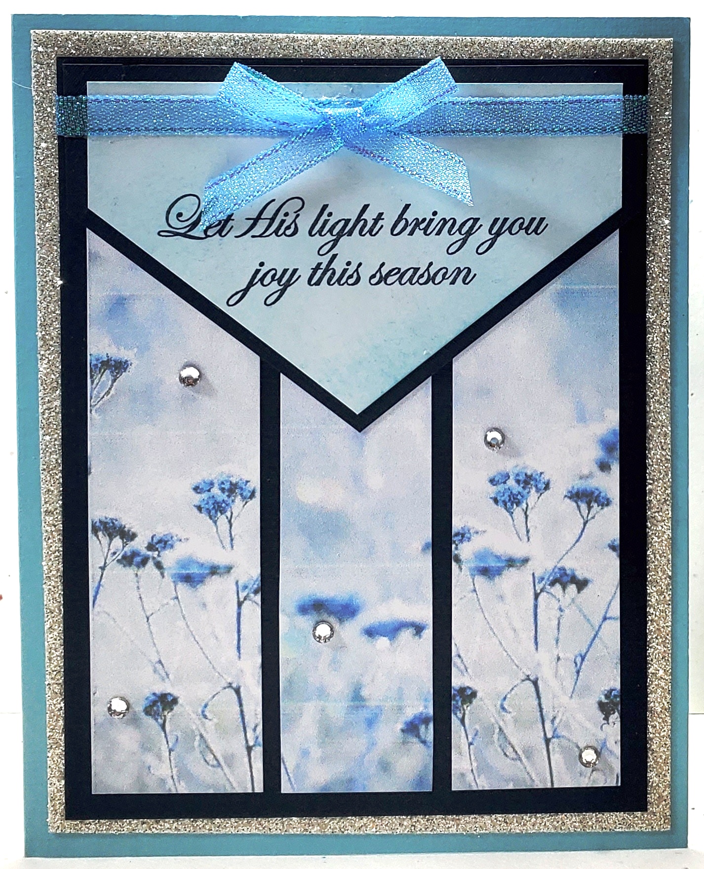
Let His Light Bring You Joy!

I'm trying to catch up on my blog posting, and I found this Christmas card that I made earlier this year that hadn't been posted.  I used this same card design for two sympathy cards back in January, but planned to remake it into several Christmas cards as well.   My card design was based on a My Favorite Things sketch from April 2018 - MFTWSC383, plus some Splitcoaststamper Challenge ideas as well.  


I liked the Feels Like Frost paper that I used on the sympathy cards, and I planned to use it on the Christmas cards as well.  I did not make the same mistake in measuring the flap this time, so it was plenty long enough to be positioned at the top of the layering scheme so the ribbon strip and bow would rested directly on the flap.  Take a peek at my finished  card:


My design rotated the sketch design to a portrait style and shortened the flap so it did not drop as low onto the body of the card.  I decided to place my sentiment on the flap similar to where MFT shows the white rectangle but lower in the angled area, and I layered the flap with navy.  In addition, I added vertical paper strips from top to bottom with the envelope flap overlaying the top portion of the strips.  Take a look at the My Favorite Things sketch that I based my card design from:


Ingredients:  Stampin' Up products:  Cardstock--Balmy Blue, Night of Navy, Silver Glimmer; Patterned paper--Feels Like Frost 6x6 dsp; Stamps--His Light (2018 Holiday); Ink--Night of Navy, Balmy Blue (sponging); Ribbon--1/4" Snowflake Splendor; Basic Rhinestones.  Other: Copic Markers (ribbon coloring); Chatterbox computer sentiment/ verse; Size--4-3/4 x 6-inches.

Monday, May 3, 2021

Enjoy Today...It's Mother's Day!

This is my second Slightly Alternative Mother's Day card for my daughter-in-law, using my first Paper Pumpkin Kit...June 2020--Box of Sunshine kit pieces.  For her card, I chose the gold metallic and white horizontal striped paper provided in the kit.  Again, I loved the card design provided in the kit for this paper, except I like layers, and I wanted to change the sentiment, so here is what I did. 


I used the card design provided, except I trimmed the top and bottom of the striped paper down a total of 3/8." I also dropped my pineapple about 1/4" lower and moved it 3/8" to the right closer to the center than the original design.  Then, I followed through with the black dot horizontal paper, sentiment fishtail flag die-cut in relation to the pineapple's position as in the original design.  I  added two mat layers beneath the card front...a new black cardbase, and a apple green and white dot mat layer between the cardbase and card front.  I also added more sequins and positioned them different.  For the most part, other than the added layers, you might not notice any difference from that of the original card front unless it is closely scrutinized.


I finished off with an inside verse sending thoughts of love and appreciation.  Take a peek below at the finished card inside and out design.  I think my daughter-in-law, Ginger, will like her card.


Ingredients:  Stampin' Up products:  Paper Pumpkin--June 2020/ Box of Sunshine: gold metallic/ white stripe dsp,  black & white dot dsp, pineapple die-cut, double-fishtail flag sentiment die-cut.  Cardstock--Basic Black, Whisper White.  Memento Tuxedo Black Ink.  Other products: Stamps--Penny Black/ Sweet Wishes.  Recollections--Primary Dots dsp; Bazzill Swiss Dots/ Honey Yellow.  EK punch--Victorian Corners.  Colorbox Chestnut Roan pigment ink (edge distressing).  Stash--sequins & black enamel dots.  Chatterbox computer verse.  Size: 4-3/4 x 6-inches. 

Wednesday, April 28, 2021

A Wondrous Gift is Given

More Christmas cards are needed for my 2021 Christmas stash.  This is a remake of a card made back in 2009, using the now retired Stampin' Up Lovely As A Tree stamp set that was so popular and remained current from 2001 to 2019!  My new card has more layers added, including some sparkly silver glimmer paper, Dazzling Diamonds glitter, and sequins that the original did not have.  


I just love the technique of layering trees in navy ink and silver embossing with a little added Dazzling Diamonds glitter into the mix.  Unfortunately, the photo does not pick up on the glitter added, but it is quite sparkly in RIL!  I've also added some sparkly sequins scattered about.  Take a peek at an update of an old card below:


Ingredients:  Stampin' Up products:  Cardstocks--Whisper White, Night of Navy, Silver Glimmer.  Stamps--Lovely As A Tree (ret. 2001-19), Wondrous Gift (ret. 2007-09), Snow Front (2019).  Ink--Night of Navy, Versamark.  Embossing Powder--Silver, Heat & Stick.  Glitter--Dazzling Diamonds.  Ribbon--1/4" Night of Navy Grosgrain; Silver Cording.  Size:  5 x 6-1/4 inch.

Wednesday, April 21, 2021

Minnie Mouse Visits for Birthday TWO!

I am finally getting around to posting the first granddaughter birthday for 2021, which was celebrated in late February, and I heard that her birthday party theme was to be Mickey & Minnie Mouse, using their traditional colors of red, black, and white.  I also heard that little Sienna would be dressed in her own Minnie dress in those same colors.  She would be TWO, so I needed to put on my creative thinking cap and find a card design that was appropriate. 


First,  I decided that I would stick to just a Minnie Mouse on the card so that it could be a big mouse with a big bow for her head.  I ended up deciding on a large Minnie punch-art head instead of a full-bodied Minnie.  Since the party theme was to be red, black, and white, I decided that would be my card colors as well!  Next, I needed some patterned papers, and I found a red with multi-sized white polka dots in my stash that I thought would be perfect.  I had some other red and black prints on standby just in case I needed a second pattern.


The card sort of evolved adding a little bit of this and a little bit of that.  I decided the white "head" background panel needed dressing up so I used a happy birthday embossing folder to add texture before adhering Minnie's head.  It occurred to me that it would be "cool" if the head parts looked like fur, so I used the Stampin' Up Subtle Dynamic folder to emboss the head and ear pieces.  I wanted the card to feature that it was her birthday number TWO, so I added a shimmery red number 2 to coordinate with the sweet, shimmery red and white diagonal striped ribbon that I found and thought I would use for Minnie's head bow.  


I continued adding background layering and popped the "head" panel onto the layered card base.  I was thrilled with the look and how well it worked to use the ribbon for the horizontal strip to host the die-cut birthday sentiment, as well as for Minnie's perky head bow.   Take a peek below at the finished card.  I was really quite happy with the results.


Ingredients:  Stampin' Up cardstock:  Poppy Parade, Basic Black, Whisper White.  Recollections pattern:  Red Dots.  Recollections Foil/ Brilliant (red).   Dies:  Cottage Cutz Expressions--Birthday, Girl; Sizzlits--Mango Tango Alphabet/ Numbers.  EK Punches:  2-1/2" circle, 1-3/8" circle, Arrow Slim Edger (SU: Pinking Hearts retired), Victorner corners.  Embossing Folder: Cuttlebug--Happy Birthday; SU--Subtles Dynamic.  Ribbon Stash: 7/8" Metallic Diagonal Strip.  Size: 4-3/4x6 inches.

Wednesday, April 14, 2021

Sympathy & Prayers

I needed to make sympathy cards for my son to give to a long-time friend from his high school days (and his parents), who lost his brother (and son) in an accident in late March.   His friend married a Polish young lady several years ago and resides in Poland; therefore, tragically, he was unable to come home for the funeral.  Our entire family sends prayers of comfort to help him and his family through this sorrowful time.


I decided to use the Stampin' Up Feels Like Frost nature scenes paper for both cards in the lavender and purple hues.  I think this paper, done in off-focus almost ethereal look, lends itself well to sympathy cards.  Both cards are in a similar design, one using a vellum overlay for the front and sentiment background and the other using the vellum only as a background for the sentiment.  Take a peek at the finished cards and inside scripture verses.


Ingredients:  Stampin' Up products:  Cardstock--Night of Navy, Gorgeous Grape, Heather Highland, Whisper White.  Patterned Paper--Feels Like Frost (2019-21 Holidays).  Vellum--Transluscent.  Dies--Crosses of Hope framelits (2018-20 retired).  Other:  Cottage Cutz Expressions dies.  Pretty Pink Posh sequins--Sparkling Clear & Iridescent.  Triveni Crafts Pearl Sunflowers-White.  EK Corner punch--Victorian.  Size: 4-3/4 x 6 inches.

Friday, April 9, 2021

A Tropical Birthday Drink!

As I mentioned back February on my blog of a friend's birthday card, I made a variety of cards that would be needed in the future while I was on my August, 2020 craft trip with my sister and Mom to Sisters, Oregon.  This has been my first and only trip that I have ventured out during COVID!  Weren't we lucky that this trip happened about two weeks before the horrendous fires all over Oregon's forests!


I also mentioned that because my mojo had been stymied by COVID's intervention, I had purchased several kits and subscribed to Stampin' Up's Paper Pumpkin to try to spur myself into getting into my craft room!   I was really excited about the June 2020 Paper Pumpkin Box of Sunshine kit because of its beautiful, rich colors, and its pineapple die-cuts!  I brought this kit and several others along to work on while in Sisters.


I like to make cards for people where the theme fits the person, whether it be focusing on a hobby, their job, their favorite song, movie, etc.  My husband's job took our family to Hawaii to live for about three years, and Jackie, our youngest daughter, was born there, thus my excitement over the pineapples in the June 2020 card kit.  I saw an alternative card idea in June, just a few weeks after the kit arrived that I really, really loved.  I remembered it and thought the "idea" was perfect for Jackie, but I did not save it to Pinterest, nor could not find it again.  I remembered it used the kit paper supplies, and particularly that it used the black/ white polka dot paper on a center panel.  There was also a pineapple with its top cut off to form a tropical beverage receptacle, plus an umbrella, a straw, and a flower.  It used one of the cardbase folds with the bright alcohol-ink-style background as the card front.  I wished I could find the exact card I saw to give that cardmaker credit for my "memory casing," but alas, no luck!


For my card, I love layers, so I cut the alcohol-ink-style background off the folded card base to use as a layer.  I made a new and larger cardbase using black cardstock and added a second layer of gold foil.  My third layer would be the AI-styled panel that I had cut off.  I cut a set of smaller papers for the center layers...black and white cardstocks and the kit's black & white polka dot paper (similar to my "memory-cased" card, I think).  I fussy-cut the pineapple top off along the diamond pineapple scales and saved it to use as greenery (my "memory-cased" card did something similar, because I remember thinking it was a nice filler).  Next, I worked on my tropical beverage pineapple drink.


My sister brought lots of her My Favorite Things stamp sets with her, one of which had a Hawaiian theme, so I was able to use her Hibiscus stamp for my drink's flower.  I brought my new SU umbrella stamp/ punch set, because Jackie also loves umbrellas.  I thought I might incorporate that into her card theme if my pineapple idea didn't work.  But, the pineapple tropical drink worked very well with the parts and pieces I was able to use from here and there.  I Copic-colored the umbrella and flower stamped images, plus added a bit of  Clear Wink of Stella to the flower for a bit of sheen.   I used the geometric die-cut and a stamp from the kit for the sentiment.  Take a peek below at how Jackie's card evolved into the finished design.  She was delighted with it, and the inside verse's play on a bit of humor!


Ingredients:  Stampin' Up products:  June 2020 PP Box of Sunshine--Patterned papers, sentiment stamp/ die-cut shape, pineapple die-cut.  Cardstock--Basic Black, Whisper White, Crushed Curry, Gold Foil.  Stamps--Under My Umbrella.  Other:  My Favorite Things--Birdie Brown Polynesian Paradise stamps (hibiscus).  ColorBox Ink: Chestnut Roan (ink distressing).  Copic Markers.  Wink of Stella/ Clear (hibiscus).  EK Corner Punch--Victorian Medium.  Chatterbox Computer verse.  Size:  4-3/4" x 6-1/4".