Saturday, July 30, 2016

Birthday Greetings to the Tournament Fisherman!

My nephew, Adam, has a July birthday, and I have never made him a birthday card. . .shame on me!!!  I got busy and created one depicting his favorite hobby. . .fishing.


Ingredients:  Recollections Cardstock: Spice Market collection.  The Paper Studio: Wood Fence.  BoBunny-A Gift of Love: Flutter Butter Solid.  Hot Off the Press: Rust/ Black Plaid.  Spellbinders dies:  Labels Three/ #7 (largest).  My Favorite Things: Stitched Circle STAX.  EK Punch: Arrows.  Ink: Memento Desert Sand (fish sponging).  Stampin' Up Dazzling Diamonds Glitter Adhesive.  Fishest free digital image (Google).  Copic Markers.  Recollections: Brads.  Bag O' Buttons: Wood.  May Arts: Fine Twine.  Stash: 1-1/2" Fringed Burlap Ribbon.  Size: 4-3/4" x 5-3/4".

The Card's Story & Other Tidbits

Adam is the oldest of my nieces and nephews, and therefore, my very first nephew.  I remember how excited I was that I would soon be an auntie when my sister announced she was expecting her first child.  Unfortunately, I haven't been such a good auntie, because so far he has never received a personally made birthday card from me.  As I said before. . .shame on me!  So, this one had to be extra special.


Adam's favorite pastime is fishing, a sport he started when he was just a little boy.  Through the years, he has become quite proficient at fishing, so much so that he enters and wins tournaments.  He fishes "catch and release" so those fish will be there another day for him to reel in, and they will be even bigger!  With this in mind, I knew his first card should be all about fishing.


I found quite a funny, big fish digital image that looks like he stole a fisherman's hat and pole, and now he's trying them out for size. . .he would be perfect.  I immediately got all my Copic Markers out, and I set to work coloring him so that he would look something like a rainbow trout.  Though the picture, disappointingly, does not show it off, I added iridescent glitter to my fish to replicate scales, and so that he would sparkle just like a fish just reeled in out of the water.  


This is probably the first time I have colored my digital image before I found the perfect papers to complete my card design.  I always choose my papers first so I know what colors to incorporate in coloring my digital image.  But, in this case, I pretty much knew I wanted to use a weathered brown or grayish woodgrain background.  Maybe like a weathered fence and then some patterned paper to add color and also compliment the woodgrain. . .definitely some masculine-looking paper.  Subconsciously, I think I knew that by coloring my fish resemble a species in the trout family, it would more than likely go with woodgrain paper.

I easily found the perfect brown, weathered-fence paper, and I found the rest of my coordinating papers right away.  Fortunately, they were all in the same are from my California trip.  I love it when it only takes a  minutes to figure out what I want to use.  The idea of using a burlap-type trim popped into my "idea bank" as soon as I chose the papers, and I immediately remembered I had the particular style I used in my stash and that it would be perfect.  


I've used the Spellbinders Labels Three with a masculine digi card before, so thought I would repeat that, but added the idea of cutting out the digi itself with a stitched circle and then using the Labels Three as a mat frame.   I decided on a little tag for the sentiment so that my card design would not be overwhelmed by the sentiment, but yet it would have one.  Since I don't have any little tag dies the right size, I handcrafted my own.  I am so pleased with how it all came together, and I think Adam will really like his first handcrafted card from his auntie!

Tuesday, July 26, 2016

Sending Prayers!

My oldest daughter's husband's father has been diagnosed with cancer, and the prognosis is not looking good.  My husband and I have liked Don's parents from the very first time we met them, so I very much wanted to make and send a special card to let them know they are both in our thoughts and prayers.  Take a peek at what I came up with below:


Ingredients:  Stampin' Up products:  Cardstock--Pool Party, Pear Pizzazz, Silver Foil.  Stamps--Grateful Bunch; Dot for Days (background - retired).  Ink--Memento Tuxedo Black.  Punches--Curvy Corners (retired); 1" Circle; 1-1/4" Scallop Circle; Blossom Bunch.  Embossing Powder--Silver.  1/8" Stitched Satin ribbon--Bermuda Bay.  Baker's Twine--Bermuda Bay (Copic Colored - retired).  Pearls (Copic colored).  Stash:  1" Organza Sage/White Check.  Die--QuicKutz Fancy Scallop Corner (retired).  Computer-made sentiment/ verse.  Size: 4-5/8" x 5-1/2".

Friday, July 22, 2016

My Sister-In-Law July...Number Two's Birthday!

My second sister-in-law birthday in July's card is due.  This one is for my husband's sister, Jeanie, who lives in Colorado.  Her card was one that I decided upon and set aside after I finished it at my Mt. Shasta Cardmaking Girls' Get-Away.


Ingredients:  Stampin' Up products:  Cardstocks--Blackberry Bliss, Old Olive, Whisper White, Gold Glimmer.  Pattern: Wildflower Fields dsp (2016 SAB).  Stamps--Friends & Flowers (2016 Occasions); Perfect Pairings (2016 SAB).  Inks--Blackberry Bliss, Old Olive.  Punches--Festive Flower Builder; Curvy Corner Trio (inside/ modified).  Wink of Stella-Clear.  Metallics Sequins.  (Thank you to Luci Kirschbaum for her original design inspiration).  Size: 4-5/8" x 5-3/4".


The Card's Story & Other Tidbits

The original card design belongs to Luci Kirschbaum and was presented at a cardmaking event in January of this year, sponsored by Luci and her side-kick, Dara Peterson.  It was a delight to be able to take a look at the new Occasions mini catalog and the Sale-A-Bration Freebie brochure.  Luci's card design uses stamp sets from both of these publications, and though simple, it is eye-catching and very appealing.  I just love the color Blackberry Bliss, and I am so sorry to see its two-year availability culminate at the end of May.


I finished off this card at my Mt. Shasta get-away in May and decided it would be ear-marked for Jeanie's birthday.  I had not finished it at the card event in January, because I wanted to add a bit more color as it just seemed too white for me.  My solution was to add two mat color layers:  the new Blackberry Bliss cardbase instead of white, and an Old Olive layer.  I also wanted to add some Old Olive leaves to my flower.  


When I added Wink of Stella-Clear to my flower petals to add some sparkle and shine, my stamping ink was evidently not quite dry, so it smeared and filled in the stark white petals with a light, blackberry-sponged look.  I rather liked it; therefore, I did not feel the need to re-make my flower again.  This was one of those moments where a mistake was not a mistake at all, but a happy event.  On that note, I think Jeanie will be very pleased with her homemade birthday card.

Monday, July 18, 2016

Remembering Sister on Her Birthday!

I wanted to make a special birthday card for my sister, Heidi, to go with the little Brighton Sister necklace I left with Mom to give to her on her birthday.  This is what I came up with:


Ingredients:  Stampin' Up products:  Cardstock--Old Olive, Soft Sky; Pattern--Irresistible Yours (2015 SAB) sponged.  Stamps--Butterfly Basics (including sentiment).  Inks--Soft Sky, Mossy Meadow.  Ribbon--3/8" Stitched Satin-Mossy Meadow.  Dazzling Diamonds Glitter.  Pearls.  Other products:  Stamps--Jillibean/ Butterflies (inside verse).  Memory Box dies:  Cascadia Butterfly Trio (solid-large); Leavenworth Butterfly Trio (filigree-large).  EK Scallop Corners-Medium.  (Thank you Liz for the original design to case.)

The Card's Story + Other Tidbits

I made a card with almost the same colors at Liz Thayer's January 30th STAMP-A-LOOZA in 2015.  She demonstrated how to make patterned paper with the stamps included in the Butterfly Basics set.  She also introduced the Sale-A-Brations Freebie flyer with the lovely Irresistible You, pre-embossed, white, patterned papers, and she showed us how this paper could be sponged with inks to change their color.  I loved the ideas and wanted to incorporate them into a card similar yet different, so I cased Liz's card and came up with my own version.

My first step was to make my three-pattern paper, using the little netting background, the postmark, and the lacy butterfly stamps from the Butterfly Basics set, stamping with Soft Sky ink on White cardstock.  I needed to make enough of this patterned paper for my two layered panels.  In addition, I needed to make the one-pattern paper shown above the ribbon, using only the netting stamp with Soft Sky ink on White cardstock.

Next, I cut the Irresistible You white pre-embossed scallop patterned paper large enough for my bottom panel below the ribbon.  I sponged this piece with Soft Sky ink and voila the paper became Soft Sky in color and the scallops popped!  I fitted the Soft Sky netting pattern to the Irresistible You sponged scallops along the narrow sides and Scotch tapped them tightly together on their back all along the center seam.


I cut a strip of the Mossy Green ribbon and applied it to the front across this horizontal seam, overlapping the ribbon over the cardstock edges and taping on the back.  Toward the right side of this horizontally adhered ribbon, I inserted another piece of ribbon vertically, tied a tight knot, and clipped the ribbon ends in a vee or fishtail shape.  I matted this panel to a piece of Soft Sky cardstock.


I cut my homemade three-pattern stamped paper into two panels.  With Mossy Green ink, I stamped one panel with the happy birthday sentiment, and the other with the fern stamp, all from the Butterfly Basics set.  I matted each of them with Soft Sky cardstock.  I used two Memory Box butterfly dies:  the solid butterfly die for the base, cut in Soft Sky cardstock, and the filigree lacy butterfly for the top layer, using white cardstock, to which I applied glue and sparkly glitter.  After the glitter dried, I adhered these two butterflies together and finished off with the Soft Sky butterfly body and pearls.

I adhered the happy birthday matted panel directly to my card front.  Next, I popped the fern panel a bit left of center as shown on the card.  The final step for the card front was to adhere my glittery little butterfly next to the fern, but only on the underside along the center of his body, leaving his wings free and unglued.

My traditional final step for all my cards is to design a complimentary inside to the card with a verse appropriate for the occasion.  I found the cute little Jillibean sentiment about glitter and thought it was perfect to stamp it onto a piece of Soft Sky cardstock in Mossy Green ink.  Below this verse, I repeated the Butterfly Basics happy birthday sentiment that I used on the card front.  The scallop corners are made by stamping the Butterfly Basics lacy butterfly stamp with Mossy Green ink onto white cardstock and punching out four corners from those stamped butterflies.  To finish off my corners, I applied glue and sparkly glitter. . .after all it's all about leaving a trail of glitter!  I think my sister will be pleased with her birthday card, made with just her in mind.

Friday, July 15, 2016

Cousin Junie Celebrates Her 81st Birthday!

It's time to get a birthday card together for my oldest cousin, Junie, who celebrates her birthday in July.  I think she is going to be 81 this year, and here is the card I prepared just for her.


Ingredients:  Stampin' Up Cardstock: Whisper White, Baja Breeze (retired).  Patterns:  K&Co. Travel Pad (blue vine); My Minds Eye: Fine & Dandy-Tickled Pink - Radiant (brown-scallop trim), Delicate (pink-flower), Pretty (green-leaves); Stampin' Up 2010-2012 In-Color pad/ Blushing Bride print.  Papertrey Ink Stamp/ die: Delightful Dahlia (stamped on printed papers).  Die: Sizzlits: Lots of Tags #1; Sizzix: Ornate Labels (medium oval/ shortened); Papertrey Ink: Large Scallop Border.  Punches: EK LG Scallop Corners; Stampin' Up Scallop Trim Corner (retired).  Stash: Crochet lace, Brown pearls, button, baker's twine.  Size: 5-1/2" square.  (Thank you Heidi Gonzales/ My Lil' Scrap Corner for the original design idea).

The Card Story & Other Tidbitds

This card design was one my sister's (Heidi Gonzales/ My Lil' Scrap Corner) that she introduced as a set of three small cards in a class when she owned her scrapbooking store in Redding, CA way back in January 2011.  I took a picture of the card samples while visiting that following spring.  I also bought several of the papers she used while making her cards and was able to stamp my own flower and leaves with her Papertrey Ink stamps/ dies, but didn't get around to completing the card while visiting so it went into my to be done later unfinished stash, and there it resided for the past five years!

I still have this ongoing goal that I will eventually get out all these card kits, card parts and pieces, unfinished, partially finished or whatever state they are in and finally get them made up into finished card so they are ready to use for just the right occasion.  Therefore, I pulled out my picture of Heidi's card design and the papers and pieces attached to make up a somewhat similar card for Junie's birthday.  This many years later, some of the papers had gone astray, so I completed my card with some of my own paper additions.  The My Mind's Eye papers noted in the Ingredients are all the ones used in Heidi's original design.

Of course, I had to make some modifications for my card version just to make the card more me, and because as you may have read in a past blog post. . .I like larger than A2-sized cards.  With that said, I did indeed enlarge my card's design and made it into a 5-1/2" square card instead of the smaller rectangle.  Rather than stamp the front sentiment directly onto the bottom pink panel, I decided to add a popped-up tag with a new and different sentiment.  I also added some pearls for a bit more embellishing.   I then finished off the inside with a complimentary design and came up with a little birthday verse that I completed and printed from my computer.  I think cousin, Junie, will be pleased with her card.

Tuesday, July 12, 2016

A Son-In-Law "Born to Ride" Motorcycle Birthday!

My daughter, Michele's husband has a birthday in July.  One of his big-time hobbies is riding his big, black Harley Davidson motorcycle whenever the weather is ready for him to meet the road.  I wanted to use my new Stampin' Up stamp, One Wild Ride, especially for his birthday, because there is an excellent vintage-looking, big, black motorcycle in this stamp set, in addition to great sentiments, such as the one I chose, Born to Ride.


Ingredients:  Darice cardstocks: Midnight Black; Kraft.  Darice Core-dinations: Patterned Cardstock-Neutrals.  DCWV Stacks: Foil/ Gold; Glitter Cardstock/ Black.  Darice Embossing Folder: Diamonds.  Ink: Memento Tuxedo Black; Versamark Watermark.   Stampin' Up products: Stamps--Born to Ride; Die--Sunburst Thinlit; Clear Embossing Powder.  EK CardCreator Corner Punch: Basketweave.  May Arts: Jute Fine Twine.  Kaiser Pearls: Black.  Computer-made verse.  Technique: Fussy-Cutting.  Size: 5" x 6".

The Card Assembly Story
My first step was to cut a 10" by 6" piece of black cardstock and crease and fold in half to form a tent-style cardbase.  Next, I cut a piece of gold foil 4-3/4" x 5-3/4" and texture-embossed it using the Darice Diamonds embossing folder.  This embossed gold foil was then adhered to the black cardbase, and set aside.

My second process was to die-cut two Sunburst designs. . .one in the Kraft patterned paper and one in the Black Glitter paper.  Instead of sitting them evenly on top of one another, I twisted them just slightly to allow the black glitter paper to peek out just under the edge of the pattern about 1/8-inch and adhered them together while in this "twisted fashion."  The edges of the rays will be uneven at this point, and and will need to be trimmed straight to the size you desire.  Mine are cut to 4" x 4-3/8" and trimmed so that the rays are as closely centered as possible.  I then cut a piece of gold foil the same size and adhered it to to the sunbursts to become their underlying mat, and now the gold foil shows through as rays as well.  I then cut a piece of black cardstock mat 4-1/4" x 4-3/4" and adhere it as the base mat for my sunburst set of papers.  This sunburst set was then popped up off the cardbase mats already prepared and adhered together in the first step above.


I wanted my vintage motorcycle to be black embossed, but I found with so much black in the image, it became muddied and unclear.  Following is what I found I could do to achieve a black embossed motorcycle using my MISTI stamping tool. 


First, I place my cardstock in the MISTI and aligned and mounted the motorcycle stamp onto my MISTI all according to the tool's directions and then inked up the stamp with Memento Black Ink.  I found that I needed to re-ink and repeat stamping the image at least three times to get a rich, black impression.  Second, while leaving my stamp adhered perfectly on my MISTI where originally placed, I cleaned off the black ink.  Next, I inked up the stamp with Versamark Watermark Ink and re-stamped over my image, repeating inking and stamping two times with the Versamark.  


The last step to finish the card front was to heat emboss the motorcycle by applying clear embossing powder to the wet Versamark ink and dusting off cleanly before heating.  I applied this same process to the "Born to Ride" sentiment.  After applying my twine, and I fussy-cut both the motorcycle and the sentiment, and popped them up off card front.


My final step, as is my cardmaking tradition, was to create an inside design and birthday verse that complimented the card front and the occasion for which it is to be given.  My verse was completed using my computer and printer.  I think Don will be very pleased with his motorcycle card!

Friday, July 8, 2016

A Visit That Was Special...!

A card to let my brother and his wife know just how glad I was to visit with them while vacationing in California.


Ingredients:  Stampin' Up products:  Cardstock--Chocolate Chip, Cherry Cobbler, Crumb Cake.  Red Glimmer paper.  Stamps--Gorgeous Grunge, Chalk Talk (sentiment).  Ink--Early Espresso, Cherry Cobbler.  Punches:  Small Heart; Heart To Heart-small (retired).  Other products:  Dies--Spellbinders Nested Hearts-smallest.  EK Slot punch.  Zutter Corner Rounder.  May Arts: Twine.  3/8" Striped Ribbon.  Washi Tape.  Size: 4-5/8" x 5-3/4".

The Card's Story & Other Tidbits

My Mom and I traveled to Nevada City, California to visit my brother Mike and his wife, Diane.  I wanted to send a homemade thank you to let them know just how much I enjoyed my visit.  I chose a card for them that Liz Thayer presented at a card class over two years ago.  I made a few changes to Liz's original design, as I thought it needed more color and a bit more embellishing.  I added a new cardbase color layer and tag layer in Chocolate Chip, and to the Cherry Cobbler Gorgeous Grunge lines, I also added Early Espresso stamped lines to the Cherry Cobbler stamped lines.  I popped on a few extra red glitter hearts.  I liked my additions and think Mike and Diane will be surprised and happy to receive their card.


I had not seen Mike for over two years, and because of Diane's illness and recovery, they were not able to make their planned trip to Redding early on in my visit.  So, what to do. . .we went to them with clear instructions. . .no elaborate planning for meals. . .a pizza, a late lunch out after church, leftovers, and a good-bye brunch out at the Humpty Dumpty, my treat would do very nicely.


Mike has just finished his 1951 Chevy coupe, which is a beautiful car.  But for Diane's illness, he would have been showing it off at Redding's Cool April Nights.  Here is a quick peek at a lot of hard work. . .no wonder he has arthritis in his hands!


Mike provided us with a quick trip up Hwy. 49 to visit the area my father grew up in, Pike, which has a population of about ten if that.  The property is still there with a family-owned trailor, but the old homestead burned down several years ago.  I remember visiting the old homestead as a little girl when Dad's family went deer hunting—dirt logging roads, no lights, and no plumbing—quite the adventure!


My Mom and I were able to make a trip to the Folsom Premium Outlets to visit the Sketchers Store, which Mom had been wanting to do for over three years.  From Mike's house, it was only an hour drive each direction, rather than the three-hour trip each direction from Redding.  We both found several pairs of Sketchers we absolutely could not do without. . .shoes, give me more shoes!  We had a delicious late lunch at Chili's, which neither of us had eaten at since Mom left Arizona about ten years ago!  All in all, it was a great day, the weather was balmy in the mid-80s,  and we enjoyed ourselves a lot.


Our nights were filled with playing Mexican Train, our family game that my Mom enjoys a lot.  She generally wins for some reason, but this time Mike took it home!  The leisurely pace of this game allows time for lots of catching up, great conversations, and a lot of joking around as well.   It was a great visit, and I hope to do it again on my next trip down to visit Mom.

Tuesday, July 5, 2016

Sister-in-Law Birthdays in July - Number 1!

A little sunshine card for Dianne, a lovely lady with a sunshiny sense of humor and a quick wit.


Ingredients:  Stampin' Up products:  Cardstocks--Daffodil Yellow, Bermuda Bay, Shimmery White.  Bright Collections DSP Stack-Yellow word pattern.  Stamps--Sunburst Sayings.  Ink--Early Espresso.  Embossing Folder--Arrows (retired).  Punches--1-1/4" + 1-3/8" Circles; Bitty Butterfly.  Pearls.  Other:  Papertrey Ink stamps: Big Birthday Wishes.  Martha Stewart punch: 3-1 Classic Butterflies (inside).  EK punch: Scallop Corners (modified).

The Card's Story & Other Tidbits


As I mentioned in a June post, I have six sister-in-laws from my husband's side of the family, and of those six, two have birthdays in July.  The first July sister-in-law is Dianne.  She is one my husband's brother's wives, whom I met when we were still teenagers and all just dating!  WOW. . .that is along time ago. . .  I'd have to do the math to figure out just how many years ago that actually was!


As mentioned above, Dianne has a wonderful sense of humor and a quick wit, so you would think her card would be humorous for sure, but not this year.  I attended a card class while visiting in Redding, CA, and our hostess was Darla Watson, a Stampin' Up demonstrator.  She presented a lovely card design for us to re-create, which reminds me of sunshine.  Right then and there, I decided this card will be perfect for Dianne as she can be like a ray of sunshine when her humor gets injected into our visits.  


I loved Darla's card design, and I cased her card exactly, using the new Sunburst Stampin' Up die.  The cards colors are cheerful Daffodail Yellow set off with bright and Shimmery White and a bit of contrast with the turquoise shade, Bermuda Bay.  The patterned paper is from the Brights Collection DSP Stack using the word print and also in Daffodil Yellow.  I think the sentiment circle replicates the sun shining brightly with a little butterfly spotlight for a bit of femininity.  I do think this card is perfect for Dianne and hope she likes it as well.  


While on my Mt. Shasta Girls' Get-Away, my goal was to complete as many partially finished cards and those without my finishing inside design and verses so I could claim them really finished!  Dianne's card was one I really wanted totally complete and ready to mail as her birthday would be soon after arriving home.  I  decided on the perfect verse that fit just this birthday occasion for Dianne and created an interior decoration to coordinate with the pretty card front.  For that bit of humor needed, I think she will get a chuckle out of the birthday verse.

Saturday, July 2, 2016

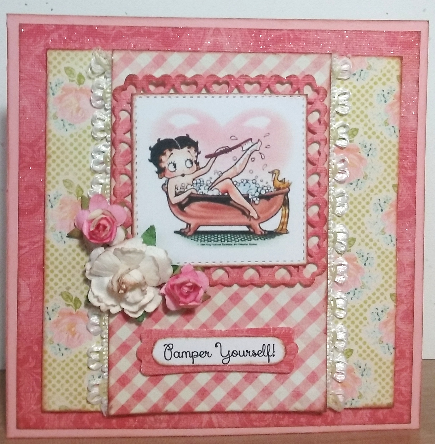
Happy Birthday Celebrations for "Betty"!

Happy Days!  My card has been chosen as a

SPLITCOASTERS FAVORITE OF THE WEEKENDING - JULY 3, 2016


A little vintage Betty Boop card for my daughter, Michele's birthday celebration!


Ingredients:  SU cardstock: Blushing Bride.  DCWV Old World Stack (glitter applied).  Authentique: Promise collection/ Six (floral).  My Mind's Eye: The Sweetest Thing collection/ Honey "Love" Fond (check).  Dies: Spellbinder's-Heart Squares; MFT-Stitched Squares STAX.  SU punches: Modern Label; Word Window (both retired).  Recollections flowers.  Elmer's Craft Adhesive Spray.  Martha Stewart Glitter: Crystal Fine.  EK punch: Basketweave Corner.  Computer-made sentiment and verse.  Size: 5-1/2" square.  (Splitcoaster Thread: Weed Ending 7-3-16/ #142).

The Card's Story & Other Tidbits


My daughters and I are planning  a "Girls' Night Out" date in celebration of the oldest one's birthday!  We are going to enjoy the magic of Teatro Zinzanni's Hotel L'Amour tonight and can't wait for it to start.  We will be all dressed up in colorful attire, with boas, masks, and funny little hats.  You may wonder, "What is Teatro ZinZanni's?"  The best description is:  a three-hour whirlwind of international cirque, comedy, burlesque and cabaret artists all served up with a scrumptious multi-course feast and elegant libations!


Since the family celebrated Michele with a short-notice, pre-birthday get-together last week-end, I had to have a card very quickly, so a pretty one came out of my finished stash.  I was very disappointed that I did not have time to complete my card idea that had been mulling around in my brain for the past several months while vacationing in California and without all my own cardmaking equipment.  Then I thought of a great idea, I would finish up her card this week and give it to her on our "Girls' Night Out."


My idea started with a bubble bath digital image of some sort to color and frame in a sassy, vintage-style card, because Michele loves bubble baths to de-stress after a busy day at work.  I ended up using a Betty Boop vintage, bubble bath image that was already colored rather than a black and white for my coloring.  There is, of course, a story explaining why this bubble bath Betty Boop image was perfect!


Michele's fun-time, nickname from her sister is Betty.  Don't ask me how that all got started, but somehow over five to eight years ago, when they were goofing around Michele became Betty and Jackie becames Roxy, each with a new personna and a new voice.  It can be pretty hilarious to watch them interact together or to listen to a telephone call between Betty and Roxy!  About a year or so ago, Ginger, their sister-in-law, joined in the group and became Felicity, our sister from another mother.  One time, in the not too distant past, when the girls were shopping for stylish sister "night out" garments, I laughingly said Michele fit the Betty Boop look with her dark hair and diva costume.  So, there's the explanation of why a bubble bath Betty Boop was perfect.  


To make my card, I needed the perfect papers to compliment my Betty Boop image.  I wanted a bit of glitter, especially on my image frame.  I decided to be a bit creative with an old piece of muted, mottled, pinkish DCWV Old World damask paper by applying spray adhesive and sprinkling on the glitter, letting it dry, and dusting it off.  Voila, I had created my very own glitter paper!  (Sorry the glitter does not show up well in the photo.)  I decided this would be my first mat layer applied on top of the Blushing Bride cardbase, and I would also use it for the image frame cut from Spellbinder's Nesting Heart Squares.  Once this paper decision was made, I searched for two more complimentary patterns to use with it, and away I went creating the design in my mind's eye.  In reviewing my card when finished, I wish I had used a corner decorator punch on the layers. . .maybe next time!  


My final step as is my tradition in cardmaking, is to create an inside that compliments the card front design, and to make up or find a verse that's just right for the occasion.  I think Michele will enjoy her card on our Teatro's night out when she and Jackie are all dolled up looking like Betty and Roxy, the divas.

Wednesday, June 29, 2016

What a Nice Visit. . .Thank Yous are Needed!

I recently returned from a nice long visit in California with my mother and occasionally with my sister, my brother and his wife, and a few nieces and nephews as well.  It was such a lovely visit and thankfully the weather was with me.  You see, those of us from the Northwest just don't get along with weather in the 90s and 100s.  Typically, Redding, CA has had many days over 100-degree days by the third week in June and many more in the 90s, but Mother Nature was looking down and smiling upon me.  In the seven weeks I was there, we only had two days over 100 and two days over 90.  There were many days in the mid- to high 70s and the low to mid-80s and even several cloudy and rainy days with thunder and lightening. . .at least eight to nine days of those days!  My gosh, I felt almost like I was at home!  But, I got out of there just in time, because since I left ten days ago, they have had weather in the high 90s almost every day and even over 100 at all times!

Mom and I (and my sister when available) did lots of things and had lots of fun.  The highlight was our week-long Cardmaking Get-Away to Mt. Shasta.  In addition, Mom and I went on several mini-trips to visit the coast and our old stomping grounds and to visit relatives.  We played numerous games of Mexican Train, Bunco and weekly Bingo games as Mom is the Bingo manager in her village.  In addition, we saw lots of movie with lunch dates and lady friends along, and we even did a bit of cardmaking when at home.  I got to meet some lovely new ladies in her village and renewed some old friendships made on other visits.  It was all quite a lovely time. . .too bad I live so far.  


I wanted to send my mother a thank you card for her wonderful hospitality and the lovely visit.  I found several thank you cards in my stash that seemed to fit the occasion just right, but the one I chose will suit Mom to a tee.  My card is derived from a kit designed by Liz Thayer for our 2015 May Girls' Get-Away.  I modified my version by not using the single white cardbase, but added two color mats instead: a Coastal Cabana cardbase with an overlay mat of Hello Honey and then the card front.  I also shifted by pom-pom ribbon knot to the left instead of centered and added glitter to my letters.  I love the design Liz provided for us to work with, and I think Mom will enjoy the card I chose as well.


Before my card could be sent off, I needed to complete the inside with a complimentary design and a verses that suited this thank you occasion.  After reviewing several ideas I had in mind, I decided on the following because it matched my needs:  a compliment to the card front and a verse that said everything I wanted to say:


Ingredients:  Stampin" Up products:  Cardstocks--Bermuda Bay, Hello Honey, Crumb Bake, Whisper White.  Stamps--For Being You (2015 SAB).  Ink--Early Espresso.  Stamp-Write Markers--Hello Honey, Coastal Cabana, Calypso Coral.  Embossing Folder--Perfect Polka Dots.  Embellishments--Thick Baker's Twine-Hello Honey, Calypso Coral Pom-Poms, 1/4" Cotton Coastal Cabana ribbon.  Dazzling Diamonds Glitter.

Sunday, June 26, 2016

A Daughter's Pre-Birthday Family Dinner!

The immediate family plans to celebrate my eldest daughter, Michele's, birthday this week-end with lunch at the Pac Island Grill in Federal Way.  Her sister, Jackie, discovered this little, tucked-away, Hawaiian barbecue-style restaurant several years ago on a blind date.  The family re-discovered it a few months ago when celebrating Jackie's birthday, and I think, we've decided to adopt it as a good place for family get-together, dining events.  Their Loli Loli Chicken is awesome and very similar to Huli Huli Hawaiian chicken, which you may have been able to try if you've ever vacationed in the Hawaiian Islands.

Oh, and the point. . .this pre-birthday luncheon idea was a quick, family decision, and I had not quite finished Michele's card that I was in the process of designing and creating just for her.  This forced me to resort to my card stash for an already completed birthday card to save the day.  I chose a beautiful pink card that I made back in January at a Dara Peterson/ Luci Kirschbaum Occasions Catalog Kick-Off cardmaking event.  This lovely card design uses the new rose stamps and dies to create a die-cut design that overlays the pink watercolor wash paper, Perfectly Artistic, from the Stampin' Up 2016 Sale-A-Brations flyer.  The card's design is an eye-appealing, wonderfully easy one, and I thank Dara Peterson for presenting it for our re-creation attempts.  See my efforts below:


Next steps, per my usual carddmaking completion style, is to create an inside design and verse that blends well with the card front and compliments the occasion for which the card is given.  Luckily, this was one of the cards that I completely finished on my May Mt. Shasta Girls' Get-Away with Mom and Sis.  I know Michele will love her card inside and out!


Ingredients:  Stampin' Up products:  Cardstock--Whisper White, Blushing Bride.  Patterned paper--Perfectly Artistic-pink.  Ink--Blushing Bride.  Stamps--Rose Wonder.  Dies--Rose Garden Thinlits.  Rhinestones.  Punch--Curvy Corners.

Thursday, June 23, 2016

A Sister-in-Law Birthday in June!

I have six sister-in-laws from my husband's side of the family and the first of those has a birthday in June.  With my cardmaking get-away, I am READY!  This birthday card is even going to be a week early when she receives it!  Oh my, that surely must be a first for me!.

I made this sweet little wildflower birthday card using one of Stampin' Up's Sale-A-Bration stamp sets and my favorite embossing folder, Elegant Dots, as a background.  This embossing folder turns your cardstock into such a lovely and delicate pattern, and it was perfect for the little wildflowers!  This card's original designer, Liz Thayer, presented the design at a cardmaking event in April, and I took it home partly finished. because I wanted to color my flowers with my Copic markers.  


I tweaked my card just a bit by adding three wildflowers rather than just two, as I prefer the look of an odd number of elements rather than an even number.  I think I read somewhere that this has to do with your brain and its perception of things it sees.  It automatically pairs things seen, and if there is an even number, it subconsciously reaches that conclusion quickly and becomes less alert; where as, an odd number keeps your brain alert and attuned to what it is looking at.  In other words, it does not get bored!  Whatever the reasons, that one sounds good to me!   See my finished sister-in-law birthday card below!


My finishing touch was to create an inside design that complimented the front design and choose a suitable little birthday verse.  As I am traveling, I used my Mom's Papertrey Ink birthday stamps to find this verse rather than composing one of my own and completing with my computer and printer.


Recipe:  Stampin' Up products:  Cardstocks--Crumb Cake, Whisper White, Pistachio Pudding, Melon Mambo.  Patterned--Birthday Bouquet dsp (2016 Occ).  Stamps--Flowering Fields; Boys Will Be Boys (sentiment); Party Wishes (to make inside corner pattern).  Embossing Folder: Elegant Dots.  Bow Paper Clips.  Glitter: Dazzling Diamonds (flowers).  Other: EK punch: Scalloped Corners-medium.  Papertrey Ink stamp:  Inside & Out: Birthday.  Copic Markers.

Sunday, June 19, 2016

A Day to Honor Fathers!

Our four children and spouses will arrive at our home on Father's Day bringing the goodies to make a magnificent barbecue dinner to celebrate my husband and myself.  You see...as I was traveling on Mother's Day to spend time with my 90-year old mother on her day, my day was planned to be celebrated with my husband on Father's Day.  We are willing to share our days with one another!

I wanted to make a special Father's Day card for my husband to not only celebrate him, but to thank him for allowing me a long vacation away to visit my family in California. ( I have to say, I was a busy gal, and enjoyed every minute of it!)  I have had the Stampin' Up Traveler stamp set for some time, and I have been itching to use it, but have never taken the opportunity.  I won a second copy of this very stamp set at a stamping event, which I brought down to share with my mother.  This was perfect. . .I'd use her set while visiting.

The stamp I wanted to use is the vintage locomotive, and I had in mind to emboss it to fit my black, white, and red card theme.  I used the Perpetual Birthday Calendar stamp set to form my background in Real Red and Smokey Slate. . . modifying it just a bit.  By using my MISTI stamping tool, I was able to wipe off half the red ink with a baby wipe and yet still be able to repeat-stamp to get a rich impression.  I was also able to re-position for the gray to enlarge that area.  I have to say, I just love my MISTI stamping tool.   Take a look at my finished train card below...it really is black, white and red in RIL...don't know why the picture picked up pink and charcoal)!  I think my husband will be very pleased with his Father's Day card.


I finished off my husband's Fathr's Day card by crafting an inside to coordinate ith the outside creation, and I fashioned a little verse fitting this special occasion.


Recipe:  Recollections cardstock: Black, Pewter.  Patterns: DCWV Bella Armoire Stack.  Stampin' Up products:  Red Glimmer Paper; Stamps--Traveler, Perpetual Birthday Calendar; Inks--Real Red, Smoky Slate; Embossing Powder--Black; Dies--Finishing Touches Edgelits-Pinked (retired).  Cottage Cutz dies: Expressions--Happy, Father's Day.  Recollections: Red Pearls.  EK punch: Scallop Corners-Medium (inside).

Thursday, June 16, 2016

A Birthday for My Niece Who Turns 10!

It's time to celebrate my little niece, who lives here where I am visiting.  Another card that I finished on my Girls' Get-Away to Mt. Shasta was one I started at a cardmaking class hosted by Dara Peterson and Luci Kirschbaum, a partnership of two Stampin' Up demonstrators.  Their classes are always fun to go to, and the other cardmakers make it a fun gathering one doesn't want to miss!


This is what I would call a "clean and simple" card, which is not always my favorite style of card to make as I usually favor cards with lots more detail and fussiness, but I really like this card's color combinations, with the little balloons and the washi tape application so it moved to my "I'm likin' this one" category!  I did add another layer of color with the black cardbase under the Melon Mambo layer.  I just thought it needed just a bit more and made the other colors pop!  Thanks to Luci Kirschbaum for her design for us to make).


True to my cardmaking style, I set myself to design and inside to coordinate with the front card design.  I chose a retired stamp for the verse, as I wanted to color it with Copics to tie in the rich vibrant colors depicted on the card front. 


Recipe:  Stampin' Up products:  Cardstock--Black, Melon Mambo, Whisper White.  Stamps:  Party Wishes (balloons/ sentiment), Big Day (2015 SAB).  Ink--Melon Mambo, Crushed Curry, Mint Macaron; Memento-Tuxedo Black.  Punch--Party Punch Pack-balloon, Curvy Corners (inside).  Washi--It's My Party (2016 Occasions).  Twine: Thick-Blace/Melon Mambo.  Other: Goosebumps--Queen & Co.-Hot Pink Quartz (inside).

Monday, June 13, 2016

A Friend's Birthday Has Arrived!

While in Mt. Shasta on our week-long Girls' Crafting Get-Away, with my Mom and my sister, my goal was to get ahead of my cardmaking needs.  I had lots of ready-to-finish cards in my stash that I brought with me from Washington to work on while gone.  I finished over 15 card completely, inside and out, but it didn't even put a dent in my stash. . .woe is me!  One of the cards that I did complete is this cute little flower card, and I thought it would be perfect for Liz, my cardmaking buddy and Stampin' Up upline. 


I cannot claim the accolades for the original design as that honor and my thanks belong to Darla Watson, another Stampin' Up demonstrator that I know in California.  As I re-created her card, I took the liberty of making a few modifications to make it more mine.  I raised the ribbon tie to allow for a sentiment fishtail flag to be stamped and popped up at the bottom as there was no front sentiment, which I prefer.  I also enlarged my Early Espresso cardbase to make it more of a picture frame background.  Even with these changes, my card retains the flavor of the original design.


To complete my card, I followed my usual cardmaking plan, which is to create an interior design that compliments the card front and to choose or create a verse that coordinates with the occasion for which my card is intended.  Take a look at my finished product below.


Recipe:  Stampin' Up products:  Cardstock--Early Espresso, Daffodil Delight Whisper White.  Dot paper--stamped with Dots for Days background stamp.  Stamps--Flower Patch (flower/ sentiment), Remembering Your Birthday (verse), Dots for Days (background).  Ink--Early Espresso.  Memento Black.  Dies--Flower Fair Framelits.  Punch--Curvy Corners.  Ribbon--1/4" Cotton-Daffodil Delight.  Pearls--Copic colored.  Other:  Zutter--Curved Corner punch.