Wednesday, July 29, 2015

Happy Belated Birthday Cousin!

My cousin, Junie, had a birthday, and I missed it by a mile!  I had her card all finished, including having the birthday verse composed and printed.  It was all ready to complete the inside design features and then add the my verse, but I dropped the ball.  I set it down, and it got buried on my craft table.   When it resurfaced, I was already three days past her birthday.  .  . my bad!

I originally made Junie's card at my Girls' Get-Away weekend in early May.  It was one of our shoebox swaps, and for this card we simply had a bare bones sample, almost like a card sketch.  The card creator forgot some of the extra paper pieces needed for her card, plus punches, in rushing to get away for our week-end.  She decided she would present her original card design sample and then allow us to develop our own card from there by starting with a variety of printed papers she brought for us to use.  


I chose the Wisteria Wonder stripped paper, which created my top angled paper and then shows through the peek-a-boo area under the negative cutout of the word "happy."  I die-cut out a new "happy" from white cardstock in order to fill in the missing pieces in the pre-cut "happy" on the white paper she brought.  I added an eyelet border across my angle from a piece of Wisteria Wonder cardstock that I had with me and then added several double layered butterflies with pearls for their bodies.  I colored the pearls with my Copic Markers in a lavender shade, and added Iridescent Stickles (glitter glue) to the butterfly wings and a bit on the white cardstock around the "happy" word.  I thank Dara Peterson for her unique Shoebox Swap.  It turned out to be a fun experience, as she forced us to think outside the box and create with an idea and only a few scraps of paper!  The ladies around my table came up with some totally unique ideas for their cards and each was quite different.

I was very pleased with the way I dressed up my "happy" card, and I decided this was a great choice for my cousin's birthday card.  I think she will like it, but might have liked it even better had it been delivered on or before her birthday instead of after. :-) :-)


Here is a peek at the finished inside design with my verse added by incorporating the digital BIG BIRTHDAY WISHES image that I so love, along with my own little rhyming poem.


Recipe:  Stampin' Up papers:  Cardstock - Whisper White, Wisteria Wonder; 2011-2013 In-Color Background Stack (Wisteria Wonder stripe).  Punches:  Stampin' Up Eyelet border (retired); Elegant Butterfly; Bitty Butterfly.  EK Triple Layer Butterfly.  Stampin' Up: Pearls (colored with Copic Markers).  Stampin' Up: Beautiful Wings Embosslit.  Stampin' Up: Hello You Thinlits (hello).  Stickles Iridescent glitter glue. Computer verse with Digital image.  Size: 5-1/2" x 4-1/4".  

Saturday, July 25, 2015

Most Happy Anniversary!

My youngest son and his wife are celebrating their ninth anniversary. . .how time flies, . . .and of course, I wanted to make them a special handmade card.  BUT. . .where have you heard this before. . .here it was the very day of their anniversary and I hadn't even started a card.  Where, oh where, has my time gone.  It seems there is just not enough of it.  So, I ask you, dear blog reader, are you getting tired of my constant lament, I'm late, I'm late, I'm late, etc., etc., etc.  Well, if you aren't getting tired of hearing it, I'm sure getting tired of feeling it and being it!  Somehow, I really need to manage my time better.  I think I've gotten just a bit too retired!

Much to my delight, I found a group of pictures I had downloaded to my computer that were taken at one of the cropping events I went to that was hosted by my Stampin' Up upline.  One of the pictures featured a cute card using an old hydrangea stamp that I knew had, and I loved the color combination of black, cherry cobbler, and vanilla.  There was lots about this card that I like, so I thought I'd use it to possibly CASE or maybe I'd go off and change it up and do my own thing.  I'd see where my creative juices took me.

I liked the little dog-eared layer beneath the hydrangea, so I decided to keep that idea.  I also loved the color scheme, and I liked the hounds-tooth black and cream Stampin' Up dsp paper that I knew I had in my paper stash.  So, away I went.  I added two more base mat layers in vanilla and cherry cobbler, and I used a Lifestyles die to cut a piece of cherry cobbler to layer behind my matted and stamped flower to add more color pizzazz.  I thought I'd throw in a few sparkly clear sequins to dress it up even a bid more.  I was pleased with my CASED, but not exactly totally copied, anniversary card for my son and his wife.


Now, I needed to focus on an inside verse and a design complimentary to the card's front.  Now that it's all finished, it is time to allow a little peek at the finished inside product.


Recipe:  Stampin' Up papers:  Cardstock - Very Vanilla, Basic Black, Cherry Cobbler; DSP - Modern Medley (2014 retired).  Stampin' Up stamps: Because I Care (hydrangea) (2011 retired), Loving Thoughts (2014 retired).  Stampin' Up Ink: Cherry Cobbler, Always Artichoke.  Lifestyles dies: Nesting Frames 3.  Stampin' Up: Dazzling Details (iridescent).  Pink Posh: Medium Sparkling Clear sequins. MFT dies: Photo Corners (modified smaller).  Computer verse: Andalus 16 bold; Edwardian Script 22 bold (first letters).  Size: 4-7/8" x 6".  

Wednesday, July 22, 2015

New Job Congratulations!

My sister just got a job promotion, and I really wanted to make her a congratulatory card.  A feather in your cap kept running around in my brain and pushing me to get busy and create!  That little idea just naturally ran to my using Stampin' Up's Four Feathers framelits that came out in their 2014 Holiday catalog.  It seemed odd to me that it came out in that edition, but I'm guessing they had it in mind to use the feathers with fall-type cards.  I was really disappointed that they did not bring these stamps and coordinating framelits back in the new 2015-2016 annual catalog.  The reason, my guess, is that they didn't go over well in the initial offering in the Holiday catalog, as Stampin' Up customers are busy thinking Fall, Thanksgiving, and Christmas, and somehow, feathers didn't seem to fit those themes; therefore, there probably weren't enough sales to justify keeping them for the annual catalog.


I recently purchased a piece of chevron patterned paper from Michael's Crafts that looked like it was watercolored and was very pretty.  Though Michael's open-stock Recollections papers are general very thin, which I do not like, I loved the design and colors so much, I decide to go ahead and use it anyway.  I planned to spruce it up with some layers of regular cardstock and glitter cardstock to give the card more body.  I think I'm pleased with the outcome and hope my sister will like her little surprise congratulatory card.


Here is a peek at the complimentary inside design and my verse that I created to fit my sister's job promotion occasion.


Recipe:  Papers: Stampin' Up cardstocks - Whisper White, Night of Navy, Soft Sky (inside); Core'dinations Glitter Silk - Regal Royal, Bermuda Bling, Jade, Majestic Magenta; Core-dinations Vellum - Baby Blue;  Recollections - Watercolor Chevron.   Hampton Art Ki stamps: Celebrate Life.  MemoryBox dies: Stitched Country Borders.  Stampin' Up Framelits: Four Feathers.  EK Scallop Photo Corner punch (inside).  Queen Co. Goosebumps (Copic colored).  Stampin' Up Embossing Powder: White.  Stash: 5/8" Iridescent Sheer ribbon.  Glitter Butterfly.  Computer-made verse (Font: odstemplik/ 21).  Size: 5-1/8" x 6".

Sunday, July 19, 2015

Happy New Home!

My Stampin' Up Upline and cardmaking mentor has just moved into her first new home. . . a cause for celebration!  Having moved a number of times in my married life, I know what an exhausting, though joyous, undertaking it is; therefore, I wanted to make a new home blessings card, sending along a little pizza gift card as well.  Finding enough time in the day to work, unpack, and find the perfect place for everything unpack, pretty much fills up a 24-hour day.  I remember there is barely time to sleep let alone cook, so the pizza gift card should come in handy any night in the near future, right!


I have to say I procrastinated a lot on this card, changing my mind numerous times.  Even when I decided on my general idea of the card's creative design, I struggled with what papers to use. . .one with houses on it, flowers...hmmm???  I finally threw out the idea of any flowers on the paper since this card would be for Liz and her husband.  When I finally decided on the paper with the cute houses, I thought, "Great, not too feminine."  But then as my design changed and evolved to fit the colors in the paper, etc. and I just couldn't throw out the pink.  I did try to stick with a border punch that wasn't too frilly, but the layout screamed for a more pizzazz, like a spritzed doily and 3D flowers.  You'd think I could have stuck to the blues, reds, and greens in the paper, which would have made the card a bit more masculine, but they just weren't as pretty as the pink. . .sorry Pat!


I spritzed the white doily with my homemade spritzing formula:  water and acrylic metallic paint.  I didn't have any shades of pink mixed up, nor did I have a pink metallic paint.  I had to get creative and mixed a combination of Metallic Bright Red and Metallic Pearl White metallic acrylic paint to come up with my Shimmery Rose-Pink color.  I was pleased with the outcome, as it made a  perfectly lovely shimmery rose-pink spritzed doily.  (The picture does not show off the shimmery quality of the spritz, though it is quite apparent when you see the card in real life.)  I do hope Liz enjoys her home blessings card and her pizza!  Now, all she needs is a wee little glass of wine to go with!


Following my tried and true method of cardmaking from beginning to end, it was time to tackle the inside design so it would compliment the card front.  This would, of course, include a verse or poem befitting the card's occasion theme.  I had a couple of strips of the ZigZag punched pink gingham plaid left over, so I decided I should certainly use those and not waste the extras.  I really like how it sets off my chosen verse.  Voila, the card is done and ready to show off!


Recipe:  Stampin' Up cardstocks: Very Vanilla, Blushing Bride, Wild Wasabi.  Echo Park dsp: Life is Good/The Neighborhood (both sides).  My Mind's Eye: The Sweetest Thing/ Honey 'Love' (check).  Stampin' Up stamps: You Brighten My Day (2015 SAB).  Martha Stewart punch: ZigZag border.. Stampin' Up punches: Bird Builder; What's Up (house).  Spellbinders dies: Labels 4; Labels LG.  MFT dies: Photo Corners (inside/modified).  Wilton: 4-1/2" Doily.  Prima: Mini roses.  Recollections: pink flower.  Spritzer (homemade): Shimmery Rose-Pink (doily).  Copic Markers (house).  Computer sentiment/ verse (font = Santas Sleigh Full Bold: 26/18 sentiment; 20 verse).  Size: 5-3/8" x 6-1/4".  

Thursday, July 16, 2015

A Little 5-Year Old Birthday Girl!

My daughter called tonight and said she needed a birthday card for her little God-daughter, who is turning four in a few days, and could I make a card for Alexis, or did I have something already made that might work?"  She knows how I love to make cards for children. . .they are just so darn fun!  But, unfortunately, I really didn't have time to create from scratch, because I have so many other birthdays coming up in the next few days.  So, to my card stash I went, because I knew I had a little card that might just work.  This was a card I had made five years ago, believe it or not, but because all my little girl birthdays did not fall in the summer months, it has just never been right for the occasion.

Here was my problem: I needed my little girl to have darker skin and her hair to be black, because then it could be Alexis sitting on the piling in the sand near the sea.  Michele said, "Can you change it?"  I bravely replied, I don't know, but I can try. . .it will either work or NOT!"  After hanging up, I, very nervously, got to work.  Why nervous?  First, I had only colored one other dark-skinned person for a card, and that was when I was in a class over five years ago, with the instructor right there to help with any questions, and it was a step-by-step tutorial.  Second, I was not very familiar with coloring black hair either.  I have done it, but only a few times several years ago.  Third, to further complicate matters, I was coloring over a little girl with pinkish-light tan skin and auburn brown hair coloring.  Does it sound like I bit off more than I was going to be able to chew??

I started with the hair, because I thought it might be the easiest to over-color, but it began by looking green in the highlighted areas, and my fear grew!  I finally got it to a point where it was black, though not the best coloring job in my opinion.  Next, I tackled the skin, which really made me nervous for sure.  I was finally able to get her somewhat blended out, but it, also, does not look like my best coloring job.  All in all, I think she turned out pretty well considering what I was trying to do with my limited talents. 


 I then decided to sponge the image background to add a subtle hint that she was sitting near the sea.  I also thought it looked a little bald and stark white, but keep in mind, I made this card when I first started making cards, and I certainly wasn't sponging in those days.  (Note: the lighter sponging in the top half of the circle doesn't show up in the picture.)  I added some green shading to the wood piling to offset her skin a bit, because I thought there were too many brown tones side-by-side.  I finished it off with some pearls to add a bit more bling, and done it was.  I think Alexis will be pleased with her little girl sitting on the seaside piling.


Next, I worked on the inside design and a birthday verse for a little girl turning four.  I got it composed to my liking and then created the interior design to coordinate with the outside.  I was glad I was able to come up with something I think Michele will be able to use.


Recipe:  Georgia Pacific White cardstock.  Bazzill cardstock.  Stampin' Up cardstock:  Soft Sky (inside).  BoBunny Double Dot: Mint Dot.  Echo Park: Sweet Summer Time/ Blue Sky.  DCWV Stack: Stripes & Plaids.  Magnolia stamp: Tilda Ready for Beach.  Copic Markrs.  Spellbinders dies: Circles; Scalloped Circles.  EK punch: Deco Scallop Corner (inside).  BoBunny Grosgrain ribbon: Mint Dot.  Recollection pearls (Copic colored).  Karen Foster: Scrapper's Floss.  Stickles: Iridescent Glittler Glue (Copic colored).  Square doily (trimmed).  Computer verse.  Size: 5-1/2" square.

Sunday, July 12, 2015

My Son-in -Law's Special Birthday Card!

My son-in-law, as I've mentioned in a few posts in past years, has a great love of fishing, but it seems there has not been time in his life lately to do much about that; therefore, I thought a fishing card with the BIG CATCH depicted would be appropriate this year!  And, need I tell you, there is a bit of humor attached by using Karen's Doodles digital image: Who Caught Who?


I decided to use the diagonal quarter-panel paper layout that I have used in the past and always enjoyed the end results.  Please note that I do not know the official name for this type of layout, and maybe there isn't any, but I think my name suits it just right.  I wanted my background behind my popped up digital colored image to be a nature scene that one would see while out fishing.  I wanted the top panel for the sky, the side panels for a patterned paper of trees, and the bottom panel for a dock.  I have to tell you, I just love my finished dock with its roped pilings on each side.  I have seen this embellishment technique on Pinterest, and one of my cardmaking buddies used it as well several months ago on a get well card for my husband after his knee surgery.  My dock is a diagonal view, so I decided there would be pilings on both sides of the dock for balance.  


Once I decided on my papers to use, I was able to begin the coloring of my chosen digital image with Copic Markers. . .the poor guy was so successful in landing the BIG CATCH, but unfortunately, his aim in reeling him in was to land him on his head rather than in the boat!  Though you can't see it in the photo, I used Wink of Stella: Clear on the fish to add a sheen to his scales.  (This is a brush-tip glitter pen.)  I know my son-in-law will get a kick out of the man with the fish head and will be intrigued by my clever little dock.


At the stage in the birth of one of my card, I turn to the inside to create a design that compliments the outside and to make a verse that goes with the theme of the card.  I have now finished this step and will share it.  I have to say I'm in love with my little acrostic verse, using the word FISHING. . .it's all about fishing bait.  I feel sure that my son-in-law will love his birthday card.


Recipe:  Stampin' Up cardstock: Old Olive (card base); Night of Navy.  Bazzill Basics: Avalanche (sandable).  Reminisce: Dog Park/ Scentral Park.  Recollections Signature Especial Textured Cardstock: Tan (like SU/ Crumb Cake).  SU Embossing Folder: Clouds.  Karen's Doodles: Who Caught Who?  Wink of Stella: Clear (on fish).  SU Stamp: Hardwood; Guy Greetings (sentiment).  SU Ink: Chocolate Chip; Soft Sky (sponging image area).  Spellbinders dies: Labels Three #6/ #7.  Maya Arts Hemp Twine.  Distressed edges.  MFT dies: Photo Corners (inside).  Size = 5-1/2" x 5-7/8".

Friday, July 10, 2015

Exciting. . .A Card Pressie!!

I'm so excited!  I just received a card in the mail from my sister, Heidi.  I'm excited for three reasons:
     1) Obviously, because she is my sister, and it is always so special to get a handmade card from a loved one; but also, 

     2) Heidi is my first cardmaking mentor.  Over six years ago, she taught me my first lessons on how to build a card using many different cardmaking techniques and ideas, including Copic Marker coloring, using the Big Shot with dies, choosing your papers, and layout and design.  Heidi makes the most wonderful cards.  I don't think I've ever seen a card made by my lovely sister that doesn't show off her incredible skills to the max; and 

     3) Heidi loves Papertrey Ink products, so a card made by Heidi will almost always use their products and show off some wonderful stamp or die that I haven't seen before and made by this company.  This card certainly does, and it makes me want to go right online and order them!


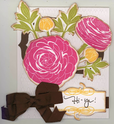
This card does not disappoint in meeting my list from above of why I'm excited, so, I want to share Heidi's card with you!  The stamp/ die combination set from Papertrey Ink.com is called Cutting Garden.  Aren't these hugh flowers just lovely.  Both the blossoms and the leaves look like the Ranunculus flowering plant.  These plants form large, perfectly round blossoms with a flat bottom surface and bloom in a multitude of deep and brillant colors.  Heidi has made such a lovely card, and her use of the argyle embossing folder on the front of the cardbase adds a very interesting backdrop for her Ranunculus blossoms.  I love it. . .thanks, Heidi!


Isn't is absolute gorgeous. . .I love the little Hi - ya! sentiment using Papertrey's Boutique Borders: Father Mini little mini curly border she used to frame her sentiment.  And. . .don't those flowers just pop off the card, asking to be cut and arranged in a vase for my dining room table!

Tuesday, July 7, 2015

Sister-in-Law #3 Birthday to Celebrate!

I'm off and running on my eight sister-in-law birthday cards for this year with number three just around the corner in early July!  We had several birthday cards to make at my Girls' Getaway in May, and there was one in particular that brought the thought to mind as a I making it that it would be such a cute card for Dianne's birthday.  


This cute card, which is ultimately my choice for Dianne's birthday, uses the new Stampin' Up Bow Builder punch.  I absolutely love the cute little bows that you can make with the parts that it punches out.  This card was designed by are hostess, Liz Thayer, and I made it true to the original design, except for my placement of the angled birthday sentiments, which I placed off to the right instead of centered.  I love everything about this card, including the lovely Stampin' Up designer paper, and I hope Dianne will like it just as well.


Next in order of business was to make a special inside creations to coordinate with my outside design.  I love this big birthday wish digital image, so I combined it with some words created on my computer to fit its message.  I decided it was just the ticket when I finished with the Copic coloring in shades to match the card front.

Recipe:  Stampin' Up products:  Cardstock: Blushing Bride, Basic Black, Whisper White.  DSP: Stacked with Love stack (2015 Occasions).  Stamp: @SoSocial.  Punch:  Bow Builder.  Ribbon: 1/8" Taffeta Basic Black, 1/4" Cotton Blushing Bride.  Rhinestones.  Memento ink: Tuxedo Black.

Friday, July 3, 2015

Belated Big Birthday Wishes for My Little Niece!

Still playing catch-up with my cardmaking, and with this heat we are experiencing in the Northwest, it feels like I'll never get there!  We don't have air conditioning in the northwest corner of our United States because it's not supposed to be in the 90's for weeks on end, and with it not cooling off much at night, it's difficult to get the house cooled down overnight for the next round!


Enough grousing and procrastinating!  I finally got my little niece's birthday card finished. . .her birthday was June 17th!!  ABOUT TIME, I say!!!  Now, don't get me wrong, I have been thinking about it since I got home in mid-June from my little venture to Seaside, Oregon to help my daughter with beach house bedroom redecorating/painting work, but we came home into high 80's heat, and it continues on, so putting thoughts into actions has been difficult.  


I had decided on a little ballerina card for niece Audrey, and of course, knowing me, I had to research just what digital images I had or could find online before making a final decision.  I found lots to choose from, but when I found a free Precious Moments ballerina color book image, I just had to use it.  Then, I couldn't start to color her until I came up with my card ideas because I had to size the image to fit the size of the card I would decide to make.  That done, digital image sized and printed, but my little ballerina still couldn't be colored until I searched for and found just the right patterned papers to combine with her.  


Finally, I had the papers and even decided to make my own piece for one of the layers by using one of my My Favorite Things big background stamps in a diagonal check.  I found Memento's Sweet Plum was the perfect shade to stamp it with.  I tried Stampin' Up Perfect Plum, but it was too dark, but I did decide it was perfect for my card base.  I finished coloring my ballerina and was really excited to begin to decide on the exact layout and put the paper layers together.  I'm pretty pleased with my final outcome. . .such a sweet little card and SO MUCH FUN to make.


I chose papers for the inside design from those used on the outside, and then made up a little verse for the inside, using my favorite BIG BIRTHDAY WISHES digital image grouping it into my words for my verse.  I then colored my wishes words with my Copics to match the little ballerina on front.  I was quite pleased with the outcome, and I'm sure Audrey will enjoy her little card from Auntie Carlene. . . better late than never!


Recipe:  Papers - Stampin' Up Perfect Plum (card base/ layers); Basic Grey: Koshi/ Lily Child (front & back); Authentique: Renew/ Rejuvenate (back).  Precious Moments Ballerina color book digital image.  AGW Stamps: Big Birthday Wishes.  Copic Markers.  MFT stamp: BG Fine Check Background (diagnonal check).  Ink: Memento: Sweet Plum.  Dies: Spellbinders - Big Scalloped Ovals SM; Classic Ovals SM.  Fishtail: handcut.  Stash:  Lilac lace, 1/2" Plaid Taffeta ribbon, Iridescent enamel dots.  Colorbox Chestnut Roan distressing.  Computer sentiment: Baroque Antique Script/ 14.  Inside verse: Andalus/ 13.  Size:  5-1/2" x 5-7/8".