Showing posts with label Vintage image. Show all posts

Tuesday, May 31, 2022

Farmyard Favorites for Father's Day!

  Father's Day is coming, and the Virtual Stamp Night Mini Sneak Peek was held just a few days ago.  The first one wants your card theme to be farm animals...like in Old MacDonald's farm.  I'm thinking someway I will build a Father's Day card out of this challenge.

My son-in-law is such a good Dad!  His daughter, and my middle granddaughter, was three this past March.  From the time she was three months old, he has taken her to oodles of animal places and events...zoos, summer fairs, petting zoos, etc. You name it, if it's within 50-miles of their location (even on vacation), he will find an animal place to take Sienna.  As a result, she just loves animals, has no fear, and you can see why. Her first favorite was a cow, and one of her first words was moo-moo! 

I'm a lover of "simple" vintage cards (those without too much frou-frou), and for some reason, I've not made many vintage cards in the last few years. I went to my stash, because I remember a vintage cow image that I almost made into a card a few years ago.  I had to scrap the idea at the last minute, because I forgot to take the image and any papers with me to a retreat where I planned to make the card! I had even mounted it on homemade script paper that I made prior to leaving that talks about medieval farming as I needed a computer and printer to do so. Using it now, was just a matter of deciding the layout, design, and papers!  I actually copied my design layout that I used on the replacement card. Take a peek at my finished card below with its vintage slant!
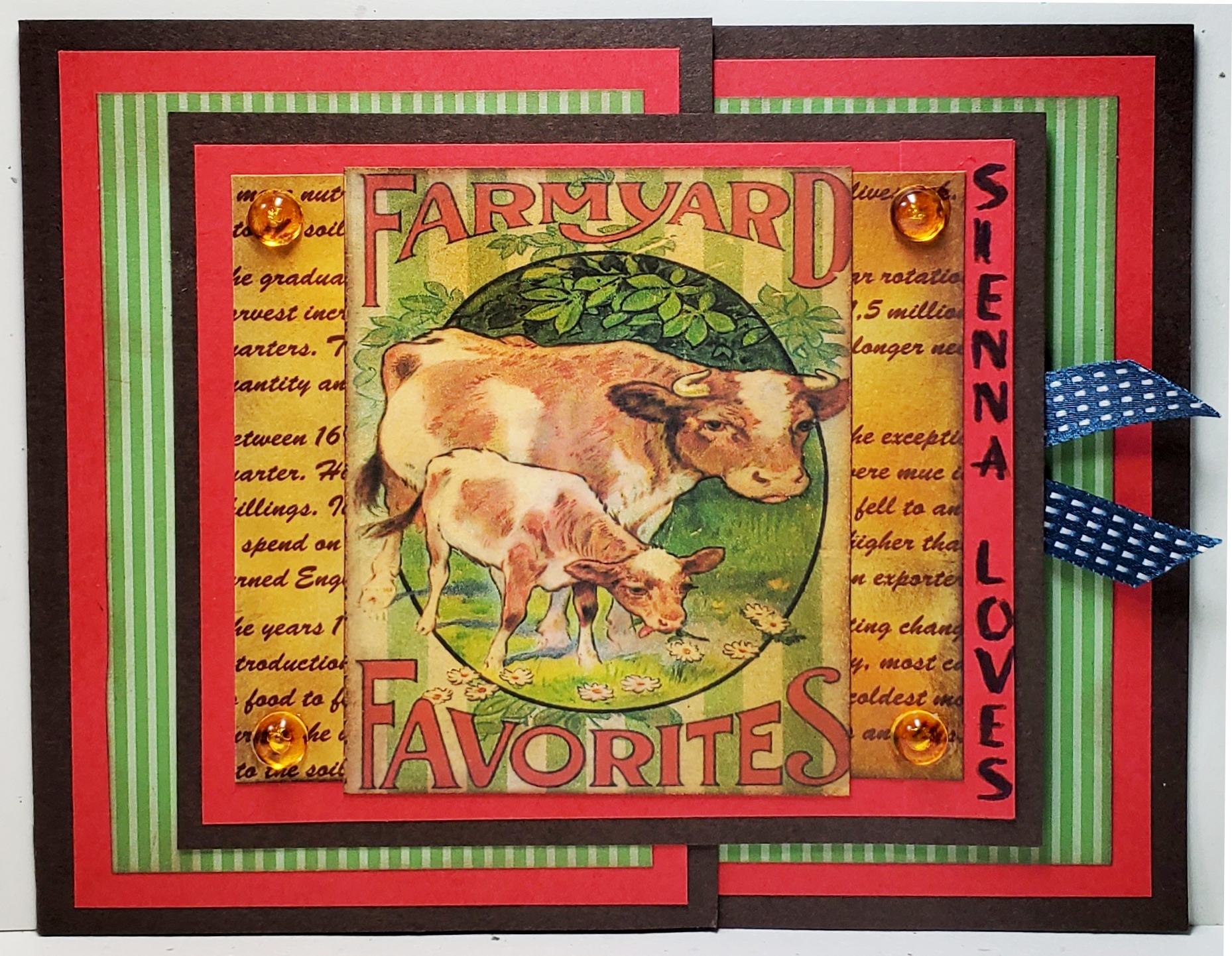
(NOTE: The ribbon peeking out the right side is attached to the gift card holder.  It's a blue ribbon seal for a First Place Dad!)

Ingredients: Stampin' Up: Cardstocks--Early Espresso, Poppy Parade, And Very Vanilla. Patterned DSP--2012-2013 DSP Stack--Wild Wasabi Stripe. Inks--Soft Suede, More Mustard, Chocolate Chip.  Other: Patterned Paper--Medieval English Farming Script (homemade/ink distressed). Vintage Farmyard print (stash). Gems--Robin's Nest DewDrops-Golden. Technique--Short Front Flap Card. Chatterbox computer verse. 4-3/4" x 6."

Monday, January 9, 2017

Splitcoaststamper's Best of 2016 Favorites!!!!!!!!!!

EXCITEMENT GALORE!!!!

SPLITCOASTSTAMPERS BEST OF 2016 FAVORITES


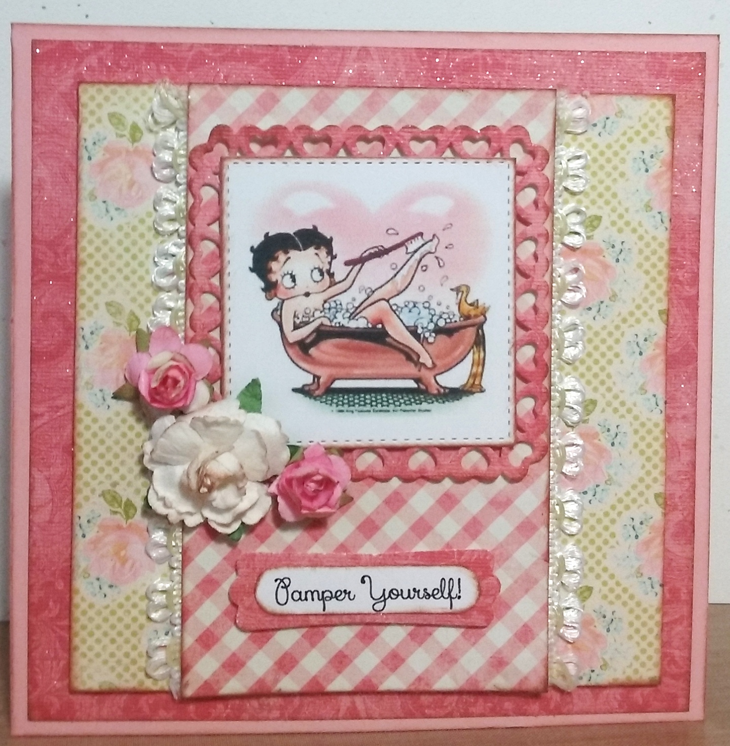
I am over the moon!  I have just been notified that my vintage-style BETTY BOOP card that I made for my daughter Michele's birthday this year at the end of June and was a Splitcoaststampers' Weekly Favorites for the week ending July 3, 2016, has now been chosen as one of their Best of 2016 Favorites!!  I can not even tell you how surprised I am. . .I did not even know that they had this award.  I just assumed, "Okay, how marvelous, my card was a Splitcoaststampers Weekly Favorite."  Can I say again, I'm over the MOON!

So, I thought I would repost this little beauty to refresh your memory if you read my blog often or to bring it to your attention if you missed its original posting and are now reading this one. (See below.)  I am also posting a link CLICK HERE back to that post as there is a story why the title of the post is, HAPPY CELEBRATIONS FOR "BETTY!" when my daughter's name is actually Michele.


Ingredients:  SU cardstock: Blushing Bride.  DCWV Old World Stack (glitter applied).  Authentique: Promise collection/ Six (floral).  My Mind's Eye: The Sweetest Thing collection/ Honey "Love" Fond (check).  Dies: Spellbinder's-Heart Squares; MFT-Stitched Squares STAX.  SU punches: Modern Label; Word Window (both retired).  Recollections flowers.  Elmer's Craft Adhesive Spray.  Martha Stewart Glitter: Crystal Fine.  EK punch: Basketweave Corner.  Computer-made sentiment and verse.  Size: 5-1/2" square.  (Splitcoaster Thread: Weed Ending 7-3-16/ #142).

Monday, November 14, 2016

Happy Birthday to a Lover of Cars & Racing

My daughter's new father-in-law has a fast-moving hobby. . .racing cars, thus the reason, I am sure, that my new son-in-law loves to race as well!  I usually like to do a hobby birthday card at least once, but I was not able to come up with a 1993 Chevy Camaro black and white image to color.  I even had my patterned paper all picked out; so, I did the next best thing.  He is getting a gatefold vintage car card, colored in purples, as I understand his race car is purple.  This color will go nicely with the vintage license plate patterned paper and gears that I had all picked out to use.  Take a peek below at my finished design both inside and out.


Ingredients: SU cardstock: Basic Black, Recollections Cardstock Pack: Cool What (dark purple), Tim Holtz Idea-ology Stash: Lost and Found (pattern + distressed purple solids).  Dies:  Spellbinders-Sprightly Sprockets, QuicKutz Nesting Pinking Rectangles (modified).  Stamp: Stampendous: Birthday Wish.  Vintage Auto: online freebie.  SU Ink: Sahara Sand, Wisteria Wonder (sponging); Memento Ink: Grape Jelly (sentiment).  Copic Markers: coloring.  Wink of Stella: Clear.  Computer-made sentiment/ verse.  Size: 4-3/4" x 6".

Saturday, July 2, 2016

Happy Birthday Celebrations for "Betty"!

Happy Days!  My card has been chosen as a

SPLITCOASTERS FAVORITE OF THE WEEKENDING - JULY 3, 2016


A little vintage Betty Boop card for my daughter, Michele's birthday celebration!


Ingredients:  SU cardstock: Blushing Bride.  DCWV Old World Stack (glitter applied).  Authentique: Promise collection/ Six (floral).  My Mind's Eye: The Sweetest Thing collection/ Honey "Love" Fond (check).  Dies: Spellbinder's-Heart Squares; MFT-Stitched Squares STAX.  SU punches: Modern Label; Word Window (both retired).  Recollections flowers.  Elmer's Craft Adhesive Spray.  Martha Stewart Glitter: Crystal Fine.  EK punch: Basketweave Corner.  Computer-made sentiment and verse.  Size: 5-1/2" square.  (Splitcoaster Thread: Weed Ending 7-3-16/ #142).

The Card's Story & Other Tidbits


My daughters and I are planning  a "Girls' Night Out" date in celebration of the oldest one's birthday!  We are going to enjoy the magic of Teatro Zinzanni's Hotel L'Amour tonight and can't wait for it to start.  We will be all dressed up in colorful attire, with boas, masks, and funny little hats.  You may wonder, "What is Teatro ZinZanni's?"  The best description is:  a three-hour whirlwind of international cirque, comedy, burlesque and cabaret artists all served up with a scrumptious multi-course feast and elegant libations!


Since the family celebrated Michele with a short-notice, pre-birthday get-together last week-end, I had to have a card very quickly, so a pretty one came out of my finished stash.  I was very disappointed that I did not have time to complete my card idea that had been mulling around in my brain for the past several months while vacationing in California and without all my own cardmaking equipment.  Then I thought of a great idea, I would finish up her card this week and give it to her on our "Girls' Night Out."


My idea started with a bubble bath digital image of some sort to color and frame in a sassy, vintage-style card, because Michele loves bubble baths to de-stress after a busy day at work.  I ended up using a Betty Boop vintage, bubble bath image that was already colored rather than a black and white for my coloring.  There is, of course, a story explaining why this bubble bath Betty Boop image was perfect!


Michele's fun-time, nickname from her sister is Betty.  Don't ask me how that all got started, but somehow over five to eight years ago, when they were goofing around Michele became Betty and Jackie becames Roxy, each with a new personna and a new voice.  It can be pretty hilarious to watch them interact together or to listen to a telephone call between Betty and Roxy!  About a year or so ago, Ginger, their sister-in-law, joined in the group and became Felicity, our sister from another mother.  One time, in the not too distant past, when the girls were shopping for stylish sister "night out" garments, I laughingly said Michele fit the Betty Boop look with her dark hair and diva costume.  So, there's the explanation of why a bubble bath Betty Boop was perfect.  


To make my card, I needed the perfect papers to compliment my Betty Boop image.  I wanted a bit of glitter, especially on my image frame.  I decided to be a bit creative with an old piece of muted, mottled, pinkish DCWV Old World damask paper by applying spray adhesive and sprinkling on the glitter, letting it dry, and dusting it off.  Voila, I had created my very own glitter paper!  (Sorry the glitter does not show up well in the photo.)  I decided this would be my first mat layer applied on top of the Blushing Bride cardbase, and I would also use it for the image frame cut from Spellbinder's Nesting Heart Squares.  Once this paper decision was made, I searched for two more complimentary patterns to use with it, and away I went creating the design in my mind's eye.  In reviewing my card when finished, I wish I had used a corner decorator punch on the layers. . .maybe next time!  


My final step as is my tradition in cardmaking, is to create an inside that compliments the card front design, and to make up or find a verse that's just right for the occasion.  I think Michele will enjoy her card on our Teatro's night out when she and Jackie are all dolled up looking like Betty and Roxy, the divas.

Sunday, June 19, 2016

A Day to Honor Fathers!

Our four children and spouses will arrive at our home on Father's Day bringing the goodies to make a magnificent barbecue dinner to celebrate my husband and myself.  You see...as I was traveling on Mother's Day to spend time with my 90-year old mother on her day, my day was planned to be celebrated with my husband on Father's Day.  We are willing to share our days with one another!

I wanted to make a special Father's Day card for my husband to not only celebrate him, but to thank him for allowing me a long vacation away to visit my family in California. ( I have to say, I was a busy gal, and enjoyed every minute of it!)  I have had the Stampin' Up Traveler stamp set for some time, and I have been itching to use it, but have never taken the opportunity.  I won a second copy of this very stamp set at a stamping event, which I brought down to share with my mother.  This was perfect. . .I'd use her set while visiting.

The stamp I wanted to use is the vintage locomotive, and I had in mind to emboss it to fit my black, white, and red card theme.  I used the Perpetual Birthday Calendar stamp set to form my background in Real Red and Smokey Slate. . . modifying it just a bit.  By using my MISTI stamping tool, I was able to wipe off half the red ink with a baby wipe and yet still be able to repeat-stamp to get a rich impression.  I was also able to re-position for the gray to enlarge that area.  I have to say, I just love my MISTI stamping tool.   Take a look at my finished train card below...it really is black, white and red in RIL...don't know why the picture picked up pink and charcoal)!  I think my husband will be very pleased with his Father's Day card.


I finished off my husband's Fathr's Day card by crafting an inside to coordinate ith the outside creation, and I fashioned a little verse fitting this special occasion.


Recipe:  Recollections cardstock: Black, Pewter.  Patterns: DCWV Bella Armoire Stack.  Stampin' Up products:  Red Glimmer Paper; Stamps--Traveler, Perpetual Birthday Calendar; Inks--Real Red, Smoky Slate; Embossing Powder--Black; Dies--Finishing Touches Edgelits-Pinked (retired).  Cottage Cutz dies: Expressions--Happy, Father's Day.  Recollections: Red Pearls.  EK punch: Scallop Corners-Medium (inside).

Tuesday, March 24, 2015

Bring on the Easter Eggs!

I must be on a roll.  This is my fifth Easter card using a vintage image.  There are so many cute ones to choose from.  Again, this little hen image was too narrow in height; and therefore, it needed a lot of work in PaintShop Pro to add size above and below the hen image in order to fit it into a rectangular frame.  I added size to the sky and the path at the bottom, making sure to get the shading just right.  I learned a lot, and I am happy with the finished product.


My first step in all my Easter card has been to decide on the image I was going to use and the type of frame or background mat best suited to the size and dimension of the image.  My second step was to choose papers that would enhance the image without taking away from it.  In this case, my image was pretty colorful and bold, so I was able to pick up those vibrant colors from the cart and the Easter eggs to use in the papers.  Again, I used the frosted glitter adhesive technique over the image, but because it was such a colorful image, it really didn't tone down much as this technique often does to softer color shades.  

I've decided that even though it is a female hen, this card is bold enough that it takes on a masculine feel; therefore, I will reserve it for one of the fellows on my Easter list.  This was definitely a delightfully fun card to make.


The last step to complete the card and be able to say it is definitely finished is the inside coordinating design with a little verse.  I usually look at the picture or image and imagine a story based around the image.  Then, I try to choose just the right message to bring home the picture's story.  Indeed, those Easter bunnies need lots of eggs to color.  I see Mrs. Hen as part of the egg coloring production cres.  She is very busy, just as those bunnies are, making sure Easter is a joyful occasion for every little boy and girl! 


Recipe:  Papers:  Stampin' Up-Early Espresso cs (card base), Tangerine Tango cs; My Minds' Eye-Stella Rose: Hattie/ Happy, Gertie/ Friends & Delightful, Forever/ Dots.  Vintage online image.  Elmer's Craft Adhesive Spray.  JoAnn's Iridescent Fine Glitter.  Spellbinders die: Lattice Rectangles; Rectangles SM.  MFT dies: Accent It Labels & Tags.  PTI stamps: Scrambled Eggs-sentiment.  Michael's: Song of Springtime Trims.  Favorite Finding Buttons (mini).  May Arts: Jute Twine.  (Size: 6" x 5-1/8").

Saturday, March 21, 2015

Top Hat Rabbit Gets Ready for Easter!

I am again using a vintage image as my focal point, and I envision this top hat rabbit in his apron going to an egg decorating party.  Don't you think he got all dressed up because he was trying to impress a certain lady bunny, whom he knew would be at the party as well.  Notice he has a bouquet of flowers that I envision he picked along the way  How's that for an imagination!


To start, I picked some possible papers that complimented my vintage image, and I was ready to go to work.  I had a 6 x 6 pad of canvas that I had used on another card recently to make a big canvas flower, and I thought that might make an interesting frame for my image rather than a traditional paper frame.  I adhered it to a piece of lightweight chipboard to give it stability, and then I ran it through my Big Shop using my Lifestyles Eyelet Square die.  It didn't cut it; it actually acted more like an embossing folder and imprinted on the canvas rather than cutting it, but I liked what I saw.  You know, one of those happy accidents, because I thought it would make an interesting mat background for my image rather than framing it!  (I'm thinking the thin wafer dies are not sharp enough to cut through a canvas and chipboard combination.)


With it now going to be a background for my image, I decided to pink the edge of the canvas with my pinking shears (old ones I keep in my tool stash).  To finish it off, I sponged and distressed the edges of the vintage image and the entire background of the embossed canvas in a combination of Baja Breeze and Pear Pizzaz Stampin' Up inks.  I so very much like the way the image and its canvas background turned out.  I was stoked!  Below is the finished product of my happy accident.


I decided this card would be for my husband, so I needed a verse that he would be pleased with...it needed to have a religious tone.  I typed it up and printed it out onto Very Vanilla cardstock, matted it with the Old Olive Words paper, and finished off the corners with the vine paper from the front.


Recipe:  Papers:  SU-Baja Breeze cs (card base), SU Brights Stack/ Old Olive words; K&Co.-Studio K: Meadow/ Breeze; Angel Co.-Country Cottage/ gold dot; Recollections: Canvas Stack; Grafix Lightweight Chipboard.  Lifestyles die: Eyelet Squares.  Vintage image (online freebie).  SU stamps: Delightful Dozen-sentiment.  SU Ink: Soft Suede, Baja Breeze, Perar Pizzaz.  SU punch: Modern Labels.  SU buttons.  Offray ribbons.  Stash: Embroidery floss/ doubled; Pinking shears.  (Size: 5" x 6").

Wednesday, March 18, 2015

Little Easter Girl Bunny Delivers Eggs!

My next Easter card uses a vintage little girl bunny all dressed up and delivering eggs.  This vintage image was not really "built" to make a square image so I had to do a bit of doctoring in PaintShop Pro to add to the background areas of sky, bushes and path.  I was pretty pleased with the way it turned out.  I framed her in a glittered frame made with my Lifestyles Eyelet Squares dies.


I found the perfect paper aqua background paper with pink flowers in the same pink shade as my bunny's dress.  From there, the lace, ribbon and vintage embellishments just fell into place without any hard work.  I love it when that happens!


Once again, creating an inside coordinating design and just the right verse has finished off my card.


Recipe:  Papers:  Stampin' Up-Whisper Whiter cs (card base), Pretty-In-Pink cs; Subtles DSP Stack-Pool Party Chevron; Jillibean-Southern Chicken Dumping Soup: Celery Stocks (back); Making Memories-Garden Party Stripe (back/ check).  Lifestyles die: Eyelet Squares (frame).  Stampin' Up dies:  Finishing Touches Edgelets; Bitty Banner framelits.  Elmer's Craft Adhesive Spray.  JoAnn's Iridescent Fine Glitter.  PTI stamps: Scrambled Eggs (sentiment).  Stampin' Up ink: Cajun Craze.  Recollections: Vintage Resin flowers.  Prima Vintage Wood embellishments.  Stash: Lace; Ribbon.  (Size: 5-1/2" square).

Sunday, March 15, 2015

Easter Bunny Takes Tea!

On  a roll, here is card number two for my Easter Stash.  This cute little Easter vintage image several years ago and stashed her on my computer for future use.  Do you ever find you are surfacing the web and find freebie images and put them away for a rainy day?  Along with Pinterest, this is another of my favorite past times.  I, of course, at this stage have more images than I'll ever use, I'm sure!


I thought this little bunny would be very cute with pastel Easter paper to add color to my card as there weren't many colors depicted in the image itself.  What better way than to do a ray card with multiple design paper patterns.  My next step was to address my little teatime bunny.  I sprayed my little image with adhesive spray and then dipped it into iridescent crystal fine glitter to make an almost frosted look to its surface.  I don't think the photograph really shows that detail much, and I apologize.  I then cut a circle frame using my Spellbinders Eyelet Circle die.  I also decided I wanted to use colored tickets for the sentiment, so I stamped up several different colors of cardstock with Easter sentiments, die-cut them with my Tim Holtz Ticket Strip, inked decorative lines around the edges, and added ink distressing.  Voila. . .three tickets just perfect for my card.   I think someone will be please when they receive this little bunny card!


Again, the final touch to complete the card is to decide on the inside creative design and the verse.  When that is finished, I know the card is totally done.


Recipe: Papers:  Stampin' Up - Pretty in Pink cs (card base), Pear Pizzaz cs.  Ray papers:  Imaginesce-For Peep's Sake: Spring Fling & Hot Chicks; WRMK-Cottontails 6x6 pad; Angel Co.-Country Cottage/ yellow; Authentique-Promise/ Four.  Spellbinders die: Eyelet Circles.  Sizzix/Tim Holtz die: Ticket Strip.  PTI stamps fr tickets.  Recollections: pink pearls.  Elmer's Craft Adhesdive Spray.  JoAnn's Iridescent Fine Glitter.  Stash: Lace, Organdy Glitter ribbon, vintage bunny image.  (Size: 5-1/2" square).  

Sunday, April 20, 2014

Easter Bunny Ready to Travel!

Late last night, I finally finished my last Easter card.  I have been on a roll using my newly invented stash of vintage Easter images that you have heard me talking about off and one for the last three weeks.  I needed another masculine Easter card and selected this cute little bunny with spectacles, who looks like he's ready to make a journey.  My guess is he is making his annual journey to color Easter eggs, and I surmise that the big egg in his basket backpack is his egg-coloring kit.  How's that for some imagination!


I found a wonderful stripe in my paper stash by Fancy Pants that matches my bunny image colors just right.  I decided all stripe was just too much, and since I seem to be using combinations of geometric paper patterns in the background of most of my Easter card so far, I might as well stick to my groove, right?  I framed this little rabbit by re-enforcing the thickness of one of the background papers, cut it out with the Spellbinders Deckled Rectangles, which had to be modified so all edges would be the same thickness, sprayed it with adhesive glue, and added a thin coat of fine crystal glitter.  I was satisfied with my results, but wished I had taken time to sewing machine a straight stitch on the striped segments and entirely around the outer edge of as well, but time was limited, so here is my finished card, which will be for my husband:


Recipe:  Papers:  Stampin' Up Very Vanilla cs (base); Fancy Pants Beach Bum-Hawaiian Stripes; AdornIt Vintage Groove-Polka Dot Green; Recollections Basics-Blue Pinstripe.  Spellbinders dies: Deckled Rectangles LG, Rectangles LG.  Vintage online Easter image.  HugSnug seam binding: Blue Jay, Moss Green.  Queen&Co.: Twinkle Goosebumps.


My husbad's striped Easter card fits the Shabby Tea Room's Week #214 Challenge, which requires the use of polka dots or stripes, so I thought I put it into the challenge as my second entry.  The challenge's inspiration photo tells you your card should be Easter-oriented as well.

Don't forget to visit The Shabby Tea Room at the link below to take a look-see at all the wonderful entries:
http://theshabbytearoom.blogspot.com/2014/04/week-214-easter-sweetness.html

Thursday, April 17, 2014

Vintage Girl and Her Easter Bunnies!

I found this cute little vintage digital postcard image online today and thought what a cute Easter card it would make.  I had to work with it a bit in PaintShop Pro because it was pretty narrow and I knew I would want to frame it with either a circle or a square frame.  I added an extra border around the image to widen it and cloned and smudged in the background color shadings all around the picture, so that when I printed the image, it wouldn't jumped from a nice shaded background to the white of the cardstock showing in the picture frame.  It also had some printing at the top and bottom right, which was extremely light and totally not legible in such a small image.  It cluttered up the image, thus I decided to removed it entirely.  Now, it was ready to size and print for my card.


I found some pretty pink and green papers and decided to do an alternating crisscross paper pattern for the background behind my little framed girl and bunnies.  I also decided to try applying a light film of glitter to the picture to add a different flair, using spray adhesive.  I think I like the way it turned out.


Recipe:  Paper: Stampin' Up Whisper White (base); WRMK Cotton Tails 6x6 pad (patterns); Martha Stewart Love Notes Mat pad; Bazzill Irish Eyes (frame). Spellbinders Fleur de Lis Squares, Squares LG.  Vintage Easter digital image (online).  Stampin' Up Dazzling Diamonds glitter.  HugSnug seam binding: Moss Green/ Vivid Pink.  Prima paper flower.  Recollections colored pearls.  Colorbox Chestnut Roan sponge distressing.

Monday, April 7, 2014

Mom's Beautiful Easter Egg!

In my newly created stash of vintage Easter images, there was one image in particular that jumped right out at me and said, "This is the perfect image to make a card for Mom for Easter...she absolutely loves the colors in this beautiful decorative egg."  The decision was easy, but finding just the right papers with the right color hues was not so easy.  I must have looked through almost all the paper I own (and that is no small amount), but still I procrastinated and looked some more.  Finally I found three that I was satisfied with.  So, to work I went and created a simply vintage Easter egg card just for Mom.

While I was at it, I noticed that the Shabby Tea Room is having a challenge, which also helped to inspire my card, so I decided I should enter the Week #213 - Floral Fantasy challenge with Mom's Easter card made just for her.  The challenge
 requires you to create a project inspired by the multitude of soft pastel roses in the photo provided and to include flowers and ribbon/ lace.  

My card inspiration for this challenge and for Mom's special Easter card is shown below.  Don't forget to go and check out the other cards entered in the Shabby Tea Room challenge this week by clicking on the link below:

http://theshabbytearoom.blogspot.com/2014/04/week-213-floral-fantasy.html


Recipe:  Bazzill Lily Pond cs (base); Deck the Halls (mat); Basic Grey Serendipity 6x6 pad; Authentique Promise-Four 6x6 pad.  Spellbinders Floral Ovals + Ovals LG.  HugSnug seam binding-Moss Green + White Copic colored R14.  Prima paper flower.  Queen&Co. Pearls.  Elmer's Craft Bond adhesive spray.  Stash: Crystal glitter (used on image + frame).  Colorbox Chestnut Roan sponge distressing.

Tuesday, April 1, 2014

Easter's Coming...Let's Get Started!

I've been working with digital vintage Easter images for the past three days.  I've found quite a stash of them, but had quite a bit of work to do on them to size them and get their background colorized to be able to use them in a frame without hiding the picture.  Out came PaintShop Pro to add an additional border around many of the images, but then I had to work with the background colors and images to clone the right textures and colors into the border to blend into the existing image.  I have finally finished all that grunt work and should be able to get started with some mojo to actually come up with a design, but I've had my daughter's birthday card that I need to get finished on in mind as well.  


While letting my juices mull on her card, I had a yen to use a BINGO card and I found a cute little kitty digital stamp to Copic color, so I pick the paper colors.  In the midst of finalizing her papers, I realized the one of my little vintage Easter chicks would be perfect with the same colors.  After finishing the sketch for Jackie's birthday card, I pulled out that little chick and realized not only would all the paper colors go just perfect, but Jackie's birthday card design would be perfect as well.  So, I decided to use it on my first Easter card to see how it would look.  I did some work on my Easter card's BINGO card and blended too images to make an EASTER bingo card, colorizing it, and a little tape measure I wanted to use, in PaintShop Pro.  I am really pleased with my BINGO Easter card, and I know the design will be cute on Jackie's birthday card as well.

Recipe:  Papers: Darice Kraft cardstock (base); DCWV Everyday Essentials; Jillibean Southern Chicken Dumpling Soup Coordinating stripe.  Lifestyles dies: Lace Circles & Circles.  Elmer's Craft Bond spray adhesive.  Stampin' Up Dazzling Diamonds glitter.  Vintage Easter Chick image (Graphic Fairy).  Vintage Bingo card and tape measure (found online).  Colorbox Chestnut Roan sponge-distress edges.

Wednesday, February 19, 2014

Welcome Little One...& a Shabby Tea Room Challenge!

One of my daughter's long-time, best friends had her first baby recently...it's a boy!  She was eight days overdue, and they were considering inducing her if she didn't get busy over that week-end on her own.  Guess what, it seemed the baby heard the ultimatum, and a trip to the hospital began at the crack of dawn that Monday morning, and it was apparent this new little person was on his way!  This coincided nicely with a challenge at the Shabby Tea Room #206, so I decided to play along.  Here is the inspiration photo for the challenge.


For information regarding the Shabby Tea Room Challenge #206 and to see my entry, click on the link below: http://theshabbytearoom.blogspot.com/2014/02/week-206-baby-shower-party.html 


I volunteered to make a baby card for my daughter to send welcoming this little guy into the world.  I've so enjoyed making the sunburst rays background card for my niece's birthday last month, and I just had to make one more and with the machine stitching added on this one.  I found a cute little colored digital image online, which I dropped into PaintShop Pro to clean it up and reshade here and there.  I then began looking for blue and green papers to compliment his room colors.  After my search was underway, I remembered that I had bought a DCWV stack full of little boy papers, and guess what...the whole pad was in blues and greens!  I was stoked and ready to begin.  I've just finished and my daughter rejuvenated her long unused poetry talents for the inside verse.  We hope Sarah likes her little guy's welcoming card shown below.


Recipe:  Papers: Recollections-Cape Cod pack-periwinkle/base; Frances Meyer-Baby Boy; DCWV-Baby Boy Stack. Spellbinders Scallop Rectangles LG, Classic Rectangles SM.  Stampin'Up punch: Modern Label. EK punch: Fancy Corners. Stash: 5/8" Baby Blue Satin ribbon, 3/4" White Crochet Lace. Vintage online digital color image.  Computer-made sentiment (Font: Christine).  Machine stitching.

Tuesday, January 28, 2014

Happy Birthday Little One!

Two great nieces, who are sisters, share January birthdays.  I was starting to think about Paisley's first birthday coming up at the end of the month,when I came across this cute little vintage baby girl image.  It inspired me to do a very girly vintage card in pinks...a color I don't seem to have used a lot in making cards, so I was excited to get started.  


After trying out a sunburst ray background card a few weeks ago and enjoying its effect and how easy it was to do, I was anxious to try it again but with sewing stitches.  I really thought this would be a very cute idea with this little girl image.  So, the hunt was on for papers in pink to fit the image.  I got a little carried away and used six different papers for my rays, plus another for a background mat as well.  I got out my sewing machine and added the machine stitching down the rays and zigzags to finish off the outer perimeter.  I think it really adds to the finished look of the card, and I am please with the results.


For the image framing and the sentiment background, I reinforced the cardstock weight by adhering the pink cardstock to a cream cardstock using an adhesive spray glue.  I used Spellbinders Lattice die to cut out the frame.  After cutting the lattice frame out, I sprayed the front surface with adhesive spray. While it was still "wet," I sprinkled it with fine iridescent white glitter with pink sparkles and tapped off the excess. A friend told me how she used adhesive spray to create the snow falling glitter on her Christmas cards. "The cheapest brand works great," she said.  And, it does work great and is very easy to do!


Below is the finished front and inside of Paisley's little birthday card with papers and embellishments to coordinate.  I hope Paisley likes her little "Can Can Cherub!"


Recipe:  Paper: Darice Kraft-base, BoBunny-Vicki B./ Perky-mat, Scrapbook Walls/ Rosey Bouquet, DCWV: Le Tres Chic Stack, Authentique: Cherish Two, Crate Paper: Farmhouse/ Handpicked, Anna Griffin: AG1467, DCWV: Garden Tea Party Stack, Authentique: Cherish One. Darice Pink cs.  Spellbinder Dies: Lattice; Rectangles SM. Stampin'Up punch: Modern Labels. Offray crochet lace. Stash: Satin-sheer 1" ribbon. Computer-made sentiment: Christine font. Homemade crochet flower.

Sunday, January 5, 2014

A Little Ford Coupe for a Birthday!

Now for the other brother-in-law celebrating his birthday on January 5th as well!  Both of them are owners of antique cars, so I thought I would focus on this idea for this second brother, Jeff's birthday this year.  His automobile is a 1933 Ford Coupe, so I went on the hunt for a digital image that I could use my Copic colors on and hope to come as close as possible to the actual color.  It is blue, but I think my little coupe is a slightly different blue than the actual car, but it goes nicely with the papers I chose for the card...LOL!


I have been seeing many cards on Pinterest using the sunburst ray design as the background and I really waned to try it out myself.  I found several U-Tube videos with instructions.  It surprised me greatly as it was a lot easier than I thought it would be.  I wished after I finished that I had done a little straight and zigzag stitching to finish off the sides of the rays, but oh well, maybe next time!


Note: There are eight colored flags in auto racing: green (start), yellow (slow...caution), red (stop), black (respond to concern), black/diagonal white stripe (suspended/ no response to black), blue/diagonal yellow stripe (slow autos must yield to faster...not in same lap), white (lead driver in final lap), checkered (winner crosses finish line).  In my card Jeff has been given two colors of flags:

  • White on the front: he is lead driver on his final lap, and 
  • Checkered inside: he is the winner crossing the finish line.  

I hope Jeff likes his little winning Ford Coupe that he will receive for his birthday!

Recipe:  Papers: Recollections-Dk. Green cs (base); DCWV-The Corrugate Neutrals Stack/ Kraft, The Shimmer Stack/ Dark Green; Heidi Swapp-No Limits/Champion; Graphic 45-A Proper Gentlemean/ Sophisticate, Bird Song/ Enlightment, LeCirque/ Wizards of Wonder, Renaissance Faire/ Romantique; Stampin' Up-Naturals/ Ivory. Spellbinders dies: Ovals, Deckled Ovals. Sizzix die: Tim Holtz Weathered Clock. Copic markers. Computer-made sentiment.

Following is the inside of the card designed using coordinating papers from the card front and a computer-made verse. 

Inside recipe: Papers: Recollections-Dk. Green cs (base); Graphic 45-A Proper Gentleman/ Sophisticate, Domestic Goddess/ Farmer's Market (checks); Stampin' Up-Naturals/ Ivory. EK Scallop Corner punch.

Monday, December 9, 2013

A Vintage Santa!

One of the style of cards that I dearly love is vintage simple.  This is a name I give to vintage cards that are not too over the top with too many frou-frou embellishments and details.  At Christmas, vintage Santas are one of my favorite images.  I have been collecting them in a file on my computer, but have never used one.  I decided this was the year that I had to try my hand at a card featuring a vintage Santa.  I love to frame vintage pictures, and I decided that would be what I would do with my lovely old guy!  Here is how my vintage Santa card evolved.

Recipe: Georgia Pacific White cs. Bazzill Blush Red Medium cs.  DCWV Christmas Stack (2011): green snowflakes. Authentique: Festive-Joyful stripe. DCWV Glitter paper: lime. Graphic Fairy: Old St. Nick color image. Wilton 6” Doily (modified). Colorbox Chestnut Roan distressing. Stampin’ Up Scallop Border punch. Spellbinders: Scallop Ovals LG, Ovals SM, Scallop Squares LG.  Petalloo Poinsettias. Recollections Rhinestones.

Sunday, August 18, 2013

My Lovely Daughter-in-Law's Birthday!

Ginger loves all things French, except maybe French Poodles. . .not sure about that.  She and my son took a trip to Europe about two years ago; her only wish was that she could have stayed longer and seen more!  


As I am generally known for making cards with the person in mind by thinking about what they like, their hobbies, their dreams, their bucket list, etc., I thought I would make a card that definitely says France. . .with the Eiffel Tower as the focal point.  I wanted the card to be immediately recognizable by almost anyone in our immediately family that this card was definitely for Ginger!  


I have a couple of Eiffel Tower stamps and even some dies, but I was looking online and at Pinterest and found many graphics and vintage pictures depicting various French items and scenes that I really liked.  In the end instead of using my stamps and dies, I went with a colored graphic that immediately brought to mind some papers I had in my stash that were begging to be used. . .and, voila. . .here is Ginger's card! 


Recipe:  Cardbase-Recollections: Spice Market-olive; Stampin'Up: DSP Patterns-Raspberry Ripple, Very Vanilla cs ; BoBunny Jazmyne-stripe/ floral vine. Colorbox Chestnut Roan (distress). Martha Stewart Corner punch. Spellbinders Fleur de Lis Rectangles. Stampin'Up Vintage Resin Rose. Inca Gold homemade spritz. Recollections colored half-pearls. Ribbon (stash): 5/8" Raspberry Organza, 3/4" Olive Organza. Glues: 3M Tape Glider, 3M foam tape, Glue gun. 

Tuesday, March 20, 2012

Vintage 2012 Easter!

Next, I decided to make my Mom's Easter card.  As I do love to make vintage cards, I decided she would get my attempt at that style.  Again, I found a softly colored digital image that I loved and then found papers that would show it off without overwhelming it.  I loved the crackled pink cardstock I found that worked perfectly for the image frame made with Spellbinder dies.  I had the pink and green ribbon in my stash and it is almost a perfect match to the green and pink flower paper.  Next, a row of buttons on lace finished it off nicely.  I think Mom will love her card with it's lovely muted colors.


Monday, February 13, 2012

A 2012 Valentine for Sibling #3 and #4!

Now to the final two of my four children.  My third-born child is Jackie, so I started thinking about a card for her and decided another of my sister's Valentine kits would be perfect for Jackie, so I dug it out.  (Credit to my sister: Heidi Gonzales: My Lil' Scrap Corner).  


Again, I decided it needed to be larger and square, so I cut a new cardbase and found a pretty red flowered print as the next mat layer.  I Copic colored little Tilda and fussy-cut her out.  The original card had a Spellbinder Label die behind the little stamped Magnolia Tilda, but I thought a heart would be more to my liking and make it much more Valentine oriented.  I was really happy with the paper and die changes I made, yet it the card retains the original flavor of the card design.  I know Jackie will like her.


My last 2012 Valentine card will be for child #4, Mark, and his wife Ginger.  I had purchased a card kit while visiting California at my favorite vintage scrapbook store, Paradise Scrapbook Boutique in Chico, CA.  For some reason, though it has a little boy on it, its hearts reminded me of love birds, which then made me think of Mark and Ginger as they have three Cockatiel, which look like "love birds" to me.  So, I decided to buy the kit and use it for them for an anniversary card, but it also seems like a good match for Valentine's Day.  I sent to my vintage image stash on my computer and found the little love birds I used on the card, and matted them with two mat layers and zigzag stitched around the bird image.  I was pretty please with the outcome and think Mark and Ginger will like it as well.