Showing posts with label SU punches. Show all posts

Saturday, March 12, 2022

Welcome to the World, Evie!

 I recently order and received SU's Sunshine & Rainbows dsp pack. I LOVE this paper, and it immediately gave me a jump-start to make a long overdue "Welcome to the World" card for my third granddaughter, Evie, who was born in November 2019.  Her birth started a four-month long whirlwind of events that kept me away from crafting.  It started with her early arrival by C-section and a 10-day NICU stay; next, my sister's cancer surgery and needed care; then a four-generation, long-planned vacation; and finally COVID!  With the start of Covid, I entered a year-long cardmaking slump...I call it the great Covid card-block! 

 
Long story short, I just made good on my promise to make Evie's welcome to the world card with a unicorn theme.  Unicorns were an absolute must for its theme!  Evie had an IV line in the NICU unit, but because her veins were too small, it was attached through a vein in her head. It stuck up with a gauze prop that made it look very much like a unicorn horn. Ever since, she has been known as our little unicorn baby. This mythical creature has very much made its presence known in room decorations, clothing, bedding, toys, etc. So, naturally, her welcome to the world needed to have a unicorn theme!


I'd been wanting to try a Card-in-a-Box for several years. For some reason this rainbow paper and my unicorn idea just shouted out Card-in-a-Box and with the help of my Splitcoaststamper challenge research, it solidified into this card below, which I'm sure Evie will enjoy and Mom will put it into her Grandma keepsake box for future enjoyment:


Ingredients:  SU Papers: Cardstock--Island Indigo, Tempting Turquoise, Basic White, White Glimmer (unicorn). SU Patterned Dsp--Rainbows & Sunshine (rainbows, clouds; 2022 SAB). SU stamp: Welcome Easter (sentiment). Cottage Cutz die: Sweet Unicorns, Expressions--Baby/ Girl. Lawn Fawn die: Grassy Hillside Borders. SU dies--Brilliant Rainbow (clouds). Punches: 2-3/8" Circle, 2" Circle, 1-1/2" Circle. SU Ink: Island Indigo. SU Embossing Powder: Clear. ClipArt: Dandelionery (Etsy)--#182-Unicorn Rainbow (rainbow--Copic re-color). Paper Pumpkin "So Cool" sun sticker (Copic re-color). Acrylic Window strips (stand-up strips for pop-ups). Copic markers. Rainbow Duct Tape. Glimmer scraps. Size: 4-3/4 x 6 inches.

Wednesday, January 5, 2022

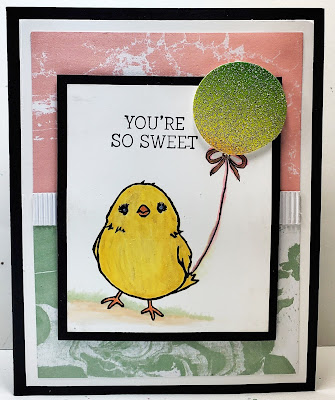
So Sweet Thank You!

 My Mom has been my go-to-person for getting my stamps, dies, and "must have" Stampin' Up items since I resigned as a Stampin' Up demonstrator back in August.  If they would just stop inventing new stuff that I just can't live without, it would help.  I wanted to send her a little thank you card just to let her know how much I appreciate all her work...I do know what a big job it is to get things entered and on order in a timely manner in order to take advantage of sales that pop up every now and then!


I decided to check out my “To Dos” stash and finish a card I started back in early 2016.  This little chick was an SAB freebie, and I started coloring her when I was away from home, and didn't have my Copic markers with me.  I was not super happy with how she turned out.  I don't find I'm very skillful using water-base markers in getting any blending or shading.  I did try to go back and "fix her up" with my Copic markers later, but I'm not sure I improved upon her at all!  I did add a little ground shading so she was not floating in the air!

  
Originally, I was trying out a honeycomb paper balloon embellishment, but I found they don't store well and are flimsy and pull apart easily, so I tore off the honeycomb and added a glitter balloon made from a Duck Tape Rainbow Glitter roll that I bought about three years ago, but never opened the package to try it out.  It really is quite pretty and I think it works quite well with my color scheme.


I shipped off a check to pay Mom for my order along with this little So Sweet thank you card.  I think Mom will enjoy the thoughtfulness even if it was just a quick and speedy card!  Take a peek below at my inside and outside finished card for Mom!


Ingredients:  Ingredients: SU Products: Cardstock--Basic Black, Basic White. DSP: Perfectly Artistic (2016 SAB) Stamps: Honeycomb Happiness (2016 SAB). Ink: Memento Tuxedo Black. Punch: 1-1/2" Circle. Stamp-Write Markers: Daffodil Delight, Pumpkin Pie. Copic Markers. Ribbon: stash. Inside: Mint Macaron, Blushing Bride. Scalloped Scallops punch.  Other: Savvy Dies: Thank You Cursive. Duck Tape: Rainbow Glitter. Size-4-3/4" x 6".

Sunday, January 24, 2021

A Doily Gatefold Garden

I finally had the nudge to visit my craft room...yay!  I really wanted to put some cards together to send to some friends who have received no cards from me to celebrate their special times, even birthdays or Christmas while my mojo and cardmaking deserted me and ran amok for over a year!  My first thought was to motivate myself by trying to finish some cards already started that were gathering dust in the unfinished stash!


My first card is one I start back in the spring of 2019 when I traveled to visit my Mom in Redding, California before the COVID pandemic took over our lives.  While there, I attended a Stampin' Up card party given by Mom's Stampin' Up demonstrator, Darla Watson.   Darla is quite talented, and I always enjoy going to her parties when visiting Mom!  I am so glad my 95-year old "young" Mom still enjoys getting out and doing cardmaking with family and friends!


There were 5 card kits to make, all fun designs.  Some I completed at the party and others I took home half completed because ideas popped in my head while making them to add other layers or embellishments to the design.  This "popping into my head of ideas" is quite common when I'm making cards, my own or someone else's designs.  Most times, I feel pressured to pursue the ideas, or I will look at the finished card and say to myself, "what if" and drive myself crazy because I didn't at least see what I thought by using the "what if" ideas.  So, this card is one of those "what if" designs from Darla's long-ago designs that I found still unfinished and remembered my "pop in my head, what if" ideas.


As most of you know, who have read my blog for any length of time, I prefer cards larger than the standard A2 size.  The original card design had a white gatefold card base and a floral dsp layer added to the gatefold .  To me, it just needed more color, which meant layers, which automatically means...larger card.  I added a Blueberry Bushel (blue) bottom layer and a Call Me Clover (green) layer and then the white gatefold with flower dsp panels. 

 
It had a yellow belly-band as most gatefold cards do, but I decided to try a permanently attached horizontal band with Rose Red or Strawberry Slush scalloped edges.  The band starts on the center left side of the gatefold, under the doily, at the edge of the flower dsp and is adhered all the way around the back to the center right-edge of the gatefold.  The doily is only attached to the left side of the gatefold and becomes an overlay over to the right side.  Because of my modifications, I added a 1-3/4" white punched circle to the centerback of the doily underside to pretty it up now that its back shows when the card is opened.  


Thank you Darla for allowing me to modify your design many months later.  I always enjoy my visits and the fun times at your parties.  Here is my finished version of Darla's original card:


I'm send this card to a cardmaking buddy who did not receive cards from Chatterbox (me) while I hibernated in isolation.  Here is the added interior that she will received when she gets it in the mail!


Ingredients:  Stampin' Up products:  Cardstock--Blueberry Bushel, Call Me Clover, So Saffron, Melon Mambo, Whisper White;  Patterned Paper--Garden Impressions dsp 6x6;  Stamps--Eastern Beauty (sentiment);  Ink--Blueberry Bushel;  Punches--Bitty Blooms, 1-3/4" and 1-1/2" Circles, Leaf;  2-7/8" White Pearlized Doily; Bitty Basic Pearl Jewels.  Other products:  EK Punch--Victorian Corners. 

Friday, April 20, 2018

Birthday Hugs!

One of my dearest friends celebrates her birthday in April; therefore, a birthday card is definitely in order!  Since my right knee replacement, I have not been back to my crafting table for several reasons:  1) it is still early in recovery to have my knee in an unelevated position and bent to 90 degrees for any great length of time; 2) stair climbing, where my crafting table is located, is still quite painful and difficult; and 3) lengthy standing and getting up and down from a seated position repeatedly is painful and difficult.  So, needing this card, I decided now was the time.  All this said, I did get the card done, but now I think a day of elevated recliner rest is needed.


Take a peek below at Sandy's finished birthday card; the inside verse and design follows; and if interested, "The Card Story" can be seen even farther down.


Ingredients:  Papers: Recollections Kraft pack; Stampin' Up cardstocks--Crisp Cantaloupe, Very Vanilla; DCWV French Country stack; scanned music sheet on vanilla cs (butterflies).  Dies:  Spellbinders Labels 17.  Punches:  Martha Stewart--Monarch Butterfly; Three-in-One Butterflies; Stampin' Up--Elegant Butterfly.  Pearls: Stampin' Up.  Offray Ribbon Roses.  Hug Snug Apricot Seam Ribbon.  Maya Arts Jute Twine.  Stash: Black & Rhinestone button trim.  Chatterbox verse/ computer-prepared.  Size: 4-5/8" x 5-7/8".

The Card Story

I have had the layout for Sandy's card in my mind's eye for several months, and just before surgery, I made a quick sketch in my layout idea book for future reference.  I also knew I wanted butterflies and music paper on the front and on the butterflies.  Before I actually began, I checked a few SCS challenges to give me some inspiration for the colors I might use with my music paper. 


I had the idea of a two-panel veritical layout, but I wanted the edge to be curvy rather than just boxy straight lines, but did not have a wavy edged border die that would work where the two patterned papers would meet.  Then, I had a "light-bulb moment". . . I thought maybe a decorative rectangle or square die might work if I only ran it partially through the Big Shot.  I found the Spellbinders Labels 17 fit my idea and the biggest die in these nested dies would be large enough for the height I wanted my card to be.  


Take a peak at the card above and note where the black music paper meets the floral rose patterned paper.  I die-cut my "rose" paper only allowing part of the die to enter under the Big Shot roller press and then cut the top and bottom straight just after the corner curve was complete with my paper cutter.  A smile appeared, showing how pleased I was about how well it worked and how good it looked with the two papers joined together!


My butterflies were the next item to work out.  I decided to punch my butterflies out of cream background music paper that I made by scanning a song sheet onto a piece of vanilla cs with my printer.  My butterfly punch that was just the right size for my little square mats is the Martha Stewart "Monarch" punch with lacy holes in the butterfly wings.  It was pretty, but it some color peaking through the lacy holes, but I did not have a solid butterfly that matched the "Monarch" shape.  Another "light-bulb moment" when I thought of trying the solid Stampin' Up "Elegant Butterfly" punch, which is a bit smaller and has a totally different wing shape than my Monarchs.  It didn't really seem to matter about the shape as long as it filled most of the lacy holes on the wings and as a bonus, I really like the little bit of the cantaloupe cs peaking out on the bottom of the wing.  From this point, the card fell together like clockwork, and I was totally happy with the results as I think my friend will be.

Thursday, February 15, 2018

A Valentine in the Pink of Things!

I have another Valentine card to enter on my blog.  This one is especially made for my first daughter, and she gets one made with pink and punches to fit my Splitcoaststmper Alphabet Challenge, Letter "P" for just that...PINK and PUNCHES!  The double challenge for this letter was "K" for kraft.  The description indicated that kraft could also be bleach white, like that used on large envelopes or gift paper bags.  I went in search of the big white envelope that came in the mail with my insurance papers in it.  I cut a piece of white from it, and used it to stamp on my little Valentine plant.  Sure hope this meets the double challenge requirements!


I am also trying to meet a self-imposed goal to use a lot of my old Valentine materials and tools in my stash rather than buying new things. . .though I have to admit I did buy a few new stamps because I just couldn't help myself, but they haven't actually arrived, so I won't be using them this year!

I really delved deep for Michele's card and pulled out a stamp set I bought way back in 2011 that I haven't used in at least four years called Valentine Defined by Stampin' Up.  I really like this set for its variety of stamps that can be so creatively used.  I decided on the little long-stem tiny heart plant, the LOVE sentiment, and the string heart border that I used to make my own stamped paper.  I also added my own punched hearts from red glimmer paper to add some bright colors and glitz!  I needed to use pink on my card to fit the alpha challenge so I used pink cardstock and pink ink distressing on my white kraft panel.  In addition, I used all punches and no dies to be sure I was spot on with Letter "P."  First three layers where adhered together flat (gray cardbase, red and pink layers) to form a set of three layers.  The remaining layers were adhered together flat and popped up off the first set of three layers.  I used a foam sheet to "pop up" the top set of layers, which is difficult to see in the photo.  Take a peek below at my finished card both inside and out!


Ingredients:  Paper:  Stampin' Up cardstocks--Basic Bray, Real Red, Pink Pirouette, Red Glimmer; Envelope Kraft White (recycled).  SU Stamp: Valentine Defined (2011-Occ/ retired).  SU Inks: Basic Gray, Real Red, Pink Pirouette.  Punches:  SU--Scallop Edge (retired), Heart to Heart (small heart-retired).  Stamped patterned paper (part of stamp set).  Darice Foam sheets.  Stahs: 1/2" Red grosgrain ribbon. Ink Distressed (Pink Pirouette ink).  Computer verse.  Size: 4-3/4" x 6."

Thursday, June 22, 2017

A Brainy Get Well!

A good friend and cardmaking buddy had brain surgery for repair of the trigeminal nerves in the brain, caused by a rare condition known as Trigeminal Neuraligia.  This condition caused her chronic pain in the area supplying feelings, by the trigeminal nerve, to the cheek, jaw, teeth, gums, lips, or less often the eye and forehead.  Bouts of pain can last from a few seconds, several minutes, days, weeks, months or longer (some people have periods when they have no pain at all for weeks or months).  Her surgery seems very successful, though she can not be sure of the exact results for up to several months.


I wanted to make Charlene a pretty get well card that was cute and cheerful, letting her know how much I can't wait until she can join us again at the crafting table!   After mulling around several ideas, I saw Sketch Challenge SC649 on Splitcoaststampers, issued June 14th.  I really thought I could do something with this sketch idea, using a colored image in a cute round frame.  
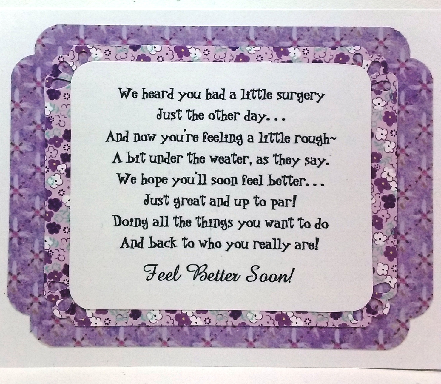
After completing my outside design, I created a little verse and designed the inside to coordinate with the front.  Take a look at her finished card below, both inside and out:  


As it turned out, I took some liberties with the sketch elements, which we are allowed to do.  Take a look at the original sketch that I worked with:


My little girl image shouted out for a square frame instead of a round one, and its angled band called for a straight and wider band to blend with my square frame.  I also decided to add a couple of corner curves and eyelets cut-outs to spruce up my layers and a sheer ribbon and bow.  I hope Charlene will enjoys her card as much as I had fun making it!


Ingredients are listed below:

Cardstocks:  Recollections Essentials (Violet); SU Whisper White. Patterns: Recollections: Purple Ditsy Floral; K&Co.-Watercolor Bouquet-Purple. Color Digital Image: Bandaging Kitty.  Die: Spellbinders: Classic Squares SM; Lacey Squares. SU Punch: Three Corner (retired).  EK Border Punch: Patterned Circles (cut in half).  Offray 5/8" Sheer Violet Ribbon.  Bath & Body Works-Magic in the Air/ Diamond Shimmer Mist. Frame (outside): 3-1/4". Frame (inside: 2-1/4".  Card Size:  4-3/4" x 6".

Friday, July 22, 2016

My Sister-In-Law July...Number Two's Birthday!

My second sister-in-law birthday in July's card is due.  This one is for my husband's sister, Jeanie, who lives in Colorado.  Her card was one that I decided upon and set aside after I finished it at my Mt. Shasta Cardmaking Girls' Get-Away.


Ingredients:  Stampin' Up products:  Cardstocks--Blackberry Bliss, Old Olive, Whisper White, Gold Glimmer.  Pattern: Wildflower Fields dsp (2016 SAB).  Stamps--Friends & Flowers (2016 Occasions); Perfect Pairings (2016 SAB).  Inks--Blackberry Bliss, Old Olive.  Punches--Festive Flower Builder; Curvy Corner Trio (inside/ modified).  Wink of Stella-Clear.  Metallics Sequins.  (Thank you to Luci Kirschbaum for her original design inspiration).  Size: 4-5/8" x 5-3/4".


The Card's Story & Other Tidbits

The original card design belongs to Luci Kirschbaum and was presented at a cardmaking event in January of this year, sponsored by Luci and her side-kick, Dara Peterson.  It was a delight to be able to take a look at the new Occasions mini catalog and the Sale-A-Bration Freebie brochure.  Luci's card design uses stamp sets from both of these publications, and though simple, it is eye-catching and very appealing.  I just love the color Blackberry Bliss, and I am so sorry to see its two-year availability culminate at the end of May.


I finished off this card at my Mt. Shasta get-away in May and decided it would be ear-marked for Jeanie's birthday.  I had not finished it at the card event in January, because I wanted to add a bit more color as it just seemed too white for me.  My solution was to add two mat color layers:  the new Blackberry Bliss cardbase instead of white, and an Old Olive layer.  I also wanted to add some Old Olive leaves to my flower.  


When I added Wink of Stella-Clear to my flower petals to add some sparkle and shine, my stamping ink was evidently not quite dry, so it smeared and filled in the stark white petals with a light, blackberry-sponged look.  I rather liked it; therefore, I did not feel the need to re-make my flower again.  This was one of those moments where a mistake was not a mistake at all, but a happy event.  On that note, I think Jeanie will be very pleased with her homemade birthday card.

Friday, July 8, 2016

A Visit That Was Special...!

A card to let my brother and his wife know just how glad I was to visit with them while vacationing in California.


Ingredients:  Stampin' Up products:  Cardstock--Chocolate Chip, Cherry Cobbler, Crumb Cake.  Red Glimmer paper.  Stamps--Gorgeous Grunge, Chalk Talk (sentiment).  Ink--Early Espresso, Cherry Cobbler.  Punches:  Small Heart; Heart To Heart-small (retired).  Other products:  Dies--Spellbinders Nested Hearts-smallest.  EK Slot punch.  Zutter Corner Rounder.  May Arts: Twine.  3/8" Striped Ribbon.  Washi Tape.  Size: 4-5/8" x 5-3/4".

The Card's Story & Other Tidbits

My Mom and I traveled to Nevada City, California to visit my brother Mike and his wife, Diane.  I wanted to send a homemade thank you to let them know just how much I enjoyed my visit.  I chose a card for them that Liz Thayer presented at a card class over two years ago.  I made a few changes to Liz's original design, as I thought it needed more color and a bit more embellishing.  I added a new cardbase color layer and tag layer in Chocolate Chip, and to the Cherry Cobbler Gorgeous Grunge lines, I also added Early Espresso stamped lines to the Cherry Cobbler stamped lines.  I popped on a few extra red glitter hearts.  I liked my additions and think Mike and Diane will be surprised and happy to receive their card.


I had not seen Mike for over two years, and because of Diane's illness and recovery, they were not able to make their planned trip to Redding early on in my visit.  So, what to do. . .we went to them with clear instructions. . .no elaborate planning for meals. . .a pizza, a late lunch out after church, leftovers, and a good-bye brunch out at the Humpty Dumpty, my treat would do very nicely.


Mike has just finished his 1951 Chevy coupe, which is a beautiful car.  But for Diane's illness, he would have been showing it off at Redding's Cool April Nights.  Here is a quick peek at a lot of hard work. . .no wonder he has arthritis in his hands!


Mike provided us with a quick trip up Hwy. 49 to visit the area my father grew up in, Pike, which has a population of about ten if that.  The property is still there with a family-owned trailor, but the old homestead burned down several years ago.  I remember visiting the old homestead as a little girl when Dad's family went deer huntingdirt logging roads, no lights, and no plumbingquite the adventure!


My Mom and I were able to make a trip to the Folsom Premium Outlets to visit the Sketchers Store, which Mom had been wanting to do for over three years.  From Mike's house, it was only an hour drive each direction, rather than the three-hour trip each direction from Redding.  We both found several pairs of Sketchers we absolutely could not do without. . .shoes, give me more shoes!  We had a delicious late lunch at Chili's, which neither of us had eaten at since Mom left Arizona about ten years ago!  All in all, it was a great day, the weather was balmy in the mid-80s,  and we enjoyed ourselves a lot.


Our nights were filled with playing Mexican Train, our family game that my Mom enjoys a lot.  She generally wins for some reason, but this time Mike took it home!  The leisurely pace of this game allows time for lots of catching up, great conversations, and a lot of joking around as well.   It was a great visit, and I hope to do it again on my next trip down to visit Mom.

Tuesday, July 5, 2016

Sister-in-Law Birthdays in July - Number 1!

A little sunshine card for Dianne, a lovely lady with a sunshiny sense of humor and a quick wit.


Ingredients:  Stampin' Up products:  Cardstocks--Daffodil Yellow, Bermuda Bay, Shimmery White.  Bright Collections DSP Stack-Yellow word pattern.  Stamps--Sunburst Sayings.  Ink--Early Espresso.  Embossing Folder--Arrows (retired).  Punches--1-1/4" + 1-3/8" Circles; Bitty Butterfly.  Pearls.  Other:  Papertrey Ink stamps: Big Birthday Wishes.  Martha Stewart punch: 3-1 Classic Butterflies (inside).  EK punch: Scallop Corners (modified).

The Card's Story & Other Tidbits


As I mentioned in a June post, I have six sister-in-laws from my husband's side of the family, and of those six, two have birthdays in July.  The first July sister-in-law is Dianne.  She is one my husband's brother's wives, whom I met when we were still teenagers and all just dating!  WOW. . .that is along time ago. . .  I'd have to do the math to figure out just how many years ago that actually was!


As mentioned above, Dianne has a wonderful sense of humor and a quick wit, so you would think her card would be humorous for sure, but not this year.  I attended a card class while visiting in Redding, CA, and our hostess was Darla Watson, a Stampin' Up demonstrator.  She presented a lovely card design for us to re-create, which reminds me of sunshine.  Right then and there, I decided this card will be perfect for Dianne as she can be like a ray of sunshine when her humor gets injected into our visits.  


I loved Darla's card design, and I cased her card exactly, using the new Sunburst Stampin' Up die.  The cards colors are cheerful Daffodail Yellow set off with bright and Shimmery White and a bit of contrast with the turquoise shade, Bermuda Bay.  The patterned paper is from the Brights Collection DSP Stack using the word print and also in Daffodil Yellow.  I think the sentiment circle replicates the sun shining brightly with a little butterfly spotlight for a bit of femininity.  I do think this card is perfect for Dianne and hope she likes it as well.  


While on my Mt. Shasta Girls' Get-Away, my goal was to complete as many partially finished cards and those without my finishing inside design and verses so I could claim them really finished!  Dianne's card was one I really wanted totally complete and ready to mail as her birthday would be soon after arriving home.  I  decided on the perfect verse that fit just this birthday occasion for Dianne and created an interior decoration to coordinate with the pretty card front.  For that bit of humor needed, I think she will get a chuckle out of the birthday verse.

Monday, March 21, 2016

Easter Brings A Dahlia-Fold Cross!

I went to a card class this past week-end hosted by Dara Peterson and Luci Kirschbaum, a team two Stampin' Up demonstrators in my area.  Most of our samples to make were miscellaneous 3D items (a berry basket, a bunny box, and a candy purse), but there was one card designed by Luci that featured the Dahlia-Fold Technique, using punched and folded circles.  Most Dahlia-fold circles are made into flowers, but our sample introduced this technique used to make an Easter cross.  

I love this technique and it isn't very difficult.  I especially like the look of it in the form of a cross, which is so perfect for Easter cards.  If you are interested in learning the Dahlia-Fold technique, it can be found on YouTube, Pinterest and Splitcoast Stampers, and here is a link to Splitcoast Stampers:  http://www.splitcoaststampers.com/resources/tutorials/dahlia_fold/


I did make a few minor changes to my card rather than making it exactly like Luci's, but my card still retains the look of the original design.  My first change was actually to correct an error I made in stamping and embossing my papers.  Now, you all probably remember the rule. . .stamp before embossing?  Well, guess what. . .I forgot all about the little EASTER sentiment in the lower right corner and away I went embossing, and making my Dahlia fold cross.  After I had it all assembled, I realized my mistake.  


To fix the problem, I decided to stamp the EASTER part of my sentiment on a small piece of Whisper White cardstock and punch it out with my Washi Label punch.  I wanted my word background much smaller than that the Washi Label punch provided, but not to worry. . .I had an idea.  After I stamped my EASTER word with the Mint Macaron coordinating ink and then punched it out, I cut the label narrower and then punched the ends shorter by lining it up and punching again to achieve my desired length. . .first on one side and then the other.  A little trick I learned long ago in order to handle a short and/or small piece of paper in a punch is to use a post-it note and stick it to your paper piece, which allows you to maneuver and position the small paper piece easier in the punch.  I think I like the way my EASTER turned out even better than the original design where it was stamped directly on the card front with the embossing on top.


My next change was to add a Mint Macaron layer between the card base and the card front.  This picked this color in the mini resin flower, the EASTER ink color, and the happy die cut.  Adding this layer did require me to cut a new and larger card base.  My final change was to add a bit of sparkly glitz by using glitter adhesive on my happy die-cut word and to the mini resin flower.  I'm likening my results, and I thank Luci for the original design that I tweaked just a bit!


I finished off my card by creating an inside coordinating design and finding the perfect Stampin' Up stamp for its verse.


Recipe:  Stampin' Up Products:  Papers - Cardstocks--Crumb Cake, Mint Macaron, Whisper White; Pattern-2015-2017 In-Color DSP Stack/ Crumb Cake dots.  Stamps--Crazy About You; Suite Sayings (verse).  Ink--Mint Macaron, Crumb Cake (insde).  Hello You Thinlit dies/ happy.  Softly Falling Embossing Folder.  Punches: 2-1/2" Circle (cross base); 2" Circle (cross side/top arms); Washi Label (Easter sentiment); Curvy Corner punch (inside).  2015-2017 In-Color Blossom Accents.  Dazzling Details Glitter Adhesive.  Recollections Pearls.

Sunday, January 31, 2016

And Paisley is Three!

One of my great-nieces turned three yesterday!  I've been so bad about getting birthday cards made and sent off starting as long ago as last summer. . .and I didn't even finished my Christmas cards for my immediate family. . .yikes!  I really need to do something about this.  One of my top-ranked New Year's resolutions is to do something about this in the coming year!  So now that life has settled back into some semblance of order after my daughter's wedding, my first goal was to get this resolution successfully started by finishing a birthday card for Paisley and get it mailed on time!  I did it!  I finishing her card about 10 days before her birthday. 


But, then, there was another problem. . .her sister turned seven at the beginning of January just before the wedding, and so far I hadn't even gotten her belated birthday card started.  When I finished Paisley's birthday card, I reaslized I really need to get Taylor's birthday card finished as well and mailed at the same time.  After all, it is well past due by now, and not getting this late card there at the same time as her sister;s might cause hard feelings.  AND, Aunty Carlene certainly wouldn't blame Taylor!


To get my mojo moving for Paisley's card, I remembered seeing a card at one of Liz Thayer's events.  I think it was one Liz received as a trade at convention or some other Stampin' Up event.  (Liz is almost like have a mini-Pinterest on hand. . .LOL!)  The card I remembered featured three big birthday candles, and in searching through my card sample pictures on my computer, I found a picture of it, and just as I thought when I originally saw it, it was quite cute.  


I went to work casing and re-creating this card, with just a minor change.  I added another color layer by making the cardbase white, rather than ending with the Early Espresso layer for the card base.  I thought this brightened the card and brought out the white candle, the cupcake frosting, and the sentiment, and it seemed to cut down on it looking quite so dark with its 99% brown with pink coloring.   I'm pretty happy with that little change, and I'm pretty sure this card will go over very well with my three-year old great-niece with a gift certificate for a movie and snacks coming right along with it!


Below is a quick peek at the inside design and verse I created keeping the front design in mind.  My little verse, a little creation of my own was accomplished on my computer matching the font ink with the stamping ink on the front!


Recipe:  Stampin' Up products:  Cardstocks--Whisper White, Early Espresso, Pink Pirouette, Champagne Glimmer paper.  Stamps:  Express Yourself (retired).  Ink--Early Espresso, Strawberry Slush.  Punches--Cupcake Builder, 3/4" Circle, Modern Label (retired), Blossom Petal Builder (retired) (candle flames; alternate: Bird Builder wing).  Dies--Ovals Collection framelits; Top Note Bigz (retired).  Embossing Folder: Perfect Polka Dots.  (Thank you to unknown card designer. . .a really cute design).

Friday, January 22, 2016

A Shower of Cards As She Celebrates Her 95th!

My husband's Aunt Margaret has lived a long and lovely life, and she celebrates her 95th birthday this Saturday.  Her five children are hosting a lovely party at the local country club in Wichita, Kansas, where my husband grew up.  They have asked those who can not attend to "shower" her with oodles of cards by mail to mark this 95th birthday.  With all of her relatives, I think it might be more like a monsoon as my husband comes from a very large family, being the oldest of eight, who in turn also have large families. . .thus, I'm sure a monsoon!


This is an "almost" duplicate of a card I cased about two years ago and sent to my cousin for her birthday.  The original design was from one made at a Liz Thayer's card class, with a few modifications to see how it turned out.  I added a third flower to its original design and a few more leaves.  I also changed the sentiment to a birthday theme and stamped it on a separate pieced of white cardstock instead of directly onto the card front itself; I tweaked its location; and I popped it up.  On this second cased card, I decided to use different punches for my layering, and I tried a little punch creativity by using a different punch for each layer.  I decided I liked this idea.


Next, I went to work creating a decorative design for the inside to coordinate with the front.  I decided the little Boho punch flowers and the pink pearls that I used on the front Flower Shop flower centers would be a nice touch on each of the verse corners, and I even threw in a few tiny leaves under each flower to make it just right.  I was pleased with the additions I made to the original card design, my birthday verse,  and the coordinating inside design.  I think John's Aunt Margaret will enjoy her specially made birthday card with its flowers showing the promises of the coming spring.


Recipe:  Stampin' Up cardstocks:  Whisper White, Melon Mambo, Gumball Green.  SU stamps:  Flower Shop.  SU Ink: Primrose Petals.  SU Modern Mosac EF.  SU punches: Pansy; Bird Builder (leaves); Scallop Oval; Word Window.  Retired SU punches: Modern Labels; Boho Blossoms; Scalloped Scallop Edger.  SU pearls (colored with Copics). Computer-made sentiment/ verse (Xiorama font).  (Size: 4-1/2" x 5-3/4").

Tuesday, December 29, 2015

Silent Night!

I attended a mini card class in late August this past year where the Stampin' Up 2015 Holiday catalog was first introduced to me.  There is a darling stamp and coordinating die set that is shown off in this catalog, using both the stamps and dies together, and also using them separately as well.   Our class sample card was designed by Dar Peterson, and she used the coordinating stamps and die sets together.


This was such a pretty card, I made it exactly like our sample card presented during class.  The background is sponged on with Night of Navy ink onto Whisper White cardstock, trying to leave white streaks in the sky.  I think mine ended up more opague than the sample.  To get the white splatter effect, we mixed about 1/2 cup of water with with 3 to 4 drops of Stampin' Up's White Craft Re-inker.  Then using a small paint brush we dipped it in the water/ ink solutiom and tapped it against our forefinger over the sponged navy background.  Check it out below:


I finished my inside coordinating design and verse, and I thought I'd show that  off to you as well.


Recipe:  Stampin' Up products:  Cardstock--Night of Navy, Whisper White, Silver Glimmer, Gold Glimmer.  Stamps:  Jingle All the Way (sentiment: silent night).  Ink: Night of Navy, White Craft Re-Inker.  Edgelit Dies:  Sleigh Ride (houses and snow slope).  Punch: Itty Bitty Accents-Star (larger Gold Glimmer star); Confetti Stars Border (smaller silver stars).  Rhinestones (colored with Copic Markers).  EK punch: Victorian corner.  Computer verse. (Thank you Dar Peterson for card design sample).

Friday, December 25, 2015

Peaceful Pines @ Christmas (Totally Lovin' Christmas #7)!

Totally Lovin' Christmas card #7. . .OMGosh, I'm within three of finishing!  Have I said this before, but I'm saying it again. . .I love this card.  It has that homespun Christmas feel to it with the rustic Hardwood background in a weathered cedar look, and the cutest little Christmas tree ever!  It so reminds me of Christmas along the coast of the Pacific Northwest while growing up with the fog rolling in on Christmas Eve and hanging around until late morning, except I would have been looking at Redwood trees, not cedars, pines, or firs!


I only made two very little changes to the original design, and one was to add another layer, making a new cardbase in Cherry Cobbler cardstock.  The second was to just add a gold cording thread to my button rather than leave the holes empty of thread; just gave it a more finished look I think.  Just got to say again that I love, love that rustic weathered wood for the background.  I also have to say that seeing the Peaceful Pines stamp set actually used and in color makes it even more appealing than I thought just looking at it on the catalog page or the stamp case.  Take a look below at this little gem of a card.


Recipe:  Stampin' Up products:  Cardstock--Cherry Cobbler, Basic Gray, Old Olive, Very Vanilla; Farmer's Market dsp; Gold Glimmer.  Stamps--Peaceful Pines (2015 Holiday); Hardwood background.  Ink--Cherry Cobbler, Old Olive, Basic Gray.  Punches--1-1/4" Scallop Circle; Itty Bitty Accents-Star.  Regals Designer Buttons.  1/8" Gold Metallic ribbon.  Gold Metallic Cording.  (Thank you Liz Thayer for the marvelous original design).
  

Friday, December 18, 2015

Candles Flickering - Christmas X10 - Card #4

We are on to card #4 from the Christmas X10 card event, which features a lovely trio of candles.  This one could be classified as punch art, much like the first angel card, as the composition of the card is composed by using a variety punches.  The candles themselves are cut in varying lengths of 3-1/2 inches, 3 inches, and 2-3/4 inches and all one inch wide, the wing of the Bird Builder punches out the glimmery candle flames, and a shallow punch with the 1-1/4 inch circle defines the wick's "well."   The background is textured with the Brick embossing folder, which reminds me of candles displayed on your fireplace mantel with a bower of pine branches to create that wonderful piney smell of Christmas!   


Again, I loved this card just the way it was created by Dara & Luci, and I find when this happens, no creative editing juice flow to make me want to tweak it in any way.  Christmas X10 card #4 can be seen below.

Recipe:  Stampin' Up products:  Cardstock--Whisper White, Old Olive, Cherry Cobbler, Gold Glimmer;  Merry Moments dsp (Holiday 2015).  Stamps--Festive Fireplace (Holiday 2015), Teeny Tiny Wishes (sentiment).  Ink--Old Olive.  Brick Embossing Folder.  Punches--1-1/4" Circle, Bird Builder-wing (flames), Itty Bitty Accents-flowers. Pearls.  


Sunday, December 13, 2015

Punch Art Angel - Christmas X10 - Card #1!

October was a busy month.  I went to another Christmas cardmaking event, Christmas X10, which was hosted by two great ladies and Stampin' Up demonstrators, Dara Peterson and Luci Kirchenbaum.  This is the first time I have been invited to one of their annual events, and I was thrilled with the ten card designs presented by these two wonderful ladies.  What a great and fun way to teach and demonstrator Stampin' Up products. . .a partnership where everything is shared.  I am sure these two have a great time together.  I met several new cardmaking ladies who love to craft as much as I do.  It surely was a fun-filled and enjoyable event.


Our first card was made from products featured in the annual catalog rather than the new 2015 Holiday mini catalog.  I so loved this card's design that in making my own card, I stuck to an exact replica of the class sample.  The cute little punch art angel and the tree were formed by using the Tree punch, and the angel's wings were formed by using the smaller round-winged butterfly from the Bold Butterfly framelit die set.  This was such a lovely card, presented in a beautifully simplistic style.  Please take a peek. . .you'll like what you see!


Recipe:  Stampin' Up products:  Cardstock--Whisper White, Shimmery White, Dazzling Diamonds & Silver Glimmer paper.  Merry Moments dsp,  Stamps: Merry Everything.  Ink: Cherry Cobbler.  Punches:  2-1/2" Circle, 3/4" Circle, Tree, Itty Bitty Accent-Star.  Framelit dies: Bold Butterflies.  (Thank you Dara & Luci for the wonderful card design).

Thursday, September 10, 2015

Thanks Needed for My Seaside Birthday Vacation!

My daughter, Michele, took two days off work and took me to her beach house in Seaside, Oregon for my birthday week.  Our vacation provided an amusing, relaxing and enjoyable respite both on our two-day vacations days and the three workday evenings, and I thank Michele for the lovely interlude with her in Seaside!  I wanted to make her a little thank card for taking her time to spend with me and providing a lovely birthday week with so many pleasurable and relaxing occasions to remember.  It was so SWEET of her, and I hope she enjoyed it as much as I did!


(Card inspired by unknown author from picture taken at a cardmaking event.)
Recipe:  Stampin' Up:  Cardstock - Basic Black, Real Red, Very Vanilla.  Pattern dsp - Summer Picnic (retired).  Stamps - Tart & Tangy (stamp-off technique), So Many Scallops (both retired).  Ink: Real Red.  Punches: 1-3/8" Square, 1-1/4" Square, Scallop Edge Border (all retired), 1-3/4" Scallop Circle (modified).  EK CardCreator Punch: Basketweave Corner.

Saturday, September 5, 2015

Thank You. . .Hydrangeas...What a Lovely Gift!

While vacationing in Seaside, Oregon for my birthday at my daughter's beach house, Michele's sister-in-law brought over a lovely bouquet of the largest, darkest purple and darkest blue hydrangeas I have ever seen.  Now, if you don't know, hydrangeas are one of my favorite flowers since I was a little girl, because they flourish in my hometown of Eureka, California.  These flowers just love that cool coastal weather found in both Eureka and Seaside!  I had to find a way to bring them home so that I could continue to enjoy them some more.


I wanted to thank Julie and her family by making and sending a little thank you card for remembering me with this special gift.  I thought I would share her thank you card with my blog readers.  I decided to pull out some of my older Stampin' Up products that I haven't used in a while because I just love this stamp set and this patterned dsp paper.  Julie's card is a circle-shaped card, made with the largest Spellbinder Classic Scallop and plain dies, but the rest of the card uses Stampin' Up products. 


Next is a quick peek at the card's inside.  The leaf is done with the Gently Falling stamp set, which has outline stamps and inside filler stamps.  By over-stamping, you can put the two together to look like my leaf.


Recipe:  Stampin' Up paper: Cardstocks - Soft Suede, Crumb Cake, More Mustard, Very Vanilla; Pattern dsp - Spice Cake (retired).  Stampin' Up stamps: Gently Falling (retired).  Stampin' Up Inks: Soft Suede, More Mustard.  Stampin' Up pumches - Modern Label (retired), Word Window.  Stampin' Up: Pool Party 3/8" Ruffled ribbon.  Spellbinder dies: Scallop Circle/ Plain Circle Computer-made sentiment and inside verse.  Font: Abbeyline/ Cheddar Cheese BTN (BIG).  Size: 4-1/2" diameter.

Sunday, December 14, 2014

A Knot of Christmas Trees!

The 2014 Holiday Stampin' Up catalog has a new set of Christmas trees to make using the Festival of Trees stamps and the new Tree Punch, but I decided to resort to an old Stampin' Up stamp set, Pennant Parade, that I had never used and its coordinating Pennant Builder punch.  I gathered various green papers that would blend with Garden Green cardstock, which would be one of my layers. 


Notice the groupings of trees with the same paper.  I like to think each paper color represents a stand of the same species of tree, like Douglas firs, Scotch Pines, etc. as we often see in the forest.  My center tree represents the one that is to go home for the Christmas holiday!  I added a little sparkle to this tree with rhinestone ornaments and a little star to perch at its tip.  Then, of course, I needed to compliment this sparkle with a layer of Dazzling Diamonds Glimmer paper.  I also added an off-center ribbon knot at the top of my card to give it more color.  I had seen this ribbon idea used at a card class given by my Stampin' Up upline, Liz Thayer.  I liked the look of it and thought I would lift the idea to use on my card.  (Thanks, Liz).  


I chose the beautiful calligraphy sentiment Merry Christmas from the Stampin' Up Greetings of the Season stamp set (retired) and stamped it with Cherry Cobbler ink.  This card is probably the closest I'll ever get to clean and simple. . .LOL. . . as I'm just not a clean and simple gal, but I loved the look of it when I was all done.


I made a complimentary inside to fit the exterior design, and I decided this one would go to my husband's sister and her husband in Kansas.  I hope they enjoy their card as much as I enjoyed making it.


 Recipe:  SU Paper - Cherry Cobbler cs, Garden Green cs, Whisper White cs, Dazzling Diamonds Glimmer.  Trees - SU Papers: Wild Wasabi cs, Polka Dot Parade dsp, Twitterpated dsp, Burthday Basics dsp, SU Petals-a-Plenty Embossing Folder, SU Petite Pennant Builder punch, SU Pennant Parade stamp (retired).  SU Ink: Cherry Cobbler, Early Espresso.  SU sentiment: Greetings of the Season (2012 Holiday).  SU 1” Stitched-Edge Cherry Cobbler Grosgrain Ribbon.

Friday, October 31, 2014

Bride of Franken-Owl!

Still on a roll making these cute little mini album cards.  Well, I made Mr. Franken-Owl, so why not a mate for him?  I thought I'd help out with a bride for him.  


Off I went designing a little lady Franken-Owl.  I decided she must be dressed in purple, with a pinked skirt and a bow in her hair.  Unfortunately, her creator was just as bad at finding her a matched pair of eyes, and thus, she has a mini googlie eye and a small googlie eye just like her beau! 


I pretty much followed the same theme as the first Franken-Owl, but with different papers for this little book.  I was truly liking her when I was done.  I planned this one for a cardmaking buddy, and I hope she likes her Bride of Franken-Owl as much as I heard that Franken does.  I heard they are already engaged and ready to tie the knot!


Front Cover with Bride of Franken-Owl's graveyard scene.


This is the centerfold of the feminine version of my card book.  I added a tag with a Halloween verse and Martha Stewart bat stickers.  I also added a little drill to the edge of the verse pocket, fitting for a female card!


Back cover, adding Beware by using the Sizzlits Halloween Set #2.  Dazzling Diamonds-Silver glitter adhesive also added to letters for a little bling!

Recipe:  Papers:  SU Old Olive, Daffodil Delight, Rich Razzleberry, Black, Whisper White; SU Core'dinations - Black, Basic Gray.  DCWV--Halloween & Fall (2011/ 2012), Bewitched Mat Stack; stripe/ argyle (pocket).  Core'dinations - Black Tie Glitter (bats).  White paper sack: 9" x 4-3/4" (Michaels).  SU Stamps: Best of Halloween.  Ink: Memento Tuxedo Black.  Dies: MFT--Spooky Scene (gravestones); Sizzlits--Halloween Set #2 (Beware); Sizzix TH Alterations--On the Fence; Spellbinders Labels 11 (tag).  Punches: Studio G--Mini Bat; EK Pointed Flower Border; SU Owl Builder, Bird Builder (owl wings).  Die-cuts: Martha Stewart Bat stickers.  Other:  SU-Dazzling Details/ Silver, 3/8" Dotted Grograin; Ki Memories--rhinestones; Online jpeg--Spooky Tree.  Stash: Googlie eyes--mini/ small, Black pearls (buttons)