Showing posts with label SUO. Show all posts

Sunday, June 26, 2022

Father's Day at the Beach!

Being raised in the Pacific Northwest near the ocean, spending at day at the beach, means the ocean is definitely the scenery.  I thought I'd give my youngest son a day off to enjoy some ocean scenery; after all, he was the only one of the four children who never lived in Hawaii where ocean beaches were very much a part of everyday life!


I used the Stampin' Up Waves of Inspiration stamps and the coordinating Waves Dies with Balmy Blue, Pacific Point, and Night of Navy inks.  I brushed and ink-blended the white cardstock top panel with Balmy Blue giving it a filtered blue sky look (a light blue sky with wispy white clouds blended into the blue).   


My wave was next, which I built with the Balmy Blue, Pacific Point, and Night of Navy inks.  I stamped my colors in layers using these three inks one on top the other...over-stamping...but stamped-off with the two darker colors.  I kept adding over-stamping until I got the look I wanted. I used my Misti to aid me in this process. My last stamping was done by applying Night of Navy on the lower portion of the waves only by using a Stamp Write marker inked onto the bottom of the stamp surface.  After it was completely dry, I ink blended with Balmy Blue until I was satisfied with this lighter color mixed into my waves. 


Then, I had an accident...while trying to stamp my seagulls where I wanted them (before popping on the clouds), my stamp block got ink on its edge, which transferred to my card front next to two of my seagulls!  Whoa as me...not the first time I've had this problem with tiny stamped objects!  So not to lose all my carefully ink waves, which I thought turned out rather spectacular, I fussy-cut the wave off and after preparing a new card front with my Balmy Blue brushed ink blending, I glued my waves to the bottom of my new card front.


I decided not to re-stamp my seagulls, as I just didn't want to chance the same problem, so I practice a little of drawing my own seagulls with a fine mechanical pencil and then flicking over with Copic markers in T5, T4, T2.  It worked so well, and I could make them larger or smaller as desired! I found adding them with Copic markers works best for me! I die cut the clouds and cloud edges, which give the clouds more texture and dimension; I popped the clouds off the card surface; and overlapped two the smaller clouds and popped them off each other.


I originally started this card thinking to make a birthday card for my stash, as I never have enough birthday cards. I pulled out my Teeny Tiny Wishes stamp set (retired) and stamped with Night of Navy ink onto Balmy Blue cs and die-cut it with the narrow die that I knew would work well for sentiments.  I attached Linen Twine through the open ends to the sentiment strip and added it to the middle of the card.  Taking a look, I realized it would be a great masculine card, and I still needed another Father's Day card for our delayed family Father's Day get together, which would be taking place next week-end.  I didn't want to re-do the die-cut with the twine, so I carefully made a new sentiment on the computer that I could carefully cut and paste over the happy birthday stamping.  It worked perfect...take a look below:


(NOTE: When I say spatulated off, I used an OLD Cricut spatula, which is irreplaceable and works wonders when for this purpose because of its narrow, thin blade,  Unfortunately, Cricut re-designed their spatula over 10 years ago so these old ones are almost impossible to come by!!)

Ingredients:  Stampin' Up:  Night of Navy, Balmy Blue, Basic White cardstocks. Stamp/ Dies--Waves of Inspiration/ Wave Dies; Teeny Tiny Sentiments (retired). Inks--Night of Navy, Pacific Blue, Balmy Blue, *Basic Gray (seagulls). Linen Twine.  Other: Copic markers--T5, T4, T2 (*Handmade seagulls, rather than stamped). Fussy-cutting. Chatterbox sentiment/ verse. Size--4-3/4" x 6."

Monday, June 20, 2022

My Daughter Grows Beautiful Flowers

 In the middle of thinking about and making Father's Day cards, I realized I also needed to be thinking about my oldest daughter's birthday card! I attended a June card class where we learned to make two cards in one by die-cutting a lacey floral die out of white cardstock to use as a stencil on another white card front panel, creating a negative inked floral bouquet. We were to use our blender brushes to ink and colorize our blossoms with three lovely ink colors, but I decided to use four: Polished Pink, Orchid Oasis, Starry Night, and Parakeet Party for the leaves.  What gorgeous colors these are together.  Our white cardstock stencil ended up very prettily ink blended as well and became the focal die-cut for the second card.  This is the card I decided to finish for my daughter! 


I adhered four 1/2" black paper strips spaced 1/2" apart and horizontally across the white cardstock front panel, starting in the middle...find the card front middle before starting.  Next, adhere two 1/4" black strips at the top and bottom, but also leaving 1/2" of the white cardstock showing. I adhered this card front panel to a black mat layer with a narrow 1/8" border. I add two more base layers...the 4-3/4" x 6" black card base and a Gorgeous Grape cardstock cut to 4-3/8" x 5-5/8". I positioned the inked Artistic lacy flower die-cut where I liked it, allowing for my sentiment strip toward the bottom and offset to the left. 


To finish, I added a 1/4" x 1" tiny black strip to host three medium rhinestones colored with Copic markers to match the Parakeet Party ink and positioned the strip toward the upper right corner of the card front. I punch my white cardstock sentiment strip with the Lovely Label Pick-A-Punch and popped two rhinestones beside the stamped "Happy Birthday".  I also added two Glitter Enamel Gems to the flower centers, coloring them with Copics to accent the inked blooms.


I was super pleased with the look...black and white always dresses up any card...such a classic combination!  Take a peek below and my finished card and my inside Chatterbox verse:


Ingredients: Stampin' Up products: Cardstock--Basic White, Basic Black, Gorgeous Grape. Stamp/ Dies--Artistically Inked (sentiment)/ Artistic Dies (lacy floral). Inks--Polished Pink, Parakeet Party, Orchid Oasis, Starry Night. Punch--Lovely Labels Pick-A-Punch (sentiment label). Glitter Enamel Gems (flower centers). Basic Rhinestones--medium & small. Other: Copic marker (Rhinestone & Glitter Gems coloring). Blender Brushes. Chatterbox verse. Size: 4-3/4" x 6".

Tuesday, May 3, 2022

Being A Dad is Whiskey Business

 I went to a card party a few months ago, and my Stampin' Up demonstrator duo (Daralee Peterson and Luci Kirschbaum) had a card design using the new "Whiskey Business" stamp set.  I loved their card design idea, but decided to enlarge it and tweak it here and there to make it more mine.  


I gave it a new, enlarged and ink-distressed white card base, a new, ink-distressed punch size panel to host my changed sentiment, re-positioned brads, plus a pale blue decanter, glass, and ice shaded with Copic Markers.  I also used Copics to color my whiskey and highball drink, getting better shading, blending, and highlights than could be achieved with the water-base markers provided.  My finished card, inside and out, can be seen below:


Ingredients: Stampin' Up: Cardstock--Basic White, Early Espresso. Patterned dsp--In Good Taste (retired). Stamp--Whiskey Business. Dies--Stitched Recentangles. Inks--Mango Melody, Daffodil Delight, Cajun Craze; Memento--Tuxedo Black; Versamark. Punch--Lovely Labels (sentiment label). Embossing Powder--White. Round Brads (colored with Cajun Craze Dark Blender). Other--Copic markers. Brilliance Gingerbread ink (edge distressing). Chatterbox verse. Size: 4-5/8" x 5-7/8".

Tuesday, April 19, 2022

Easter's Symbol of Salvation!

Moving on to my second Easter card that I found in my "TO DO" box: a previously finished card from a 2018 class card. When I got home from class, I separated the layers with my trusty spatula (OLD Cricut spatula), because I knew I wanted to elaborate on the card when I had time and I didn't want the glue tape to set. The pieces ended up stashed in my "Need to Finish...TO DO Stash" box and promptly forgotten! The original card's design credit goes to Dar Peterson, one of my two SU demonstrator duos.


I got out all the pieces and my photo of the original to see if I could remember what I wanted to do different. My changes do not really change the original design look too much, but adds a bit more sparkle and elegance, I think, with more Gold Foil added. I enlarged the card to a 4-3/4" x 6" card from an A2 by making a larger new white card base, adjusting the Blackberry Bliss larger (I used the original for an inside card layer), and cut and inserted a Gold Foil layer before adding the top white embossed card front layer. I also added a Gold Foil scalloped oval below the multi-color stitched dsp layer.


I was really please with the foil additions as it dressed up this lovely card even a bit more by adding more eye-catching metallic sparkle that coordinates with the gold filigree cross.  Now, here's the rub!  I forgot to take a photo of my remodel before popping it in the post for mailing! 


All I got to say is...woe is me, sigh! I bid you to use your imagination to envision how those changes looked as this is a photo of the original design! Take a peek below at it and my inside design and stamped verse:


Ingredients:  Stampin' Up: Cardstock--Blackberry Bliss, Basic White, Gold Foil. Pattern--Painted with Love Specialty dsp (2018 Occasions).  Stamps--You're Inspiring (sentiment); Easter Promise (inside verse). Dies--Cross of Hope Framelits (2018 Occasions/ 2018-19 AC); Stitched Shapes Dies (oval). Petal Burst EF (2018 AC). Other: Brilliance Chalk ink--Gingerbread. Ribbon scrap.

Saturday, March 5, 2022

It's the BIG 50!

During March, we have several birthdays to celebrate.  One of special significance is to mark my oldest son's half-century birthday...the BIG FIVE-O!  Yes, his 50th birthday.  His fiancĂ©, oldest sister, and I got together to make a day-long adventure out of preparing for the BIG party.  We shopped for many, many balloons...rubber ones in black, metallic gold, white, and clear confetti and Mylar ones in black & brightly colored splatters with CELEBRATE and candles featured, gold 5-0 numbers, plus metallic stars in black, gold, and white!  We bought party supplies for the cake and eating, and LOTS of food.  On the menu was BBQ'd pulled pork sandwiches, coleslaw, homemade baked beans, pasta salad, and beverages!  It was a wonderful day full of fun and laughter and the weather even cooperated with a sunny, balmy 53 degrees.  We were able to play outside with a little help from two patio heaters and some warm sweaters!


To help celebrate this noteworthy halfway mark, I needed a card.  I have long contemplated a woodgrain card using some SU companion papers that I bought back in 2017, Wood Textures. Somehow, I just have never got around to opening the package and making the wonderful masculine patterns into a card. This was the time and the event to make good on this card idea that has been lurking in the recesses of my mind for over five years!  Take a peek below at the completed results both inside and out.  I think David will be thrilled with its final outcome!


Ingredients-- Papers: Cardstock--SU-Basic Black, Copper Foil. Kraft-paper bag recycled. Patterned Paper--SU-Wood Textures (2017-2019). SU Stamps--Picture Perfect Birthday. SU Dies--Seasonal Layers (Scrap stash copper leaves--smaller modified from larger). SU-Embossing Powder/ Black. Colorbox-Chestnut Roan (Ink Distress-Edges). Fold--Front Flap Overlay Fold.  Size--4-3/4 x 6-inches.

Thursday, November 18, 2021

Santa's Sleigh Christmas Tag Card! (VSN#2)


At the end of September, I went to a card class hosted my Stampin' Up demonstrator duo and friends,  Dar Peterson and Luci Kirschbaum.  It was their annual holiday card event and it was so nice to see friends of old!  I'm always looking for more Christmas cards, so I was only too happy to attend!  


As always when presented with a finished card sample, my creative edit mode kicks in with ideas that I might like to change or include that would make the card more me.  This never means that I do not like the original design, it just means that I can not curb myself to just make the card as is...my bad??!!  Therefore, I often complete cards at home after leaving the class, keeping in mind while at class where I might want to make changes.  I got this card's die-cutting, embossing, etc. complete at class and brought the pieces home, along with a picture, but I just finished putting it together last night because it was so perfect for one of the  Splitcoaststampers' VSN mini challenges (more about that later).


This card's original design is by Dar Peterson.  She used Stampin' Up's new holiday die, Giving Gifts, using the Santa Sleigh, plus the Tailor Made Tags dies from the Annual catalog.  Though I contempted adding a red foil layer instead of the regular Real Red cardstock, I loved this sweet Christmas card pretty much just as it was.  I ended up deciding to only add red rhinestones to give a little sparkle. . . three to the upper left and two to snowflakes.  Take a peak at the finished card, which is almost ready to mail after I add my verse and inside design: 


NOTE:  I just found another card on Pinterest by Cindy Brumbaugh that is very similar to this with a few tweaks.  It was made about 5 weeks before Dar's; Dar's uses a different sentiment and ribbons; but I suspect they should each be given credit for this card design, thus I am doing so.  My  rhinestone additions were a different twist not on either card.

Ingredients:  Stampin' Up Papers:  Cardstock--Sahara Sand, Real Red, Basic White. Pattern Paper--Tidings of Christmas dsp.  Stamps--Peaceful Deer (sentiment).  Dies--Giving Gifts; Tailor Made Tags, So Many Snowflakes.  Ink--Real Red.  Embossing Folder: Wintry 3D.  Red Rhinestones.  Ribbon--Playful Pets (red); White Cotton twine.  Chatterbox inside verse.  Size:4-1/4 x 5-1/2-inches.

Sunday, November 14, 2021

Triangle Christmas Trees!

This is a Christmas card design by Luci Kirschbaum from a Stampin' Up card class I attended at the end of September. I brought it home to think about what it needed, if anything, before I felt it was finished.  It has been sitting in my unfinished Christmas cards for well over a month!  It was time revisit it and make up my mind what I wanted to do. . .leave it as is or add something more.


The design is geometric, not normally my style especially in a Christmas card, but somehow I found this card very appealing.  I decided I liked it, but maybe it needed a little sparkle and be a bit larger to fit the card size I generally prefer.   I added some rhinestone tree toppers for sparkle and a new Always Artichoke card base, enlarging its size to 4-3/4 x 6-inches.  I do like the sparkle, extra color, and layering that I added to tweak just a little.  See my finished card below:


Ingredients: SU Cardstock--Evening Evergreen, Basic Gray, Always Artichoke. SU 2021 July-Dec Mini: Peaceful Place Specialty DSP & Sweet Little Stockings stamps. SU Dies--Stitched Triangles. SU Ink--Evening Evergreen. SU Embossing Folder--Evergreen Forest 3D. SU Basic Rhinestones. Colorbox Charcoal ink distressing (trees). Chatterbox computer verse.  Size: 4-3/4" x 6".

Saturday, November 6, 2021

A Happy Day Birthday! (Paper Pumpkin--March 2021--"Here's to You" Alternative #3)


Ingredients:  Stampin' Up Products--Cardstocks/ Papers: Old Olvie, Pretty Peacock, Basic White, Copper Foil; Paper Pumpkin March 2021--Here's To You (scenes, die-cuts, dsp=envelope inserts, fussy-cut scene pieces). Stamps: Itty Bitty Birthdays. Die: Stitched Nested Labels. Ink: Early Espresso, Pretty Peacock, Old Olive, Seaside Spray. Embossing Folder: Subtle Dynamic Textured. Sequins: Artistry Blooms.  Other-- Colorbox Chestnut Roan pigment ink (inked edge distressing); Maya Arts Hemp Twine; Copic Markers (sky, water enhancement); Chatterbox verse (inside); Size: 4-3/4" x 6".


CARD STORY & CONSTRUCTION NOTES

My friend's birthday was yesterday while I am away at a crafting get-away with my long-time group of crafting buddies.  This hobby event has been a long time coming as the last was pre-COVID (over two years ago)!  Now that we've all been vaccinated, we've been anxiously awaiting getting together again! So, while I am here, my primary project was to make this needed birthday card.  I wanted to keep my crafting supplies to a minimum, so I've decided to take Paper Pumpkin kits that either were not finished or ones not started, along with their coordinating papers, inks, extra sentiment stamps, ribbon, and other embellishments that I might need.

For this first project, I decided to use a kit I had already made two alternative cards from...the Paper Pumpkin--March 2021 - Here's To You. It, of course, is Alternative Card #3.  I used the cloud-meadow scene that I have not yet used.  Like I did previously, I fussy-cut scenery parts to double layer these areas in the scene in order to add more depth, texture, and color. For this Alternative #3 card, I focused on the clouds, lake shadows, green trees, and meadow with flowers leading to the lake.  

Onto the fussy-cut pieces, I sponged on more ink for color depth, plus I ink-distressed the edges with the Colorbox Chestnut Roan ink that I loved to use when I want ink edge distressed this effect.  Notice that I sponged Pretty Peacock on several of the cloud formations and Old Olive onto the green trees before double layering them onto the scene.  I Copic-colored the fussy-cut lake shadows as I did not have an appropriate ink color to use and double layered them as well.  

Next, I embossed the card base front and the copper foil layer with the SU Subtle 3D embossing folder.  I really like the copper foil with this particular kit as it enriches and brightens the entire look of the completed card.  To finish, I added my trio of twines and adhered all layers including the card front together.  I stamped the sentiment, added the copper die-cut layer pieces, attached the sentiment layering, and finished with sequin embellishments.

Tuesday, August 31, 2021

Something to Brighten Your Day!

I missed my Mom's birthday...shame on me!  I decided to send a little “I love you” card,  day brighter, belated birthday card, thinking of you card, and thank you card all rolled into one!  I also enclosed a little shopping money, hoping she might visit her favorite boutique and pick up a few pieces of jewelry, (she loves to add to her stash), or even some cardmaking supplies from Stampin' Up.  My Mom is a 96-year old youngster and still going strong.  She has always been able to shop the socks off of me that is for sure.

I made her card from the last pieces I had left from the June 2020 Paper Pumpkin kit.  This was the first kit I purchased, and I loved its bright and cheerful papers and sentiments.   Of course, I can never make the cards as they are suggested in the kit, and this one is no exceptions, though since it was my first kit, I did not make any extravagant additions.

Here is what I did to add more color and pizazz to my card.  I enlarged my card to 4-3/4 x 6-inches by adding a new black card base and Poppy Parade color layer underneath the simulated alcohol-ink background paper provided.  I added some ink-distressing to the paper edges and sequins to add sparkle.  I finished off an inside design and verse to suit the occasion.  I was happy with the additions as it really made my cards POP!


Ingredients:  Stampin' Up products:  June 2020 PP Box of Sunshine--AI-style dsp, black & white dot dsp, sentiment stamp/ die-cut shape, and lemon die-cuts.  Cardstock--Basic Black, Poppy Parade, Whisper White, and Gold Foil.  Ink: Memento Tuxedo Black Ink; ColorBox Chestnut Roan pigment ink (edge distressing).  SU: Artistry in Bloom Sequins.  EK Corner Punch--Victorian Medium.  Chatterbox Computer verse.  Size:  4-3/4" x 6-1/4". 

Thursday, August 5, 2021

Non-Traditional Christmas Dove!

More Christmas cards to do!!  This card's original design idea came from my Stampin' Up hostess duo's 2020 Covid Christmas Card Make-It @ Home Kits, by Dar Peterson.  It was time to get the last card finished and posted.  I tweaked the card to fit the ideas circulating in my head: enlarged the card, tweaked the dove placement, added more gems, more silver foil, and changed-up color layers...  explanations below:


I scrapped the white cardbase, changing to the dove's Roccoco Rose and enlarging the card to 4-3/4" x 6", which I prefer.  I enlarged my border layers to 1/4" on the bottom two color layers.  I added a silver foil sentiment backing to coordinate with the silver olive branch in the dove's beak.  I added three vertical rhinestones to the upper left corner, coordinating with those in the sentiment.


As I "tweaked and built" this card, its color scheme grew on me.  At first, I wasn't sure I even like it, though I loved the card design.  Now, several months later, I actually really liked it!  Thanks Dar for the original card design and always encouraging us to change-up, tweak, and "build" our cards to fit our own creativity!  See my finished card below: 


Ingredients:  Stampin' Up products:  Cardstocks--Roccoco Rose, Gray Granite, Whisper White.  Ink--Gray Granite.  Patterned Paper--In Good Taste dsp.  Stamps/ Dies--Dove of Hope (sentiment)/ Detailed Dove, Wreath Builder, Ornate Frames (sentiment shape).  Basic Rhinestones.  Recycle: Silver Foil (from package backing).

Sunday, May 9, 2021

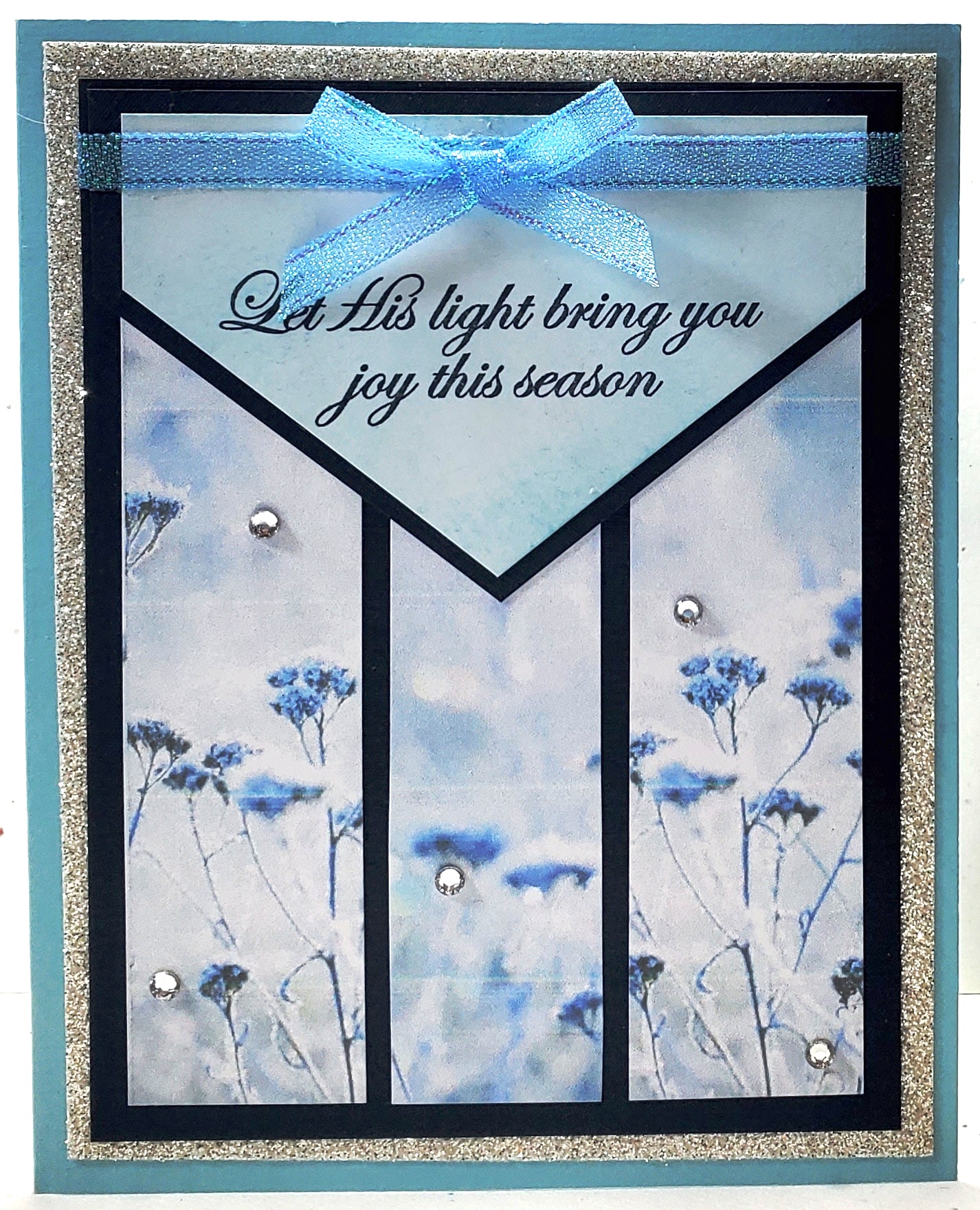
Let His Light Bring You Joy!

I'm trying to catch up on my blog posting, and I found this Christmas card that I made earlier this year that hadn't been posted.  I used this same card design for two sympathy cards back in January, but planned to remake it into several Christmas cards as well.   My card design was based on a My Favorite Things sketch from April 2018 - MFTWSC383, plus some Splitcoaststamper Challenge ideas as well.  


I liked the Feels Like Frost paper that I used on the sympathy cards, and I planned to use it on the Christmas cards as well.  I did not make the same mistake in measuring the flap this time, so it was plenty long enough to be positioned at the top of the layering scheme so the ribbon strip and bow would rested directly on the flap.  Take a peek at my finished  card:


My design rotated the sketch design to a portrait style and shortened the flap so it did not drop as low onto the body of the card.  I decided to place my sentiment on the flap similar to where MFT shows the white rectangle but lower in the angled area, and I layered the flap with navy.  In addition, I added vertical paper strips from top to bottom with the envelope flap overlaying the top portion of the strips.  Take a look at the My Favorite Things sketch that I based my card design from:


Ingredients:  Stampin' Up products:  Cardstock--Balmy Blue, Night of Navy, Silver Glimmer; Patterned paper--Feels Like Frost 6x6 dsp; Stamps--His Light (2018 Holiday); Ink--Night of Navy, Balmy Blue (sponging); Ribbon--1/4" Snowflake Splendor; Basic Rhinestones.  Other: Copic Markers (ribbon coloring); Chatterbox computer sentiment/ verse; Size--4-3/4 x 6-inches.

Sunday, January 31, 2021

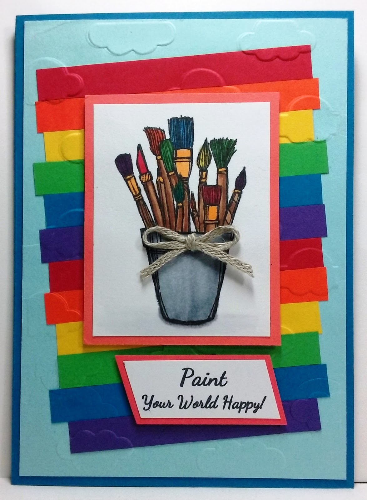
Paint Your World a Happy Rainbow!

Moving on with Splitcoaststampers' Virtual Stamp Night Mini Challenge.  Challenge #3 was posted at 7:00 p.m., ET and was entitled: Always Be A Rainbow.  Our hostess asked us to be inspired by the song Rainbow by Kacey Musgraves and create a card with a rainbow or using all the colors in a rainbow.


I chose to go with the idea of using all the colors in a rainbow rather than an actual rainbow.  The song is a bit sad, but also depicts another way to see your life, as there's always a rainbow in your life if you just look.  I decided my card would choose a happy rainbow with the sentiment Paint Your World Happy!  Note that it depicted crafting paint brushes...aren't we all happy when we are crafting, thus the sentiment works perfectly!  This little happy card will be for my friend, Sandy, whom I am missing during this long, never-ending social distancing. See the finished card below:


Ingredients:  Stampin' Up products:  Cardstocks:  Pacific Point, Balmy Blue, Real Red, Tangerine Tango, Daffodil Delight, Cucumber Crush, Pacific Point, Concord Crush, Poppy Parade, Whisper White.  Stamps--Crafting Forever (2017-19/ retired).  Trim--3/16" Braided Linen.  Wink of Stella--Clear.  Other:  Embossing Folder--Darice--Cloudy Sky.  Copic Markers.  Chatterbox sentiment (computer).  Size: 4-1/2" x 6-1/4."

Saturday, January 16, 2021

Reindeer Prancing & Dancing!

After my abysmal failure with getting 2020 Christmas cards made and sent to friends and family, other than my four children, and I was probably only successful with those, because I always make a gift pocket inside their cards to hold their Christmas checks...basically the "packaging" to hold their present.  These four cards were all one design with four different colors that I made just two days before Christmas.   


As the New Year approached and I was still in my funk, I woke one morning and was just fed up with my down mood that had persisted during all of the holidays.  I was really upset with myself and "kicking myself in the hindquarters" for not forcing myself into my craft room to make Christmas cards.  I felt that I had pushed by depressed vibes onto everyone else and not cheered them up if they needed it by getting happy mail at Christmas!  I vowed never to let another Christmas go by without me making and sending my cards, because with all my surgeries for my knees and hands in the previous three years, I had missed other Christmases as well.


In early January, I pushed myself into my craft area and gave myself a good talking to.  I made a wonderful New Year resolution.  I would stay in my craft area and make enough cards to cover family and long-time friends for Christmas 2021 (that would be around 70 cards) by the end of January; I was not allowed to make other cards; and I was not allowed to put what Christmas materials I had out away until I finished.  To help me out, my first two designs were alternative designs off the October 2020 Paper Pumpkin, "Joy to the World."


YAY! I completed my resolution, though I fudged a little on "other cards."  After I got over 3/4 of the cards finished, I had a few sympathy cards I felt I really needed to address...so I cheated a wee bit.  I spent many, many hours and literally a minimum of three weeks of January continually at my craft table getting my 70 Christmas cards finished, except for their inside design and verse.  I developed about 15 designs and made four to six of each.  This blog post is for my fourth card design, which is a take-off of an unfinished 2019 card kit from my Stampin' Up mentors, Daralee Peterson and Luci Kirschbaum.  Its design was originated by Dar, and I modified and embellished upon it, changing it to make it my own. 


The original design only had two layers and both were the same color...Very Vanilla.  I exchanged the Very Vanilla cardbase for one in a lovely, soft navy, called Blueberry Bushel, plus added additional layers in copper foil and Pretty Peacock.  I colored the stamped berries, peeking from under the foliage framing, with Copic markers to match the blueberry cardbase.  I added clear embossing and glitter to the Pretty Peacock foliage framing, and added an embossing folder design to the dashing deer.  I enlarged single layer sentiment, changed its shape to a double fishtail flag, and added a double fishtail blueberry mat layer beneath.  I moved it from a right off-center position, centering it up below the framing.  To finish, I Copic-colored rhinestones to match the color of the Pretty Peacock cardstock and added them to the four corners of the vanilla layer.  I am really pleased with all the colorful paper and embellishment additions.  It is so pretty and sparkly!  Take a peek below at my finished card:

Ingredients:  Stampin' Up Products:  Cardstocks--Blueberry Bushel, Pretty Peacock, Very Vanilla; Foil--Copper; Pattern dsp--Brightly Gleaming Specialty; Stamps--Frosted Foliage, Itty Bitty Christmas; Dies--Dashing Deer (2018 Hol.), Frosted Foliage (2018 Hol.), Stitched Rectangles, Lakeside Dies (sentiment banner) (2019-20 Annual) (coor. stamp: Lilypad Lake); Rhinestones (Copic-colored).  Other:  Spellbinders Mystique Embossing Folder.  Size: 4-3/4 x 6-1/4 inches.

Wednesday, February 5, 2020

I Love Me A Christmas Tree!

Here is a one of my 2019 Christmas cards that I am finally getting posted to my blog.   I check some of the SCS Challenges to see if it would fit as I knew there are usually categories in bling, paper tearing, Christmas themes, etc. 


I remember I was running up against a tight timeline to finish my cards and get them delivered on time.  I dug out some old Liz Thayer Christmas kits that I almost forgot about and decided I really should try to use at least one of them.  I decided on this Peaceful Pine beauty.  I was excited to use the die with the pop-out branches.  I tweaked the card a bit, adding a white cardbase and a Gold Glimmer layer between the base and the card front.  I also added a popped and ink distressed Merry Christmas die-cut to the inside.  I like the end result and made several more to add to my stash of cards to give.  Here is the result below:


Ingredients:  Stampin' Up products:  Cardstocks--Garden Green, Cucumber Crush, Mint Macaron, Whisper White, Glimmer paper-Gold.  Stamps--Peaceful Pines (2016-17 annual/ verse), Perfectly Plaid (2019 Holiday/ Merry Christmas).  Dies--Perfect Pines Framelits (2016-17 annual).  Ink: Cucumber Crush (sponging), Garden Green (sentiment stamping), Crumb Cake (ink distressing).  Winter Wonderland Washi tape (2015 Holiday). Other:  Dies--Spellbinders Petite Labels One (inside).  Crystal Effects (clear droplets).  Size: 4-3/4" x 6".  (Thank you Liz Thayer for the original design, which I modified a bit).

Sunday, February 18, 2018

A "So Sweet" Valentine for Hubby!

I decided I should finish a card that was demontrated in a card class hosted by Stampin' Up demonstrator Liz Thayer a few years ago.  Its parts have been languishing in my "To Do" box for quite awhile.  Of course, I have to tinker a little to make the card a bit more my own.  


I added a black cardbase to add more layers and because I thought a black and red edging would look ever so much more striking than just red, plus I widened my layered edges to be more like a frame.  I re-arranged my heart colors a bit, plus added rhinestones to the curlicues on the sentiment.  The inside to tie-in with the front is entirely my own design, including the created verse, which I used on all my Valentines this year.  I used to do a different verse on every seasonal card. . . finally the lightbulb went on after feeling way overburdened.  "Why do that,"  I said to self. . .so obviously I stopped!

I plan to enter this into the SCS Alphabet Challenge for Letter S...no double challenge for me on this...I just couldn't quite see a hot glue design that would in any way enhance the look of my card...LOL!  Hot glue reminds me of buggers to be quite blunt and honest!  Didn't think hubby would appreciate that!  Although, one clever lady wound yarn around her glue ball as her focal point was all about cats. . .that glue ball did work well!  


I found a few other challenges it might fit into as well.  Now it's time to take a peek at hubby's finished card inside and out below:


Ingredients:  Stampin' Up papers:  Cardstock--Basic Black, Real Red, Whisper White; Pattern--*Stacked with Love Pad.  SU stamp: *You Plus Me.  SU Ink: Real Red.  SU Punch:** Sweetheart; **Itty Bitty Accent Punches--Heart.  **1/8" Taffeta Silver Edge ribbon: Red and Black. SU catalogs: *2015 Occasions/ retired.  **2014-2015 Annual/ retired.  SU Rhinestones.  Created Verse.  Size: 4-5/8" x 5-7/8". 

Tuesday, February 6, 2018

A 2018 Valentine for Mom!

It's time to make a Valentine card for my Mom!  I sure miss her...with all my knee and hand issues starting over two years ago, I've missed three of my traditional semi-annual trips to visit her.  I will not be able to go until this coming fall due to my second knee replacement in March!  Mom will be a spry 93-years old in August, 2018.  We always spend lots of time cardmaking together on my visits, along with my sister who lives in the same town in California!  We usually schedule a week-long girls' get-away to Mt. Shasta...what wonderful memories!


I pulled out some of my old unfinished Liz Thayer card kits and their pictures to see what I might use and get them out of my too full "To Do" box.  I found this little gem that I never put together during my knees "hiatus."  I love the paper colors and Liz's design, so my plan was to keep it quite similar, but add a little here or there to put a little "me" into it.  Then, I would design a complimentary inside and verse to finish it off.


I re-cut and enlarged the white cardbase and added a Crisp Cantaloupe layer between the base and the black layer to add more color.  (I saved the old cardbase to cut and use for the inside card verse).  I added rhinestone gems to the four corners, the banner points, hearts, and sentiment circle, but the bones of the design still shine through.


Now that Mom's card is finished, it really reminded me how much I loved the Valentine Stampin' Up products I bought in 2015 and 2016 but never had the opportunity to use.  I will check out some Splitcoaststamper challenges to see if any of them fit, as I already had the colors, papers, and design ideas before beginning my card.  Take a look below at the finished card inside and out.  I think Mom will be pleased!


Ingredients:  Stampin' Up papers:  Cardstock--Whisper White, Basic Black, Crisp Cantaloupe (retired); Patterned dsp--Stacked with Love.  SU stamps: Hello Life (2016-retired).  SU: Happy Heart EF.  SU punches: Itty Bitty Accents Pack (2016-retired); 1/2" Circle; 2" Circle; 2-1/4" Scallop Circle.  SU-Rhinestones.  Wink of Stella-Clear.  Computer-composed verse.  Size: 4-1/2' x 5-5/8".

Wednesday, July 19, 2017

Celebrating Father's Day Late!

WHAT A PLEASURE!  

THIS CARD IS NAMED A

SPLITCOASTSTAMPERS FAVORITE OF THE

WEEK ENDING - JULY 23, 2017!!


My husband was away on Father's Day, so the children decided they would just wait and celebrate him belatedly.  I went to a card class while he was away, and I decided right then and there that one of the design ideas available to created would be perfect for hubby.  It reminded me of a family reunion vacation that hubby and I took, where most of his brothers, sisters, and their spouses were there.  We all pooled together and rented a beautiful three-story home on the Outer Banks of North Carolina right on the ocean...lovely, lovely.  Take a peek below...my husband will loved his card.


While making my card, our hostess ran out of the ombre-shaded paper from Stampin' Up's Color Theory dsp stack, so I thought sponging would do the trick just as well using Dapper Denim ink.  One other pattern in the same paper stack was used as the ocean waves by applying the torn paper technique.  The darker blue part of the paper was also in short supply, but when we checked the opposite side we felt this side would work just as well.  Personally, I like it better than the original suggestion.  I wanted my card to be a Father's Day card, so I took my card home and applied my own sentiment.  Such a fun card to make.  Thanks Dar Peterson for the design idea to CASE.


Ingredients:  Stamp;in' Up products:  Cardstocks--Whisper White, Dapper Denim, Crumb Cake;  Pattern dsp: Color Theory DSP Stack; Stamps--High Tide(birds, sand), Colorful Seasons (Adirondack chair), Delightful Dozen (sentiment - retired); Inks--Dapper Denim (ombre sponged sky), Crumb Cake, Soft Suede (distressing chair), Always Artichoke (grass).  Size: 4-1/4" x 5-1/2".

Friday, December 23, 2016

Two for Santa's Sleigh Rides!

Yay!  My navy and gold sleigh card has been chosen as a 

SPLITCOASTSTAMPERS FAVORITE FOR  THE 

WEEK ENDING DECEMBER 25, 2015


I recently bought my favorite stamp and die bundle of the entire Stampin' Up 2016 Holiday mini catalog called Santa's Sleigh.  I've seen sooooooo... many cute ideas using it on Pinterest, and I've even made a few cards using the reindeer myself.  But, my very favorite is the Z-Fold cards that use a team of reindeer with a variety of other ideas.  Some ideas I've seen include:  the sleigh with presents being pulled by a team of deer, a Christmas tree in the sleigh pulled by the deer, Santa in the sleigh with the team, and one even had a little Eskimo girl in the sleigh...all were really cute.  A lot of the variations come in the sentiments used, the pieces used, the arrangement of the pieces, and the papers used.  I decided to use this stamp/die bundle to make my children's Christmas cards this year.


I wanted my sleigh cards to be taller than all the sleigh cards that I saw on Pinterest.  These were almost always the A2 size - 4-1/4" x 5-1/2" size, and mine would be 4-3/4" x 5-1/2."  I also decided my cards would feature three layers on each of the three panels.  Many samples included a tutorial with the paper cutting dimensions included, but with mine being larger, I would have to figure out my own dimensions for each of the three layers I planned to use in each of the three panels.


My first try using the Santa's Sleigh bundle is a moonlit night scene with a sleigh full of present pulled by a team of reindeer.  I found a beautiful piece of blue and gold patterned paper by Moxie that I would use as my focal paper.  For each card, there are two views: the first with the card closed, and the second with the card opened up all the way.  Take a looked below at the very first card, which will be earmarked for our first born son, David.  I think he will be very pleased with this first edition.


My second card will be earmarked for our second child, daughter Michele and her husband, because of the color of my chosen focal paper.  Her favorite colors are in the turquoise color range from aqua to teal, and she loves anything made with those color hues included.  I found a Christmas pattern in the medium aqua hues, featuring red cardinals.  Take a peek below at the second card.  I think Michele will love it.


Ingredients:
Moonlit Night:  Stampin' Up products - Cardstocks: Midnight Muse (retired), Burnt Brown Sugar (retired).  Stamp/Die Set: Santa's Sleigh, Joyful Christmas (sentiment). Punch:  1-3/8" Circle  Embossing Powder,  Other: SU Midnight Muse (retired).    DCWV - Shimmery Stack (blue), Glitzy Glitter Stack..  DCWV Glitzy Glitter stack.  Pattern Paper:  Moxie/ Faith.  WRMK Corner Chomper/ Stub.   Size: 4-3/4" x 5-1/2".

Aqua & cardinal:  Papers - Cardstocks: Stampin' Up Shimmery White, Burnt Brown Sugar,  Recollections Foil/ Brilliant,  Darice Core'dinations: Opulent Opal, Fashionesta.  Pattern: Jillibean/ Winter Tortellini & Spinach Soup/ Stewed Tomatoes.  Stampin' Up Stamp/ Die Set: Santa's Sleigh; Joyful Christmas (sentiment).  Embossing Powder: Cherry Cobbler.  WRMK Corner Chomper/ Deco.  Size: 4-3/4" x 5-1/2".

Monday, October 17, 2016

Birthday Balloons for a Sister-in-Law Birthday!

Now for my last female family birthday card for early days in October.  This next card is for my husband's sister who lives in Utah.  I chose a card that I made at a girls' get-together given by my Stampin' Up upline, Liz Thayer, for a few of us back in March of this year.  I know I say this a lot, but it's true every time. . .I absolutely loved this card. . .everything about it.  These Stampin' Up shades of aqua blues are my very favorite:  Pool Party and Bermuda Bay.  If Liz had thrown in Coastal Cabana, then I would have been over the moon!  LOL

I finished every part of this card's assembly at our fun little get-together with Liz.  I was thrilled she used the Irresistibly Yours dsp, which is a white pre-embossed paper to be sponge colored whatever shade you wish.  We, of course, sponged ours with Pool Party ink.  The only thing left to finish my card completely was to create a suitable inside design and birthday verse, and these I was able to do in May while in Mt. Shasta, California.  It is ready to be sent off to Judy for her birthday, and I think she will be delighted with her card.


Ingredients:  Stampin' Up products:  Cardstocks--Pool Party, Bermuda Bay.  Pattern--Irresistibly Yours dsp.  Stamps--Kinda Eclectic (sun), Balloon Celebration.  Ink--Pool Party (balloons/ sun/ distressing), Bermuda Bay (birthday/ balloon sprinkles/ verse).  Punch:  Balloon Bouquet, Curvy Corners (inside/ retired).  Dazzling Diamonds Glitter adhesive.  Metallic Silver cord (2015 Holiday).  Sequins--2013-2015 In-Color Asst. (2014-15 Annual).  Papertrey Ink stamps:  Tuck In Birthday (verse).  Size:  4-1/4" x 5-1/2".

Thursday, June 2, 2016

Hello There. . .Seems I Missed Your Birthday!

I must say this traveling does not help me keep up on getting my cards finished and mailed in a timely manner.  Come to think of it, this seems to happen to me now and then, even when I'm not traveling. . .so, guess that excuse doesn't really work too well! 


The card I am in need of is for the principal of the school where I worked before I retired, and my former boss, who has a late May birthday.  I really like to make him a card and get it to him on time to show him that I'm not a total reprobate now that I'm retired.  But, ho-hum, that's not the case this year.  


With the attitude "better late than never, I dove into my "To Do stash" that I brought along with me on my travels to try to get some work done in my spare time.  Surely, there would be the perfect "need to finish" masculine card for me to work on hidden away in the stash.  I found this wonderful Open Seas ship card that was partially made with pieces of paper in its envelope for completion.  The ship and its port hole where already finished, as well as the self-stamped patterned paper made with The Open Seas stamps.  


To finish the card, I, of course, could not seem to follow directions exactly, a problem that seems to plague me frequently.  So, my card is just a bit different than the original by Liz Thayer in that I changed the card base color to a darker gray and made it a belated birthday card rather than just a "hello" card, and I added copper porthole brads all around.  Liz's original card was featured in one of her card classes I took over two years ago!  I am super pleased to say that I have another card finished and out of my "To Do Stash," and I think it is perfect for Scott.


Next up, was finishing my nautical masculine card with an appropriate interior design to compliment the card front.  I wanted my "Hello There" greeting on the front to be the intro into missing Scott's birthday by a few days and sending him belated birthday wishes to exonerate my seemingly reprobate behavior. . .LOL.  


Recipe:  Stampin' Up products:  Cardstocks--Basic Gray (cardbase), Bermuda Bay, Very Vanilla, Smokey Slate (porthole).  Pattern paper--self-stamped using The Open Seas stamps w/Crumb Cake).  SU stamps:  The Open Sea (all things nautical-retired 2016); Happy Days (sentiment-retired 2014).   Ink--Crumb Cake.  Die--Deco Label Framelit.  Punch:  2-1/2" Circle.  Essentials Paper Piercing Pack (porthole circle).  Acrylic Clear Sheet.  Staz-on Black Ink (ship).  Memento Tuxedo black (sentiment).  Other:  EK Punch:  Victorian Corners.  Recollections mini copper brads.  Computer verse.  Size:  4-1/2" x 5-3/4".