Showing posts with label Coloring. Show all posts

Wednesday, January 6, 2021

Christmas Flowers Bring Joy (Paper Pumpkin October 2020 - Joy to the World Alternative)

I think I mentioned several months ago that I finally signed up for Stampin' Up's Paper Pumpkin subscription hoping that would motivate my lost cardmaking mojo.  It helped a little, but not as much as I'd hoped.  I still didn't get started on Christmas cards until just a few days before Christmas...YIKES!  I did fall in love with the October 2020 "Joy to the World" Paper Pumpkin kit, and it did finally spark me to try some alternative designs of my own rather than just make the couple of designs provided in the kit. 
 
I received a cute little penguin card from Ann Otto, the hostess of the Splitcoaststampers' Christmas Card Challenge...one I have participated in many times in past years.  I loved Ann's simple layout design with its left side triangle so much that it immediately gave me the idea to use the bones of her layout and incorporate it into the Stampin' Up October 2020 "Joy to the World" Paper Pumpkin kit elements to create my own card.


My deviations to Ann's layout were to add several layers to the card background, enlarge the left-side triangle and add layers and embossing to it as well.  Instead of a cute little alcohol inked penguin, I positioned two layers of kit's Christmas rose flowers on the triangle to which I did a bit of fussy-cutting and coloring.  I also added gold sequins to the flower centers and added green to the leaves.  I wanted the leaves to show off more and wanted to add depth and texture with the layers, sequins and dry embossing.


The kit came with gold metallic "Joy" die-cuts, but I decided to use my own "Joy" die, cutting it in two colors and setting them in an off-set,  layered placement.  The kit provided two vertical Crumb Cake card bases with a gold-etched vertical patterned, but I wanted to make multiple numbers of my card design to build up my Christmas stash, so I found a background stamp that I thought would work really well.  I stamped and heat embossed the pattern in gold onto plain Crumb Cake cardstock to create eight more card fronts.  I also added ribbon and more sequins that were also not part of the kit.  (Unfortunately, the other seven pre-cut and prepared card pieces are still waiting for me to finish putting them together!)  

Take a peak below at my first alternative card design using the Paper Pumpkin kit supplies, plus some added items and supplies not provided by the kit.  I have included the card ingredients below for your information:


Ingredients:  Stampin' Up products:  Paper Pumpkin October 2020 "Joy to the World" kit elements.  Cardstock--Cherry Cobbler, Whisper White, Call Me Clover.  Gold Embossing Powder; Versamark Watermark Ink.  Polka Dot Tulle Ribbon.  Other:  My Favorite Things background stamp: Balloon Strings.  Alina Craft die: "joy."  Hot Off the Press:  Diamond Dots EF.  Pretty Pink Posh sequins.  Colorbox Ink: Chestnut Roan (edge distressing).  Size: 4-3/4" x 6".

Tuesday, October 9, 2018

Revisiting "A Peek at Fall"

I originally made this card and posted it to my blog on September 20, 2017.  Click here to see the cards original posting: A Peek at Fall).  I intended to use it as one of my fall birthday cards for 2017, but somehow I missed doing that.  Therefore, I am now going to use it for my youngest son's October birthday this year.  I have composed a little birthday verse inside to suit the theme of the card.  Check out the finished card inside and out below! 


Ingredients:  Stampin' Up products:  Cardstock--Old Olive, Cherry Cobbler, Gold Glimmer.  Stamps--Hardwood, Happy Scenes (retired).  Inks--Crumb Cake, Daffodil Yellow, Pumpkin Pie, Cherry Cobbler.  Dies--Leaflets Framelits, Seasonal Layers Thinlits.  Embossing Folder: Woodgrain.  Linen Thread.  Dazzling Diamonds Glitter.  Glitter Enamel Dots (inside & out: colored).  Other products:  Inks--Encore Gold Metallic, Memento Tuxedo Black, Colorbox Chestnut Roan.  Copic markers.  Offray Burlap Weave.  Techniques:  Stamping, Sponging, Coloring.  Inside: EK Punch: Victorian Med. Corner.  Chatterbox verse.  Size: 4-3/4" x 6".  (Woodgrain stamped bg  and the chairs are also Woodgrain embossed to add texture.  Chairs are popped up).

Saturday, March 10, 2018

Miss Callie's First Birthday!

My granddaughter is having her first birthday!  Oh, how exciting and so much fun to make her a one-year old birthday card!  I've been busy making ice-cream cakes for the birthday party event, so have left myself little time to get her birthday card finished!  I did start on it because I wanted to try a technique that I've been eyeing for more than a year called Faux Tile Sponging, which is similar to Delft Tiling, except you don't stamp a pattern on the tiles to get a similar look to Delft pottery.  The two techniques are similar in that you do make a diagonal grid scored background on both and sponge ink onto scored grid by using a mask over your score lines and sponging color onto the edges of your tiles. 


Before I figured out what cute focal point I wanted to use or planned my layout design, I visited the Splitcoaststamper challenges forum to see what inspiration I might find.  I planned to use the Alphabet Challenge, Round 8, Letter Y for yellow, but when mojo arrived from the Inspiration Challenge, I decided to go with Letter G for giraffe!  I found the foundation for my layout by visiting the Featured Stamper's gallery of Bronwyn Eastley.  I did modified Bronwyn's original layout quite a bit to make it fit my baby theme for my card!   Take a look below at granddaughter Callie's birthday card, plus the inside design with Grandma's created verse.  I'm thinking she will like it, especially when she's around four to five years old!


Ingredients:  Stampin' Up cardstock:  Very Vanilla, Lemon-Lime Twist.  Stampin' Up Ink: Daffodil Yellow, Lemon-Lime Twist.  Precious Moments Coloring Pages digital image.  Copic Markers.  Wink of Stella-Clear.  Die: unknown/ gift.  Ribbon: stash.  Stampin' Up Pearls.  Technique: Faux Tile Sponging.  Size: 4-3/4" x 6".

Wednesday, September 20, 2017

A Peek at Fall!

GOOD NEWS!  

THIS CARD IS NAMED A

SPLITCOASTSTAMPERS FAVORITE OF THE

WEEK ENDING - SEPTEMBER 23, 2017!!


I have been mulling over creative ideas in order to use my Adirondack chairs, which is part of the new die set in Stampin' Up's annual catalog named, "Seasonal Layers."  It a great set with many different dies besides the chair, and it coordinates with the "Colorful Seasons" stamp set.  I went to a card class in June and made several cards using both items, but I have not cracked the seal on my own set, and I was anxious to do so.

I had an idea for an anniversary card, which was my focus when I started this card, with the sentiment inside..."Life is better when there are two," thus the reason for using two Airdondack chairs, but I am undecided, and may use it for one of the many October birthdays on my "To Do" list.

I also wanted to enter the card in several Splitcoaststamper challenges, which helped me come up with my color scheme and making it a fall card.  Take a peek to see how my Adirondack chair card turned out.  Unfortunately, the colors are a bit washed out.  They are much more vibrant in RIL!


Ingredients:  Stampin' Up products:  Cardstock--Old Olive, Cherry Cobbler, Gold Glimmer.  Stamps--Hardwood, Happy Scenes (retired).  Inks--Crumb Cake, Daffodil Yellow, Pumpkin Pie, Cherry Cobbler.  Dies--Leaflets Framelits, Seasonal Layers Thinlits.  Embossing Folder: Woodgrain.  Linen Thread.  Dazzling Diamonds Glitter.  Glitter Enamel Dots (colored).  Other products:  Inks--Encore Gold Metallic, Memento Tuxedo Black, Colorbox Chestnut Roan.  Copic markers.  Offray Burlap Weave.  Techniques:  Stamping, Sponging, Coloring.  Size: 4-3/4" x 6".  (Woodgrain stamped bg  and the chairs are also Woodgrain embossed to add texture.  Chairs are popped up).

Monday, September 4, 2017

First Christmas for a Little Husky Named Zhanna!

OVER THE MOON!!!

THIS WAS ONE OF TEN OF MY 2017 CARDS 

RECEIVING A 2017 SCS BEST OF FAVORITES!!


HAPPY MAIL TIDINGS!  

THIS CARD IS NAMED A

SPLITCOASTSTAMPERS FAVORITE OF THE

WEEK ENDING - SEPTEMBER 9, 2017!!


You would not believe how long this card has been in the making!  I colored the image at my Girls' Craft Get-Away in late May!  I only brought coloring with me because it was so soon after my knee replacement surgery, and I knew I wouldn't be getting up and down a lot.  See my first Christmas 2017 card below.  The "story" follows.


Ingredients:  Papers:  Recollections--Punchy Florals Pack (card base); Core'dinations Silk Glitter Opulent Oval cs; Stampin' Up--Silver Glimmer; Stampin' Up--Winter Frost dsp (retired).  Digital image/ Copic coloring.  Dies: Spellbinders--Floral Ovals; MFT--Stitched Oval Scalloped Frame; MemoryBox--Snow Burst (snowflakes).  Punch: Recollections--5/8" Snowflake.  SU: Glitter Enamel Dots.  Size: 4-3/4" x 6".


The Story!


I was about half way through coloring my little image and was putting finishing touches on my little girl before moving onto her shoes and the puppy, when I applied the wrong color of Wink of Stella (gold instead of clear) onto her furry coat bottom.  After getting back from my craft retreat at the end of May, it took two weeks before I could get into my craft room...the knee was just too painful to sit and twist in and out from under a table.  The get-away kind of took a tole on me and my recovery.

In the second week of June, I re-colored my little image once again.  I used some mojo and came up with a pretty clear idea of my layout, and completed the white oval glittery frame for her, which is actually two dies together.  See Ingredients below for die names.  That's when I came to a screeching halt! I wasn't able to do much crafting yet, and I had two get well cards, two graduations, five birthdays (that I got done), two Father's Day cards, an anniversary, and an award card that interfered with finishing this card.  Three months later, I've actually finished the card!  (Theatrical bow being done!)

I worked on this cute little image so long that I gave my little Eskimo girl and her little female Siberian Husky puppy names.  The little girl is Lara and little husky's name is Zhanna, which is a Russian name.  This puppy will grow up to be a sled dog, and I wanted her to have a strong name, because she will be a glorious sled dog, probably a lead dog, and her name needs to fit her heritage and who is is!  Because of Zhanna, I will be able to enter my card into the Splitcoaststamper's Alphabet Challenge, Round 7, Letter Z.

I will also enter this card into two other Splitcoaststamper challenges.  To finalize my card, I used the colors from a fellow Splitcoaster in the Featured Stamper Challenge, and Christmas in July, because that was my original intended time to finish this card.  Alas, that did not happened, but I'm entering late.

In addition, she will be entered into a fourth challenge that was her original purpose when I first got started on the idea for the card, which is the very first Christmas 2017 for January with the theme of making a card using a sled, snow tube, snowboard, or skiing.  We have all the themes for the year, and we can make them whenever we want, BUT, I think I can safely say I am way behind!  My challenge to myself was to make 24 cards/ two each for each month's challenges, and here we are in September and this is my first!  Shame on me!

Monday, August 28, 2017

Let It All Hang Out Birthday!

OVER THE MOON!!!

THIS WAS ONE OF TEN
OF MY 2017 CARDS RECEIVING
A 2017 SCS BEST OF FAVORITES!!

GOOD NEWS!  THIS CARD IS NAMED A SPLITCOASTSTAMPERS 

FAVORITE OF THE WEEK ENDING - SEPTEMBER 2, 2017!!


We are celebrating my daughter-in-law's birthday a little late this year, because we were camping when her birthday arrived.  It seemed only fitting to celebrate her and my birthday celebration together since we are only two weeks apart.


I made her a special card with my new Penny Black kitty stamp called an Uplifting Occasion!  I thought I'd add a little humor by doing a play on words in the birthday verse I composed.  I also like the idea of livening up the card with the Starburst Background technique.  Here is a Splitcoaststampers link to their tutorial: http://www.splitcoaststampers.com/resources/tutorials/starburstbackground/


Take a peek below at Ginger's finished card, inside and out.  I think she will be delighted and get a laugh as well!


I thought I would enter my card into several Splitcoasterstamper's challenges:  Free for All: FA392 - choose your own "National Day".  My day will be National "Let It All Hang Out" Day; Dirty Girls' Monthly July Themes:  "Time to Relax."  Mine will me three challenges provided: CT0717 - make your showing how you Relax; WORD0717: make your card using things that fit NAPS - N=Nestablities, A= Aroma, P= Penny Black stamp, and S=Sponging; DINSP0717 - inspiration photo: a hammock.  Now, that was fun!


Ingredients:   Cardstocks:  Recollections--Essentials (Violet), Soft Side (Lt. Orchid)-inside; SU Sweet Sugarplum. Patterns: Recollections: Purple Ditsy Floral; K&Co.-Watercolor Bouquet-Purple; Floral Bouquet; Lang-West Plaza (damask/ sponged); DCWV Collage Art Stack (words/ sponged).  Darice: Foam Sheet.  Stamp: Penny Black-Uplifting Occasion.  Ink: Memento--Tuxedo Black; Copic Marker coloring.  Die: SU-Oval Framelits (lrg scallop).  Punch: EK Scallop corner-inside.  SU: Glimmer Enamel Dots. Bath & Body Works-Magic in the Air/ Diamond Shimmer Mist. Computer-verse. Technique: Starburst Background. Size: 5" x 6-1/4".

Friday, July 14, 2017

Tweeting a Belated Happy Birthday to a Dear Sister-in-Law!

WOW!  I'M EVEN MORE GIDDY!  

THIS CARD IS NAMED A

SPLITCOASTSTAMPERS FAVORITE OF THE

WEEK ENDING - JULY 16, 2017!!


Take a peek below at the card that I designed and sent off as a belated birthday for one of my sister-in-laws on my husband's side of the family.  Also included below is the verse and complimentary design I created as well.  Then, follows The Story behind the creation.


The Story

With the slow recovery from my knee replacement surgery, I am so far behind, and I have missed so many birthdays and other events with my inability to climb stairs to my craft room.  Some are so far back, I will just have to let them go this year and concentrate on keeping up to date in the future.  Yet, I have several sister-in-laws' birthdays that I've missed, and I would really like to send them belated wishes if I can without getting behind with upcoming celebrations.

My sister-in-law, Dianne, is the wife of one of my husband's younger brothers.  They were married within a year of our marriage, and we spent a lot of time together as couples in the early years of our marriages.  This was before we each began a round of transfers around the country due to career promotions, etc.  We have never ended up residing in the same state in more than 30 years.  Just a few years ago, this younger brother passed away from a heart attack, but Dianne is still very much a part of the family, and she is always included in every reunion and get-together!

Since I have a new goal in cardmaking to try to enter more Splitcoaststampers' challenges, I thought I would focus my card design around at least one challenge's requirements.  I chose the Inspiration Challenge IC605 - Dessert Bies: Macaroons & Meringues, but ended up being able to use it in the Alphabet Challenge as well from its tag.   For the Inspiration Challenge, I went to the Pinterest inspiration board set up for the challenge.  Oh my, I learned a lot about macaroons.  While my stomach realized it was hungry and began growling loudly the longer I looked over those delicious-looking, beautifully, colorful morsels that can be any color in God’s Earth from soft pastels to bold and vibrant dark splashes of color!!  Below are the three particular pictures that inspired my card:


When I first start creating a card design, if I don't have a particular idea already in my mind, I check out my leftover, partial card pieces to see if there is anything that inspiring me to use it.  I found a yellow tag with pink ribbon and an uncolored birdie stamp tacked to a patterned dsp.  It was pretty bright and cheerful, but had a thanks sentiment stamped at the bottom of the birdies, which was actually part of the original stamp.  I thought...hmmm...trim off the sentiment and make the tag shorter to fit the shorter image.  Then, I separate sentiment tag with belated birthday might fit below the tag...I was in business and started rolling right along!

The little dsp attached had a bit of navy in the flowers; therefore, navy had to be the cardbase after seeing those lovely navy macarons (see above).  I switched out the pink tag ribbon for navy, and then I chose mat layer colors to add to the tag and dsp and layers to add to my cardbase.  Daffodil yellow would be my top layer and I decided embossing it would dress it up and make it more interesting and even better, crop the layer corners with my WRMK Deco Corner Chomper.  

When I began assembling, I popped up the tag and its layers on the yellow layer,  and then decided to pop up the yellow and Melon Mambo on the cardbase.  Before reattaching the stamped birdies to the tag, I colored them with Copic markers and finished with Clear Wink of Stella to add sparkle.  Because my tag was pretty small, I decided to use the Washi punch (SU retired) and modify it by shortening it and only used a one-word sentiment to keep its size in balance with the tag.  I'm pretty satisfied with my card for Dianne...take another peek above!


Ingredients:  Stampin' Up products: Cardstocks-Night of Navy, Melon Mamo, Daffodil Yellow.  DP: Gingham Garden.  Stamp-For the Birds (retired), Happy Birthday Gorgeous (sentiment).  Ink: Memento-Tuxedo Black, Wink of Stella-Clear.  Embossing Folder: Perfect Polka Dots (retired).  Punches: Washi Label,    1/4" Circle punch.  Ribbon: 3/8" Denim.  White Baker's Twine.  Other products:  Copic Markers; Darice: Foam Sheets.  Computer-verse.  Size: 4-3/4" x 6".

Saturday, June 10, 2017

Graduation Congratulations!!

A long-time friend of my daughter's son is graduating from high school...boy how time flies!  His mother and grandparents hosted a graduation barbecue picnic in their backyard, and we were invited to attend.  I wanted to make Cody a special graduation card for this big event in his life.


I chose 2 Cute Ink's digital graduation squirrel image, because all the while Cody was growing up, he had a favorite gray squirrel that he even named that lived in Grandma's backyard.  Cody was sure that this squirrel came back every spring to visit with him by running up on  the deck and beckoning and chattering to him each time the squirrel saw him in Grandma's backyard.  I thought it only fitting that his squirrel friend be featured on his graduation card.


I tried my Heidi Swapp Minc foil transfer machine on the "congratulations" tag, using the Royal Blue foil and backed it with a royal blue and Crushed Curry cardstock enchanced with the Clear Wink of Stella pen to given the background a bit of glittery sheen to match the foil sheen of the greeting.  That was lots of fun.  I'm anxious to try more cards using my new Minc machine.  Take a peek below at Cody's "squirrely" graduation card!


My final step was to find just the right verse to add to my card's inside design created to compliment the card front.  I was able to craft Cody's verse from an inspiration that I found on the Internet...I think it has just right message for this special young man.


Ingredients:  Cardstocks: SU-Whisper White, Crushed Curry; Recollections-Royal Blue.  Darice Core'dinations: Dark Blue Plaid. 2 Cute Ink Digi: Squirrely Graduate.  Copic Markers.  Dies:  MFT-Stitched Oval Scallop Frame; Spellbinders-Scalloped Ovals LG.  Punches-EK Scalloped Edges; Scallop Photo Corner (inside).  Minc: Foil transferred sentiment tag; Minc Transfer Foil: Royal.  Wink of Stella: Clear.  Computer-made verse.  Size: 5" x 6".

Monday, January 9, 2017

Splitcoaststamper's Best of 2016 Favorites!!!!!!!!!!

EXCITEMENT GALORE!!!!

SPLITCOASTSTAMPERS BEST OF 2016 FAVORITES


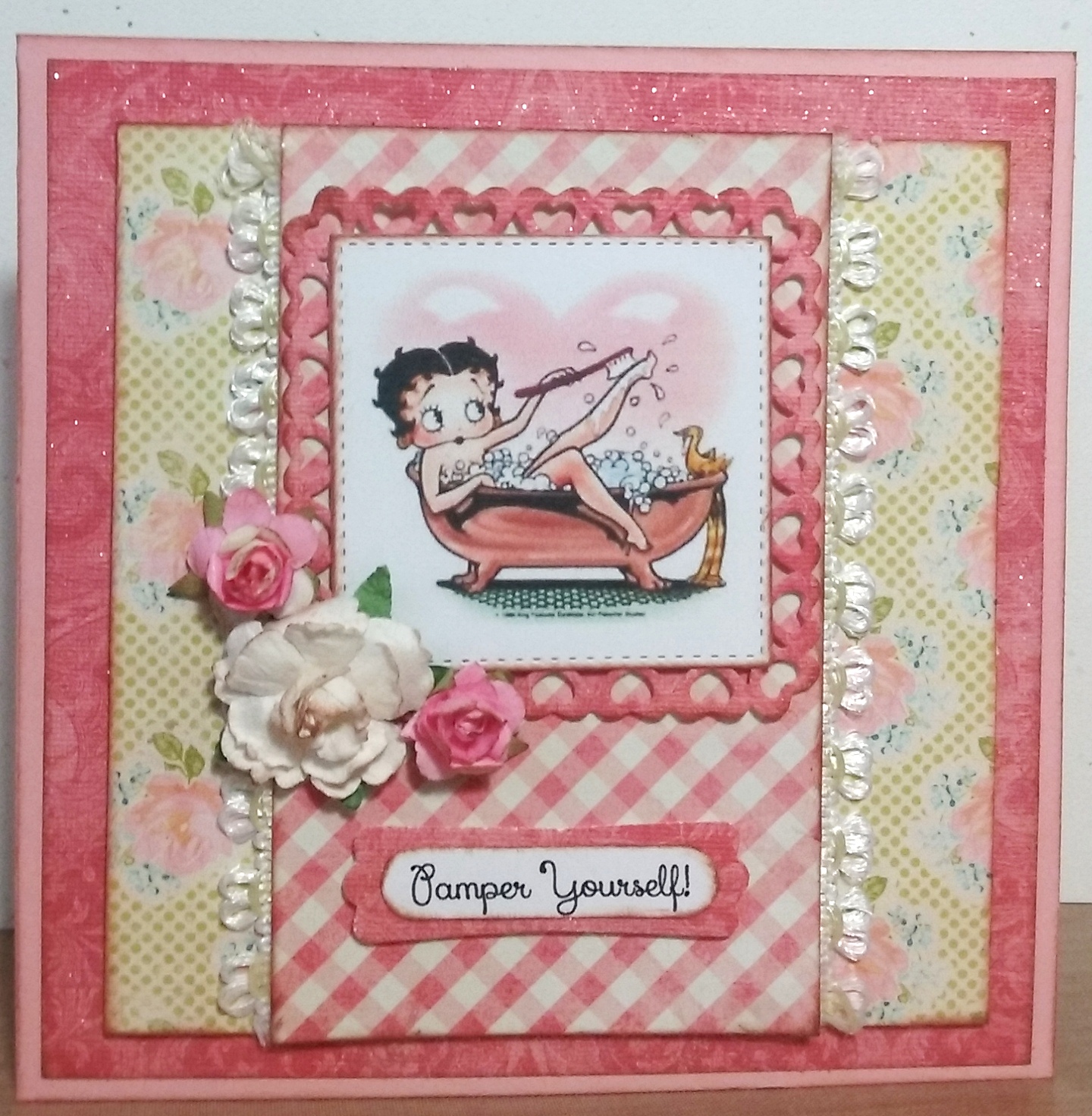
I am over the moon!  I have just been notified that my vintage-style BETTY BOOP card that I made for my daughter Michele's birthday this year at the end of June and was a Splitcoaststampers' Weekly Favorites for the week ending July 3, 2016, has now been chosen as one of their Best of 2016 Favorites!!  I can not even tell you how surprised I am. . .I did not even know that they had this award.  I just assumed, "Okay, how marvelous, my card was a Splitcoaststampers Weekly Favorite."  Can I say again, I'm over the MOON!

So, I thought I would repost this little beauty to refresh your memory if you read my blog often or to bring it to your attention if you missed its original posting and are now reading this one. (See below.)  I am also posting a link CLICK HERE back to that post as there is a story why the title of the post is, HAPPY CELEBRATIONS FOR "BETTY!" when my daughter's name is actually Michele.


Ingredients:  SU cardstock: Blushing Bride.  DCWV Old World Stack (glitter applied).  Authentique: Promise collection/ Six (floral).  My Mind's Eye: The Sweetest Thing collection/ Honey "Love" Fond (check).  Dies: Spellbinder's-Heart Squares; MFT-Stitched Squares STAX.  SU punches: Modern Label; Word Window (both retired).  Recollections flowers.  Elmer's Craft Adhesive Spray.  Martha Stewart Glitter: Crystal Fine.  EK punch: Basketweave Corner.  Computer-made sentiment and verse.  Size: 5-1/2" square.  (Splitcoaster Thread: Weed Ending 7-3-16/ #142).

Tuesday, December 27, 2016

Christmas Elf from Yesteryear!

Last year Liz Thayer did a little elf card at her 2015 Totally Lovin' Christmas, which was colored with Stampin' Up markers.  I promptly ruined my stamped image trying to color and blend with these pens.  I have never been very good getting a good color result using these water-based pens.  It's just me, as I have seen some beautiful coloring jobs achieved by others.


I decided that since I had purchased this stamp set already, I would take my salvageable pieces home and re-do my card in the quiet of my craft room.  Well, that did not happen last year, but I made a goal for this year:  I would try to finished my Christmas cards in my "To Do Stash" that were totally unfinished kits or half-started.  Since little elf fell into one of these categories, he was in luck to be finished this year!

I re-stamped my elf image and colored him using Copic markers, which is my pen of choice.  I like the way they shade and blend and the richness of color that you can achieve.  I also wanted the edges of my mat layers to be more visible to bring out the colors used on my elf's clothing, so I decided to start with a new green card base that would be slightly larger rather than cut down the size of all the layers on top of the cardbase.  I prefer the color edges of my layers to be from 1/8" to 3/16" wide instead of the narrow, almost invisible 1/16" that many cardmakers use.  I also decided to put a green mat layer under my little sentiment tag for even more green accents. 


Liz's original design is so very cute and cheerful, and the stamp set is also very cute and cheerful; thus, the resulting card is sure to make its recipient feel very happy when they open their card!  Take a peek below at both the finished exterior results and the inside design that I made to compliment the front.


Ingredients:  Stampin' Up - Cardstock:  Very Vanilla, Garden Green, Real Red, Whisper White, Watercolor paper.  Holiday Fancy Foil Vellum (2015 Holiday). Stamps: Christmas Cuties (2015 Holiday).  Dies:  Top Note BigZ (retired).  Punch: Decorative Label (modified).  Ribbons: 1/8" Red Stripe; 5/8" Vanilla Satin ribbon (retired).  Dazzling Diamonds Glitter (hat trim).  Dazzling Diamonds Gold Glitz glitter adhesive (elf bells).  Stash: Gold sequins.  Size: 4-1/2" x 5-3/4".

Monday, November 14, 2016

Happy Birthday to a Lover of Cars & Racing

My daughter's new father-in-law has a fast-moving hobby. . .racing cars, thus the reason, I am sure, that my new son-in-law loves to race as well!  I usually like to do a hobby birthday card at least once, but I was not able to come up with a 1993 Chevy Camaro black and white image to color.  I even had my patterned paper all picked out; so, I did the next best thing.  He is getting a gatefold vintage car card, colored in purples, as I understand his race car is purple.  This color will go nicely with the vintage license plate patterned paper and gears that I had all picked out to use.  Take a peek below at my finished design both inside and out.


Ingredients: SU cardstock: Basic Black, Recollections Cardstock Pack: Cool What (dark purple), Tim Holtz Idea-ology Stash: Lost and Found (pattern + distressed purple solids).  Dies:  Spellbinders-Sprightly Sprockets, QuicKutz Nesting Pinking Rectangles (modified).  Stamp: Stampendous: Birthday Wish.  Vintage Auto: online freebie.  SU Ink: Sahara Sand, Wisteria Wonder (sponging); Memento Ink: Grape Jelly (sentiment).  Copic Markers: coloring.  Wink of Stella: Clear.  Computer-made sentiment/ verse.  Size: 4-3/4" x 6".

Monday, October 31, 2016

Nephew-in-Law #2 End-of-October Birthday!

Now it's time to post my last October birthday card, which is for nephew-in-law #2.  I had this lovely fall card partially finished that I started at a Liz Thwyer event for Fall and Thanksgiving cards last year.  It was meant to be for Thanksgiving, but I converted the peek-a-boo sentiment "Give Thanks" to "Happy Birthday" by adding a half-circle of the front pattern paper and a new birthday sentiment overlay.  I also added hemp twine in my button for a more finished look.  Somehow, it just seems to me that buttons always need to have some thread in them as they generally have when sewn on.  Otherwise, my card is true to Liz's original card design.


My finally steps are to design an interior that compliments the outside, and finally, to added a verse appropriate for the occasion.  (You can see my added patterned paper half-circle and birthday sentiment overlay that I mentioned above.)  Now that I'm all done, off into the mail it goes for Jared's birthday.  I'm thinking he will really enjoy his card.


Ingredients:  Stampin' Up products:  Cardstock--Early Espresso.  Gold Glimmer paper.  Patterned--Farmer's Market; Color Collection-Early Espresso.  Stamps--Lovely As A Tree; Sweet Cupcake  Punch--2" Circle.  Gold Basic Buttons. 1" Burlap Ribbon.  Maya Arts: Hemp Twine.  Copic Markers. 

Friday, October 14, 2016

New Son-in-Law Has An October Birthday!

I jokingly told my youngest daughter when she became engaged that one of the criteria I should have demanded in her choosing a husband be that his birthday did NOT fall in October. . .but, wouldn't you know. . .another October birthday!!  Now, I needed to figure out what kind of a card would be best for my new son-in-law.  He has a number of activities and hobbies that he enjoys, which include car racing, riding ATV quads in the sand and dirt, dirt bike riding, hiking, and planning vacations.  These two just returned from a belated two-week honeymoon to Florida, where I am positive they went to every amusement park and tourist attraction in that State!

After giving it some thought, I decided I would do a racing car card, because Josh has a 1979 baby blue Chevy Camaro race car.  He and his father have been involved in short-course racing since Josh was a young boy.  Though he has not raced his baby blue Camaro for a few years now, I am sure that at some time in the future, he will pick up this life-long hobby again.  Since I could not find a 1979 Chevy Camaro image to color, I decided on a 1969 RGX Camaro, which according to what I read is a much desired car.  Personally, I did not see a lot of difference between the two cars when I looked a photographs of actual cards, especially with the digital image that I found online of the 1969.  Take a look at Josh's finished card inside and out. . .I think he will be very pleased with one of his mother-in-law's homemade birthday cards made with only him in mind.


Ingredients:  Stampin' Up cardstock: Night of Navy, Old Olive, Vintage Natural.  Darice Core-dinations Glitter Paper: Ball Gown. My Mind's Eye pattern: Lost & Found Two/ Breeze Boyish Plaid.   Graphic 45: Happy Haunting (black/cream check).  Spellbinders: Deckled Ovals LG, Nested Ovals SM.  Sizzix BigDie: Weathered Clock.  EK Punch: Scalloped Corners-LG.  WRMK Punch: Deco Corner.  Heidi Swapp Metallic Accents.  Stampin' Up Glitter Brad.  Google Online: 1969 Chevy Camaro digital image.  Copic Markers.  Computer-made sentiment/ verse.  Size:  5-3/8" x 6".  

Friday, September 9, 2016

Little Reese Turns One!

One of my little nephew's is turning one-year old this month.  Reese has an older nine-year old brother, for whom I have always made birthday cards, so Reese gets to become one of my permanent birthday card recipients as well.  See the finished card I chose for him below:


Ingredients:  Cardstocks: Bazzill--Tapioca (yellow), Aruba (aqua).  Stampin' Up--Very Vanilla.  Patterned paper: My Mind's Eye--Be Loved/ Fond Flowers.  Magnolia stamp: Edwin the Bug Catcher.  Spellbinders: Labels Eight.  Punches: Zutter Corner Rounder; EK Scallop-LG Corner (modifed to rounded corners).  Progresso Koh-I-Noor Woodless Colored pencils with mineral spirits.  Recollections: Gold rhinestones.  Ribbon: 5/8" Offray Chocolate Double Satin.  Distressing: Colorbox Chestnut Roan.  Computer-made sentiment.  Size: 5" x 7".

Story + Tidbits

Reese's card is one that I actually made during a 2010 card tutorial class on woodless pencil coloring and cardmaking skills!  The class and card designs were created by my sister, Heidi Gonzales, who owned a scrapbook store at the time.  Take a look at the wonder coloring textures that she taught us in coloring his shirt.  


Yikes, I just realized this card is way older than its recipient by over five years!  Now, don't think I have never given this card away because I hate the card, but rather, the reason is that I loved this Magnolia stamped little Edwin the Bug Catcher so much that I hated to part with him.  He also represents the last card I have of my first attempts to color using the woodless colored pencils and Gamsol for blending and setting the colors, a coloring technique I used before I jumped to Copic marker coloring.

Another reason I still had it in my possession was because I really considered it a "little boy card," and I waited so long to give it up that eventually all my nephew's grew too old for it.  With the birth of Reese last year, I decided this was the time to part with it, and to Reese it would belong even though he still a bit young for bug catching.  But, you will note that the verse ties in bug catching that will surely be in his future.


When making my card, I tweaked the design just a bit by making it larger, from a 4-1/4" x 5-1/2" size to 5" x 7" size.  In addition, I used a different and larger die set behind Edwin and added a few more rhinestones to the front ribbon.  The inside is completely my own creation from paper to verse. 

Wednesday, August 17, 2016

A Special Card for Mom's Birthday!

As is true every year. . .I always want to make an extra special card just for Mom for her birthday.  It needs to be something pretty and feminine that she will love.  My gosh, it is difficult to believe, but Mom will be 91 this year!  I just returned from a long and wonderful visit during May and the first half of June, and I am happy to say that she is just as spry as she has always been.  She always was able to walk my legs off on any mall shopping trip.  


For her card, my creative juice have been fermenting for quite some time while I was busy making other cards.  I had definitely decided that somehow I was going to use flowers on her card by using my new Stampin' Up Botanical Builder framelits that I had purchased in the early spring and somehow had never gotten around to using them!  Shame on me!  Take a look at my finished card that I finally decided upon, as well as the finished inside to coordinate with my outside creative design.


Ingredients:  Bazzill Platinum Frost Vellum.  DCWV: Watercolors Stack.  Darice Glitter Silk: Opulent Opal (glitter paper).  SU products:  Pretty in Pink cardstock, Gold Foil, Pretty in Pink Ink, Botanical Builder framelits.  Digital image by 2 Cute Ink: Pretty Ostrich.  Copic Marker coloring.  MFT dies: Zigzag Stitched Ovals.  Spellbinder dies: Big Scallop Ovals SM (largest).  EK punch: Arrows.  Wink of Stella: Gold.  Technique: Cloud Sponging.  Size: 4-3/4" x 6".

The Story + Tidbits
Not only did I know I wanted to add flowers made with my Botanical Gardens thinlits, I also wanted to use a flamingo, which seems to be all the rage right now.  I found this darling flamingo paper in a DCWV stack called Watercolors.  It was shade in the ombre style in a light pink-violet shading into almost white at the bottom.  It was really just was I was looking for except I was looking for more of a real pink shade without the violet tinge.  My solution was to choose the perfect pink for my cardbase, which turned out to be Pretty in Pink (a retired Stampin' Up color).  I then sponged the flamingo paper with the Pretty in Pink stamp pad ink until I got the depth of color I desired.

In my mind's eye I had light pink vellum mixed with Pretty in Pink shaded petals and gold foil for the leaves and flower centers to match the gold foil flamingos.  I had some really pretty frosted platinum white vellum that looked pearlescent.  I sponged the back and the front of the flower petals with the Pretty in Pink stamp ink, which doesn't really show up in the picture.  Next, I chose Pirouette Pink cardstock for the base of the flowers and shaded them with the Pretty in Pink ink as well so it had different shadings of light and darker rather than a flat color by just using the color of the cardstock.  It made for a prettier more realistic flower, though I don't think the picture does it justice.

I colored my 2 Cute Ink digi image with Copic Markers to match my cardstock and patterned paper colors, choosing a darker shade for the head flower and body flowers on the little flamingo.  I also used Wink of Stella: Gold on the digi images flower centers.  Except for the larger head flower, I'm not sure this gold glittery effects shows up elsewhere.  Next came the background behind my flamingo digi.  I didn't think just a brushed light blue with my Copic markers would really look that good and I thought it needed clouds.  So, I used the cardstock template idea made with a scalloped die to get the look you see on the card picture.  I had seen several YouTube videos showing this technique, but never tried it myself.  I think it turned out okay, but feel I still need a bit more practice to feel totally comfortable.

Saturday, July 30, 2016

Birthday Greetings to the Tournament Fisherman!

My nephew, Adam, has a July birthday, and I have never made him a birthday card. . .shame on me!!!  I got busy and created one depicting his favorite hobby. . .fishing.


Ingredients:  Recollections Cardstock: Spice Market collection.  The Paper Studio: Wood Fence.  BoBunny-A Gift of Love: Flutter Butter Solid.  Hot Off the Press: Rust/ Black Plaid.  Spellbinders dies:  Labels Three/ #7 (largest).  My Favorite Things: Stitched Circle STAX.  EK Punch: Arrows.  Ink: Memento Desert Sand (fish sponging).  Stampin' Up Dazzling Diamonds Glitter Adhesive.  Fishest free digital image (Google).  Copic Markers.  Recollections: Brads.  Bag O' Buttons: Wood.  May Arts: Fine Twine.  Stash: 1-1/2" Fringed Burlap Ribbon.  Size: 4-3/4" x 5-3/4".

The Card's Story & Other Tidbits

Adam is the oldest of my nieces and nephews, and therefore, my very first nephew.  I remember how excited I was that I would soon be an auntie when my sister announced she was expecting her first child.  Unfortunately, I haven't been such a good auntie, because so far he has never received a personally made birthday card from me.  As I said before. . .shame on me!  So, this one had to be extra special.


Adam's favorite pastime is fishing, a sport he started when he was just a little boy.  Through the years, he has become quite proficient at fishing, so much so that he enters and wins tournaments.  He fishes "catch and release" so those fish will be there another day for him to reel in, and they will be even bigger!  With this in mind, I knew his first card should be all about fishing.


I found quite a funny, big fish digital image that looks like he stole a fisherman's hat and pole, and now he's trying them out for size. . .he would be perfect.  I immediately got all my Copic Markers out, and I set to work coloring him so that he would look something like a rainbow trout.  Though the picture, disappointingly, does not show it off, I added iridescent glitter to my fish to replicate scales, and so that he would sparkle just like a fish just reeled in out of the water.  


This is probably the first time I have colored my digital image before I found the perfect papers to complete my card design.  I always choose my papers first so I know what colors to incorporate in coloring my digital image.  But, in this case, I pretty much knew I wanted to use a weathered brown or grayish woodgrain background.  Maybe like a weathered fence and then some patterned paper to add color and also compliment the woodgrain. . .definitely some masculine-looking paper.  Subconsciously, I think I knew that by coloring my fish resemble a species in the trout family, it would more than likely go with woodgrain paper.

I easily found the perfect brown, weathered-fence paper, and I found the rest of my coordinating papers right away.  Fortunately, they were all in the same are from my California trip.  I love it when it only takes a  minutes to figure out what I want to use.  The idea of using a burlap-type trim popped into my "idea bank" as soon as I chose the papers, and I immediately remembered I had the particular style I used in my stash and that it would be perfect.  


I've used the Spellbinders Labels Three with a masculine digi card before, so thought I would repeat that, but added the idea of cutting out the digi itself with a stitched circle and then using the Labels Three as a mat frame.   I decided on a little tag for the sentiment so that my card design would not be overwhelmed by the sentiment, but yet it would have one.  Since I don't have any little tag dies the right size, I handcrafted my own.  I am so pleased with how it all came together, and I think Adam will really like his first handcrafted card from his auntie!

Tuesday, July 26, 2016

Sending Prayers!

My oldest daughter's husband's father has been diagnosed with cancer, and the prognosis is not looking good.  My husband and I have liked Don's parents from the very first time we met them, so I very much wanted to make and send a special card to let them know they are both in our thoughts and prayers.  Take a peek at what I came up with below:


Ingredients:  Stampin' Up products:  Cardstock--Pool Party, Pear Pizzazz, Silver Foil.  Stamps--Grateful Bunch; Dot for Days (background - retired).  Ink--Memento Tuxedo Black.  Punches--Curvy Corners (retired); 1" Circle; 1-1/4" Scallop Circle; Blossom Bunch.  Embossing Powder--Silver.  1/8" Stitched Satin ribbon--Bermuda Bay.  Baker's Twine--Bermuda Bay (Copic Colored - retired).  Pearls (Copic colored).  Stash:  1" Organza Sage/White Check.  Die--QuicKutz Fancy Scallop Corner (retired).  Computer-made sentiment/ verse.  Size: 4-5/8" x 5-1/2".

Saturday, July 2, 2016

Happy Birthday Celebrations for "Betty"!

Happy Days!  My card has been chosen as a

SPLITCOASTERS FAVORITE OF THE WEEKENDING - JULY 3, 2016


A little vintage Betty Boop card for my daughter, Michele's birthday celebration!


Ingredients:  SU cardstock: Blushing Bride.  DCWV Old World Stack (glitter applied).  Authentique: Promise collection/ Six (floral).  My Mind's Eye: The Sweetest Thing collection/ Honey "Love" Fond (check).  Dies: Spellbinder's-Heart Squares; MFT-Stitched Squares STAX.  SU punches: Modern Label; Word Window (both retired).  Recollections flowers.  Elmer's Craft Adhesive Spray.  Martha Stewart Glitter: Crystal Fine.  EK punch: Basketweave Corner.  Computer-made sentiment and verse.  Size: 5-1/2" square.  (Splitcoaster Thread: Weed Ending 7-3-16/ #142).

The Card's Story & Other Tidbits


My daughters and I are planning  a "Girls' Night Out" date in celebration of the oldest one's birthday!  We are going to enjoy the magic of Teatro Zinzanni's Hotel L'Amour tonight and can't wait for it to start.  We will be all dressed up in colorful attire, with boas, masks, and funny little hats.  You may wonder, "What is Teatro ZinZanni's?"  The best description is:  a three-hour whirlwind of international cirque, comedy, burlesque and cabaret artists all served up with a scrumptious multi-course feast and elegant libations!


Since the family celebrated Michele with a short-notice, pre-birthday get-together last week-end, I had to have a card very quickly, so a pretty one came out of my finished stash.  I was very disappointed that I did not have time to complete my card idea that had been mulling around in my brain for the past several months while vacationing in California and without all my own cardmaking equipment.  Then I thought of a great idea, I would finish up her card this week and give it to her on our "Girls' Night Out."


My idea started with a bubble bath digital image of some sort to color and frame in a sassy, vintage-style card, because Michele loves bubble baths to de-stress after a busy day at work.  I ended up using a Betty Boop vintage, bubble bath image that was already colored rather than a black and white for my coloring.  There is, of course, a story explaining why this bubble bath Betty Boop image was perfect!


Michele's fun-time, nickname from her sister is Betty.  Don't ask me how that all got started, but somehow over five to eight years ago, when they were goofing around Michele became Betty and Jackie becames Roxy, each with a new personna and a new voice.  It can be pretty hilarious to watch them interact together or to listen to a telephone call between Betty and Roxy!  About a year or so ago, Ginger, their sister-in-law, joined in the group and became Felicity, our sister from another mother.  One time, in the not too distant past, when the girls were shopping for stylish sister "night out" garments, I laughingly said Michele fit the Betty Boop look with her dark hair and diva costume.  So, there's the explanation of why a bubble bath Betty Boop was perfect.  


To make my card, I needed the perfect papers to compliment my Betty Boop image.  I wanted a bit of glitter, especially on my image frame.  I decided to be a bit creative with an old piece of muted, mottled, pinkish DCWV Old World damask paper by applying spray adhesive and sprinkling on the glitter, letting it dry, and dusting it off.  Voila, I had created my very own glitter paper!  (Sorry the glitter does not show up well in the photo.)  I decided this would be my first mat layer applied on top of the Blushing Bride cardbase, and I would also use it for the image frame cut from Spellbinder's Nesting Heart Squares.  Once this paper decision was made, I searched for two more complimentary patterns to use with it, and away I went creating the design in my mind's eye.  In reviewing my card when finished, I wish I had used a corner decorator punch on the layers. . .maybe next time!  


My final step as is my tradition in cardmaking, is to create an inside that compliments the card front design, and to make up or find a verse that's just right for the occasion.  I think Michele will enjoy her card on our Teatro's night out when she and Jackie are all dolled up looking like Betty and Roxy, the divas.

Wednesday, June 29, 2016

What a Nice Visit. . .Thank Yous are Needed!

I recently returned from a nice long visit in California with my mother and occasionally with my sister, my brother and his wife, and a few nieces and nephews as well.  It was such a lovely visit and thankfully the weather was with me.  You see, those of us from the Northwest just don't get along with weather in the 90s and 100s.  Typically, Redding, CA has had many days over 100-degree days by the third week in June and many more in the 90s, but Mother Nature was looking down and smiling upon me.  In the seven weeks I was there, we only had two days over 100 and two days over 90.  There were many days in the mid- to high 70s and the low to mid-80s and even several cloudy and rainy days with thunder and lightening. . .at least eight to nine days of those days!  My gosh, I felt almost like I was at home!  But, I got out of there just in time, because since I left ten days ago, they have had weather in the high 90s almost every day and even over 100 at all times!

Mom and I (and my sister when available) did lots of things and had lots of fun.  The highlight was our week-long Cardmaking Get-Away to Mt. Shasta.  In addition, Mom and I went on several mini-trips to visit the coast and our old stomping grounds and to visit relatives.  We played numerous games of Mexican Train, Bunco and weekly Bingo games as Mom is the Bingo manager in her village.  In addition, we saw lots of movie with lunch dates and lady friends along, and we even did a bit of cardmaking when at home.  I got to meet some lovely new ladies in her village and renewed some old friendships made on other visits.  It was all quite a lovely time. . .too bad I live so far.  


I wanted to send my mother a thank you card for her wonderful hospitality and the lovely visit.  I found several thank you cards in my stash that seemed to fit the occasion just right, but the one I chose will suit Mom to a tee.  My card is derived from a kit designed by Liz Thayer for our 2015 May Girls' Get-Away.  I modified my version by not using the single white cardbase, but added two color mats instead: a Coastal Cabana cardbase with an overlay mat of Hello Honey and then the card front.  I also shifted by pom-pom ribbon knot to the left instead of centered and added glitter to my letters.  I love the design Liz provided for us to work with, and I think Mom will enjoy the card I chose as well.


Before my card could be sent off, I needed to complete the inside with a complimentary design and a verses that suited this thank you occasion.  After reviewing several ideas I had in mind, I decided on the following because it matched my needs:  a compliment to the card front and a verse that said everything I wanted to say:


Ingredients:  Stampin" Up products:  Cardstocks--Bermuda Bay, Hello Honey, Crumb Bake, Whisper White.  Stamps--For Being You (2015 SAB).  Ink--Early Espresso.  Stamp-Write Markers--Hello Honey, Coastal Cabana, Calypso Coral.  Embossing Folder--Perfect Polka Dots.  Embellishments--Thick Baker's Twine-Hello Honey, Calypso Coral Pom-Poms, 1/4" Cotton Coastal Cabana ribbon.  Dazzling Diamonds Glitter.

Thursday, June 16, 2016

A Birthday for My Niece Who Turns 10!

It's time to celebrate my little niece, who lives here where I am visiting.  Another card that I finished on my Girls' Get-Away to Mt. Shasta was one I started at a cardmaking class hosted by Dara Peterson and Luci Kirschbaum, a partnership of two Stampin' Up demonstrators.  Their classes are always fun to go to, and the other cardmakers make it a fun gathering one doesn't want to miss!


This is what I would call a "clean and simple" card, which is not always my favorite style of card to make as I usually favor cards with lots more detail and fussiness, but I really like this card's color combinations, with the little balloons and the washi tape application so it moved to my "I'm likin' this one" category!  I did add another layer of color with the black cardbase under the Melon Mambo layer.  I just thought it needed just a bit more and made the other colors pop!  Thanks to Luci Kirschbaum for her design for us to make).


True to my cardmaking style, I set myself to design and inside to coordinate with the front card design.  I chose a retired stamp for the verse, as I wanted to color it with Copics to tie in the rich vibrant colors depicted on the card front. 


Recipe:  Stampin' Up products:  Cardstock--Black, Melon Mambo, Whisper White.  Stamps:  Party Wishes (balloons/ sentiment), Big Day (2015 SAB).  Ink--Melon Mambo, Crushed Curry, Mint Macaron; Memento-Tuxedo Black.  Punch--Party Punch Pack-balloon, Curvy Corners (inside).  Washi--It's My Party (2016 Occasions).  Twine: Thick-Blace/Melon Mambo.  Other: Goosebumps--Queen & Co.-Hot Pink Quartz (inside).