Tuesday, March 29, 2016

Easter Kangaroos in Australia???

As I've mentioned before, I joined the 2 Cute Ink Digital Stamps Club, which has a monthly fee of $5.00, though you can sign up and pay for more than one month if you choose.  For this fee, you receive five free 2 Cute Ink images, plus one exclusive to the club, for a total of six each month.  In addition, you receive a coupon to use in the 2 Cute Ink Etsy Shop.  The coupon varies monthly, but has been 75% off purchases from the shop of already published images.  There are also several challenges available through 2 Cut Ink, one of which is open to club members using the exclusive monthly stamp.

I've not made it a habit of entering challenges very often simply because I never seem to have enough time to make cards that fit a challenge requirement and my personal cardmaking obligations.  But, for some reason with these 2 Cute Ink digital images for Easter, I have entered two other cards into challenges so far!  Now that has to be an all-time record for me, and guess what, I'm about to submit my Easter Kangaroo card that I just finished to the club's exclusive challenge.  It seems I'm on a roll wanting to color, color, and more color my 2 Cute Ink Easter images.  I'll even be able to put this one away in my card stash to give out next Easter!


I found getting my coloring and shading for my kangaroo to where I would be satisfied was a difficult thing.  I finally called it good before I totally messed him up and had to start all over!  Ever been there. . .done that???  Though the picture does not show it well, I made a lightly colored blue mottled sky, which was really easy, as it turned out, and I added a bit of Wink of Stella--Clear on my eggs and chicks and also in my grass just under my kangaroo.  In real life, it looks pretty cool!  Love that Wink!!!


Recipe--  Papers: Stampin'Up Gumball Green cardstock; DCWV Dots & Stripes Stack; Recollections Mom's Diner/ Cone; AdornIt Vintage Groove Collection/ Vintage Polka Dot Green-side 2 (frame).  2 Cute Ink digital image: Easter Kanagroo.  Dies: Spellbinders--Big Scallop Ovals LG; My Favorite Things--Stitched Oval STAX.  Ribbon: Celebrate It 360--7/8" Metallic Gold Sheer; Waverly--5/8" Satin Metallic.  Lion Brand Bonbons Yarn: Celebrate (Copic colored).  Crafter's Square Sequins.  Wink of Stella/ Clear.  Colorbox: Chestnut Roan (distressing).  Copics:  Kangaroo Tummy: E50, E51, E53.  Kangaroo Body: E21, E53, E55, E23, E25.  Ears/ Nose: R02, RV11.  Chicks--Y00, Y08.  Eggshells--BG000, BG13, BG57; YG11, YG09; R00, YR04.  Sky: B0000. Grass: YG03, YG17.  Ground: YG03, YG11, G0000.  Size: 5-1/2" square.

Saturday, March 26, 2016

Hippity Hop to Easter with 2 Cute Ink!

I have just finished my final needed Easter card, and this one was made with another 2 Cute Ink digital stamp named Hippity Hop.  I think I will enter this final card into the 2 Cute Ink Challenge #133, which makes my second and final entry.  You can take a peek at my card, as well as all the other cards that have been entered into this challenge at the following link:   http://2cuteinkchallenges.blogspot.com/2016/03/challenge-133-easter-theme-new-digital.html.  Reading on below will given you more particulars about the making of this card, as well as a picture of my finished card inside and out.

This Easter card will need to lean a bit toward the masculine theme as it will be for my husband.  Since I wanted to continue to try my hand at more coloring and also use more of my 2 Cute Ink digital images, I chose 2 Cute's
 Hippity Hop image for this card.  I'm sure this digital bunny is a masculine bunny, because he is wearing pants and flexing his muscles while carrying such a big heavy egg!   


I had a picture lurking in my mind for my layout, so to start, I needed patterned papers that would be really colorful, with one blue as one color in them, and they needed to coordinate well together.  Blue was necessary for Hippity Hop's planned blue jeans and a number of other colors for my egg, flowers, and grass.  The striped pattern was perfect, and the word paper coordinated with it quite well.  I'm was excited and ready to begin coloring my bunny!


When Hippity Hop was finished, I moved on to choose by cardbase and mat layer cardstocks.  I settled on a grass green as the cardbase and a warm yellow for my contrast mat layers, but I changed my mind mid-stream.  My final decision was a yellow cardbase, because I liked the green as the mat layer for Hippity Hop and as the layer under the word patterned paper.  Somehow, the yellow didn't look quite right under either, but the green looked great, and the yellow was good under the striped pattern.  Once that was decided, the card went together very easily and quickly.  Take a look below at my finished Hippity Hop card.  Isn't that little bunny just too cute!


Following my longstanding tradition, I completed my card by finishing off the inside with a design and verse to coordinate with the outside creativity.


Recipe:  Papers:  Cardstocks--Paper Company pack/ In Full Bloom (green); Stampin' Up Daffodil Yellow; Patterns--DCWV/ Easter Words, Reminisce/ Happy Easter Stripe.  Digital image: 2 Cute Ink/ Hippity Hop.  Stamps: Stampin' Up--Indescribable Gift (sentiment), Suite Sayings (verse).  Ink: Memento Tuxedo Black.  Dies: MemoryBox--Cross Stitched Frame Borders.  Punch:  EK CardCreator-Basketweave Corner (inside).  Wink of Stella/ Clear.  Recollections: Pearls.  Colorbox: Chestnut Roan/ distressing.  Copic Markers:  Pants--B41, B32, B34. Shoes--T0, T1, T3, T5. Egg--R22, R24, R27, R29; Y11, Y13, Y15, Y35. Flowers/Grass--YR00, YR12, YR18; V000, V01, V05; YG01, YG03, YG17.  Bunny-- C0, 0 (Blender).  Nose--R22.  Size: 5-1/2" x 5-3/4".

Friday, March 25, 2016

It's An Easter Bunny Turtle!

Last October I joined the 2 Cute Ink Digital Stamps Club, hosted by artist/owner, Heidi Arrowood.  This club gives its members six free images per month for $5.00, with one being exclusive to the club members only, plus a coupon code to be used in the 2 Cute Ink Etsy shop for more digital images.  I am sorry to say, I have not done a thing with any of my new digital images yet, even though I bought additional digis not given for free!!  They were too cute to resist, and the percentage off offered was too good to ignore!  But, let me whine and make excuses. . .I think my excuses are pretty good. . .LOL!

Throughout last fall until mid-January, I have been totally wrapped up in planning my daughter's wedding with the result that there has been NO time to take on any extra cardmaking as my whole focus has been the wedding and lending my crafting expertise to both the wedding and my daughter's shower.  I didn't even get Christmas cards made for my immediate family. . .I felt so guilty!  Since the wedding, which turned out beautiful, I have been playing catch-up with my life, trying to find and grab all the loose ends trailing around that were either ignored or shelved while working on wedding stuff, more wedding stuff, and MORE wedding stuff!!  Finally, about mid-March, I began to actually feel things might be getting back to normal. . .whatever normal means!

This past week, I have been busy making Easter cards for my immediate family and trying out some new techniques recently learned.  Finally satisfied that I had mastered these new techniques, I decided it was time try a little coloring again. . .it's been oh so very long since I colored.  What better way to get back into it than to color one of my 2 Cute Ink Club freebie digital images and maybe even participate in their challenge with an Easter card for my oldest son.  I chose a February club digital image called the Easter Bunny Turtle. . .such a darling image.  I found a very colorful paper that I thought would work very well for my design idea, which helped me choose the Copic markers to use on my little turtle-bunny and his eggs.  I'm pretty happy with the results and offer you a peek below at this very colorful card!   Also, jump on over the visit the 2 Cute Ink Challenge #133 - Easter Theme and see other cards submitted for this months challenge.  Their link is:  http://2cuteinkchallenges.blogspot.com/2016/03/challenge-133-easter-theme-new-digital.html


And now for the final step to finish up my card. . .the inside design and a verse to coordinate with my front design.  I did think my verse needed to include bunnies that "are an interesting sight" as this bunny is certainly an interesting sight!


Recipe:  Papers:  Stampin' Up cardstocks--Whisper White, Island Indigo; Reminisce--Easter Basket Stripe (front + back side).  Digital Image:  2 Cute Ink/ Easter Bunny Turtle.  Stamp: Lawn Fawn--Happy Easter (sentiment).  Ink--Memento Black Tuxedo.  EK Punches:  Scalloped Scallops Border; 1-1/2" Scallop Circle; Medium Victorian Corner (inside).  Offray 3/8" ribbon.  Craft Medley--sequins.  Hand-cut: Tag & Double Fishtail Flags.  Copic Markers:  Turtle--YG00, YG01, YG03, YG17 (feather YG17); Ears/Tail--C0, RV00, RV11; Eggs--YR04, YR12; BG02, BG05;  Y04, Y15; Grass--YG01, YG03, YG17 (feather); Ground--E04 (feather).  Size: 5-1/4" x 5-1/2".

Thursday, March 24, 2016

Another Two-Technique Easter Card!

Well, I guess you can tell I was being truthful when I said I was enamored in my last card post. . .so I had to try one more Easter card using the Dahlia-Fold Cross and the Braided Edge (aka Basket Weave, aka Lattice Edge.  This one I'm making in purple because my daughter-in-law loves all things purple.

I tried some lace to set off my cross, and I even colored it with Copic markers so that it matches my patterned paper more closely.  I like the lace, but I've decided I would have liked the end result better if it was not so wide.  My previous card used a 7/8" ribbon, and I've decided this horizontal ribbon or lace should not be wider than one inch.

Another thing I learned on the Braided Edge, is that if the "V" that you cut off the bottom is not long enough reach the top edge of your card when it is re-positioned to the top and also have its point buried the same depth as all of the others in the braid, you can cut a longer one from cardstock by:
  • Cut a 2" x 3" rectangle of white cardstock.
  • Score it vertically in the center down its 2" height.
  • Fold on the score line.  Note: The remaining instruction are carried out with rectangle folded on the score line.
  • With the scored fold on your left, measure at the top over 1 inch.
  • With pencil, lightly draw a diagonal line from the tip of the fold at the bottom of the fold up to this 1 inch mark.
  • At the top, measure to the left from the pencil line over 3/8" and mark with a dot.
  • From this dot, lightly draw another line to the fold.  The two lines drawn should be exactly parallel and 3/8" apart.
  • Cut along both lines to form your new "V" for the top of your card braid.  Note: Erase all pencil markings. 
I admit, I'm a perfectionist so it bothered me that this top "V" did not exactly match all the others in the depth of its "V" point and its legs did not reach the top edge of my card perfectly.  I think this may be a problem if you like your cards to be larger than the standard 4-1/4" x 5-1/2" A2 card size, as the template was designed for this that standard sized card.  Below is my finished card:


And the final step is now complete. . .finishing off the inside of the card with coordinating embellishments and a verse to please!

Recipe:  Stampin' Up Products: Cardstocks--Whisper White, Perfect Plum; Pattern--2013-2015 Regals DSP Stack/ Perfect Plum (retired).  Stamps--Delightful Dozen (retired), Indescribable Gift (2016 Occasions).  Ink--Perfect Plum + Memento: Tuxedo Black.  Punch: 2" Circle, 2-1/2" Circle, Curvy Corners (inside).  Sizzlit Die: Lots of Tags (retired).  Something Borrowed Rhinestone Embellishment (retired).  Stash:  1-5/8" Lavender Lace, 5/8" Variegated Sheer, Flower Rhinestones (inside).  Techniques:  Braided-Edge (aka Basket Weave); Dahlia-Fold.  Size: 5-1/16" x 5-7/8". 

Wednesday, March 23, 2016

Two Techniques in One for Easter!

I think I'm enamored!  I just had to try another Dahlia-fold cross, plus another technique I learned this month. . .the Braided Edge (aka Basket Weave; aka Lattice Edge), and I rolled them both into the same Easter card.  I have decided to enter this card into the 2 Cute Ink Digital Stamps Challenge Blog.  Jump on over and take a look at all the wonderful cards that have entered this month's March Challenge:  http://2cuteinkchallenges.blogspot.com/2016/03/challenge-133-easter-theme-new-digital.html


My cross on this card is more like a Greek Cross with all arms of equal length, rather than the more familiar Latin Cross with the descending arm longer.  The Latin Cross is also known as the Western Cross and represents the cross of Christ's crucifixion.  I forgot that we punched a 2-1/2" Circle for the descending arm of the cross and three 2" Circles for the top and side arms of the cross.  My circles are all 2" Circles, thus ending up with a Greek Cross.  With this little circle size change, it had my wondering why I had so much more room at the bottom to add a sentiment, but after reviewing my first cross card, I realized what I had done differently.  Oh well, there is never a mistake in cardmaking just a little creative deviation!


Below is a tutorial I found on Pinterest by Francine Davis on how to make the Dahlia folds for each petal.  A Dahlia-Fold flower uses eight 1-1/4" to 1-1/2" circle punched petals, depending on how large you want your flower.  The size of the circle determines the size of your flower. . .smaller or larger.  It's usually easier to assemble your petals into a flower if you cut a ninth circle to adhere them to.  A cross uses only four punched circles.  The Latin Cross (the traditional cross style) uses one - 2-1/2" Circle for the longer descending arm and three - 2" Circles for the top and cross arms.  A Greek Cross, as in my card below, uses four - 2" circles as all arms are of equal length.


Dahlia-Fold Petals Mini Tutorial

Dahlia Fold flower - slightly different tutorial where you can't see the folded line in the final product:


Next I moved on to prepare my braided-edge card base.  Below is a link to a pdf file of the pattern template used for my card.  There are actually seven patterns on this sample template, which can be printed out on 8-1/2" x 11" printer paper:

http://stampingimperfection.com/wp-content/uploads/2014/05/braid-template.pdf

Next is a video link that shows step by step how to prepare and make your braided edge:  http://stampingimperfection.com/braided-card-tutorial-template/


After I completed the braided-edge on my card base, I prepared by card front panel by embossing it with Stampin' Up's Elegant Dots folder, and then I added a horizontal ribbon band to act as a base for my Dahlia-Fold cross, burying the raw edges of the ribbon to the back of my card panel.  This panel was then adhered to my braided-edge card base.  


I wanted even more embellishing, so I added a ribbon tie at the base of my braided weave, tying it through the weave.  Next, I added a folded liner to the inside of my card to coordinate with my cross color and contrast with the white card front.  I made my liner large enough that it also peaks out around the card edges to add even a bit more color.  This liner is purely optional as the card is equally pretty with an open braided effect as well.  


To finish my card, I added a layered Easter sentiment and a fancy pearl embellishment to the middle of my cross.  If this embellishment were a brad, it would need to be attached prior to adhering the card front panel to the card base in order to bury the brad prongs.  Take a peek below at my second Dahlia-Fold Cross where I branched out and applied even more creative ideas.


Below you will find the finished inside of my card with a little embellishing to coordinate with the front design and a lovely verse from Stampin' Up's Suite of Sayings.

Recipe:  Stampin' Up Products: Cardstocks--Whisper White, Coastal Cabana (retired); Pattern--2013-2015 DSP Stack/ Coastal Cabana (retired).  Stamps--Indescribable Gift (2016 Occasions).  Ink--Coastal Cabana (retired).  Punch: 2" Circle.  Sizzlit Die: Lots of Tags (retired).  Stash:  7/8" Satin Dot ribbon; Fancy Pearl.  Techniques: Braided-Edge (aka Basket Weave, aka Lattice Edge); Dahlia-Fold.  Size: 5-1/8" x 5-7/8". 

Monday, March 21, 2016

Easter Brings A Dahlia-Fold Cross!

I went to a card class this past week-end hosted by Dara Peterson and Luci Kirschbaum, a team two Stampin' Up demonstrators in my area.  Most of our samples to make were miscellaneous 3D items (a berry basket, a bunny box, and a candy purse), but there was one card designed by Luci that featured the Dahlia-Fold Technique, using punched and folded circles.  Most Dahlia-fold circles are made into flowers, but our sample introduced this technique used to make an Easter cross.  

I love this technique and it isn't very difficult.  I especially like the look of it in the form of a cross, which is so perfect for Easter cards.  If you are interested in learning the Dahlia-Fold technique, it can be found on YouTube, Pinterest and Splitcoast Stampers, and here is a link to Splitcoast Stampers:  http://www.splitcoaststampers.com/resources/tutorials/dahlia_fold/


I did make a few minor changes to my card rather than making it exactly like Luci's, but my card still retains the look of the original design.  My first change was actually to correct an error I made in stamping and embossing my papers.  Now, you all probably remember the rule. . .stamp before embossing?  Well, guess what. . .I forgot all about the little EASTER sentiment in the lower right corner and away I went embossing, and making my Dahlia fold cross.  After I had it all assembled, I realized my mistake.  


To fix the problem, I decided to stamp the EASTER part of my sentiment on a small piece of Whisper White cardstock and punch it out with my Washi Label punch.  I wanted my word background much smaller than that the Washi Label punch provided, but not to worry. . .I had an idea.  After I stamped my EASTER word with the Mint Macaron coordinating ink and then punched it out, I cut the label narrower and then punched the ends shorter by lining it up and punching again to achieve my desired length. . .first on one side and then the other.  A little trick I learned long ago in order to handle a short and/or small piece of paper in a punch is to use a post-it note and stick it to your paper piece, which allows you to maneuver and position the small paper piece easier in the punch.  I think I like the way my EASTER turned out even better than the original design where it was stamped directly on the card front with the embossing on top.


My next change was to add a Mint Macaron layer between the card base and the card front.  This picked this color in the mini resin flower, the EASTER ink color, and the happy die cut.  Adding this layer did require me to cut a new and larger card base.  My final change was to add a bit of sparkly glitz by using glitter adhesive on my happy die-cut word and to the mini resin flower.  I'm likening my results, and I thank Luci for the original design that I tweaked just a bit!


I finished off my card by creating an inside coordinating design and finding the perfect Stampin' Up stamp for its verse.


Recipe:  Stampin' Up Products:  Papers - Cardstocks--Crumb Cake, Mint Macaron, Whisper White; Pattern-2015-2017 In-Color DSP Stack/ Crumb Cake dots.  Stamps--Crazy About You; Suite Sayings (verse).  Ink--Mint Macaron, Crumb Cake (insde).  Hello You Thinlit dies/ happy.  Softly Falling Embossing Folder.  Punches: 2-1/2" Circle (cross base); 2" Circle (cross side/top arms); Washi Label (Easter sentiment); Curvy Corner punch (inside).  2015-2017 In-Color Blossom Accents.  Dazzling Details Glitter Adhesive.  Recollections Pearls.

Friday, March 18, 2016

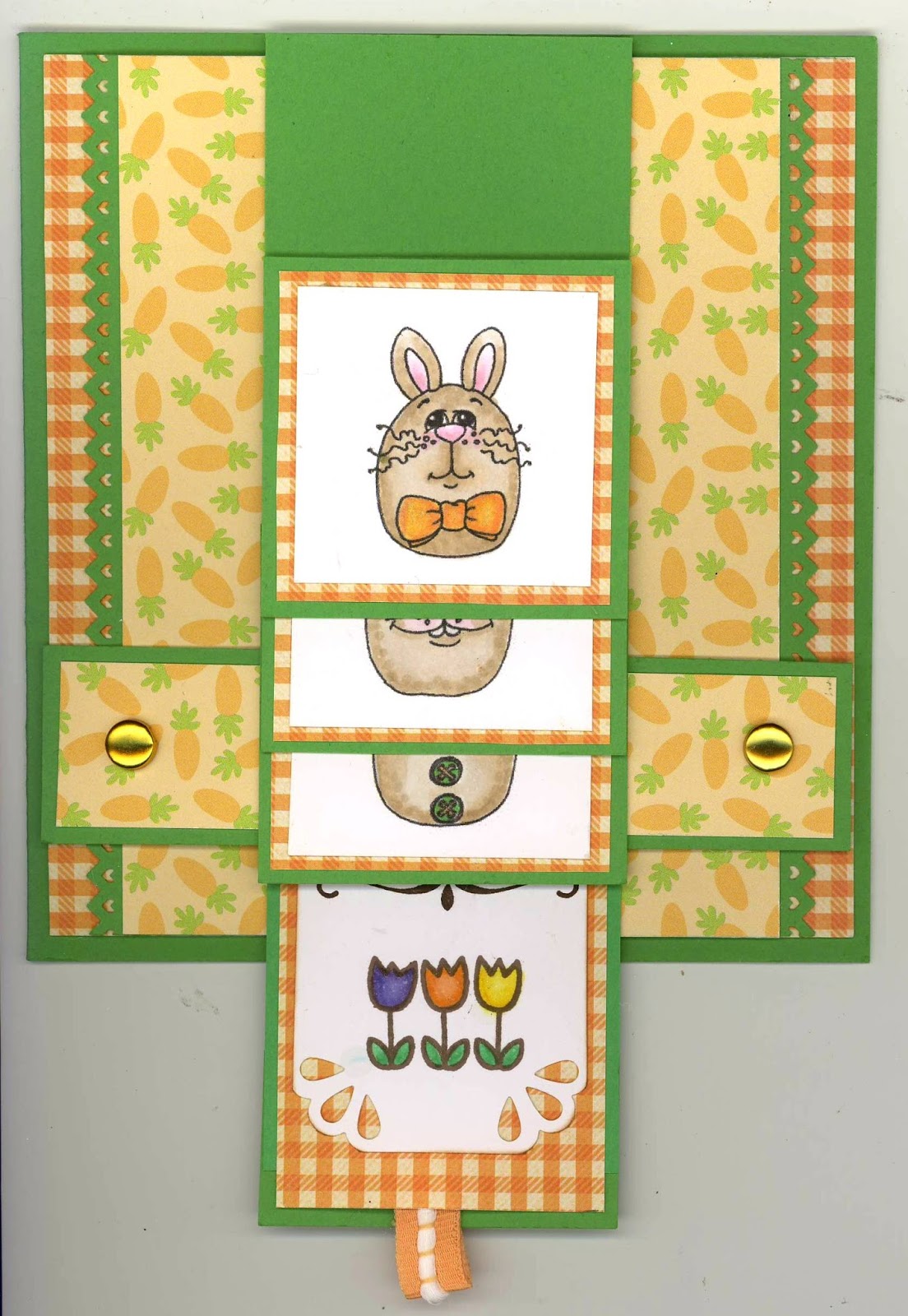
An Easter Waterfall!

I know the Waterfall technique was introduced as a tutorial on Splitcoaststampers way back in 2007, so it is definitely not a new technique, but one of my cardmaking buddies just introduced it to me last week. . .so it is brand new to me.  I just love it. . . such a clever idea.  After making a introductory card last week with her tutelage, I loved it even more.  Though it looks very involved, it turned out to be relatively easy to assemble, and I thank my friend Charlene for sharing her expertise.


This week, I challenged myself fly solo and create and cut my own waterfall card all by myself with no help.  Easter is looming; therefore, I decided my theme for my solo waterfall flight should be just that, an Easter card.  I went in search of the perfect images and papers to make my design.  I also decided to enter my end result in the 2 Cute for Ink Digital Stamps Challenge #133 - Easter Theme.  You might want to zip on over to their site and see all the cards submitted at: http://2cuteinkchallenges.blogspot.com/2016/03/challenge-133-easter-theme-new-digital.html.


Now, on with the search for items needed for my card.  In my Easter digital image stash, I found a simple Easter basket that I thought would be perfect with the Three Bunnies digital images by Beccy Muir.  Way back in 2011, she offered these fat little egg-bunnies as a free offering on her blog, and I knew they would be perfect for my Waterfall squares.  From my Easter paper stash, I decided on Doodlebug's Hello Spring--Easter Bunnies patterned paper, using the baby carrots as my focal paper and teaming it up with Stampin' Up's Cucumber Crush cardstock and an orange and cream small gingham check as a companion piece. 

 
I have an idea to make a bordered edge on my waterfall slide, but decided to wait until I felt I had mastered this technique first.  I am pretty happy with my second Waterfall attempt all on my own.  I even enlarged my card, waterfall squares, and the slide just a bit from my original "training" card.  I think my solo waterfall flight was successful and I'm pretty happy with my first Easter card.  Take a peek below!


The following pictures shows the card as the ribbon tab at the bottom is pulled to expose the hidden pictures one at a time creating the waterfall effect.  I love the impact you get and it isn't even difficult to do!!


I finished off my card by completing the inside with a simple Easter sentiment and decorative corner punching dressed up with bitty orange rhinestone flowers.


Recipe:  Papers:  Stampin' Up--Cucumber Crush cardstock; Doodlebug--Hello Spring/ Easter Bunnies; Orange/Cream gingham check (from stash).  Beccy Muir digital images: Three Bunnies; Easter Basket (from stash).  SU punch: Pinking Hearts (retired) (aka EK punch: Arrow Edger).  Recollections: 1/4" brads.  Copic Markers.  3/8" ribbon (from stash). Wink of Stella-Clear.  Size:  51/4" x 5-3/4".

Tuesday, March 15, 2016

Easter Greetings From My Doorstep to Yours!

I've been at it again. . .wreathmaking!  Several a few weeks ago, I still had my Valentine wreath on my door. . .and being sick, I had no inclination to remove it!  Well, last weekend, my wreathmaking pal, and daughter, came over to help me measure and cut ribbon and deco mesh so that I could get my Easter wreath completed. . .after all, such a disgrace, a Valentine wreath still on my door two weeks after the holiday was over!  I jest, because I thank her immensely for helping me with the "grunt" work and giving me company and encouragement in order to finish my Easter wreath and, at the same time, to become un-disgraced!

I was so glad that I had purchased all my Easter embellishment ingredients at the same time that I shopped for my Valentine wreath embellishments very early in February.  It not only helped get my Easter project done sooner, but also helped because I wasn't feeling too energetic while still overcoming the tiredness that lingered well after the flu.  If I had to go shopping for Easter embellishments before I could finished, my wreath may never have been completed before the upcoming holiday.

With all that said, I want to share my little Easter bunny wreath.  She sits very prettily on my door as we speak!


Recipe:  Deco Mesh: 21" White & Turquoise Metallic (Michaels).  Deco Mesh: 10" Metallic: Lime, Yellow, Lavendar, Medium Pink, White (JoAnns).  Deco Mesh: 12" Lt. Blue Metallic (Michaels).  Hobby Lobby: bunny, carrots, egg wire ribbon, large eggs.  JoAnns: small bunnies, tiny eggs (basket).  Michaels: small multi-colored eggs.  Stash: wire ribbons-yellow daisy, plaid, tulips (from Costco), mini basket.

Friday, March 11, 2016

The Force is With Him on His Birthday!

Happy Days!  This card was chosen as a

SPLITCOASTSTAMPERS FAVORITE OF

 WEEK ENDING - MARCH 13, 2016


My oldest (son) has a March birthday, so it was time to put on my thinking cap to come up with the perfect card for this year's celebration.  As you know if you've read my blog a bit, I like to make cards that suit each person's personality, hobbies, favorite things to do, etc.  Over the last seven years, I have made him a Space Invaders card, a computer geek card, a movie mania  card, a Game On t-shirt card, a game controller card, and last year depicting one of his favorite foods. . . a pizza card.  What to do this year????

While browsing in Pinterest and on different blogs, I found a challenge blog where one of the cards had a Star Wars theme, using a Star War's character digital image from the challenge sponsor: Sassy Studio Designs.  Stars Wars...OMGosh, one of David's all-time favorite movies!  Like a magnet I was drawn to go to the Sassy Studio Design website, and lo and behold, their new monthly issue of digital images was based all around the Star Wars characters, from R2D2, to Chewy, to Yoda, to Princess Leia, and more. . .just waiting for me to bring them home . . .and home, I did bring!

My choice for my son's card was Yoda, so the search was on to learn Yoda's authentic color shades, which seemed to vary quite alot from gray green to green with tans, etc.  Even with these variations, finding Copic markers along the right hues was a bit of a challenge, because though I have over 300 marker colors, none were exactly along the right greenish to tan color lines that are depicted as Yoda's colors.  I had to select a variety of different shades and combine them to try to come out with the right greenish-tan for his face and hands.  For his robe, I decided it would be a bit more colorful than his regular robe for two reasons:  primarily, I didn't want my card to be totally drab, and I decided he would be dressed up in his best robe for a special occasion. . .David's birthday!  (Whatever works. . .right!)

After I got him all colored, then I went in search of the right cardstock colors and patterns to use for my card.  When I saw the black with gold star patterned paper, I knew I was on the right track.  I wanted some glittery stars, but decided to keep them subdue by using the Stampin' Up retired Brushed Gold for the stars, my planet, and the middle layer between the card front pattern and the cardbase.  Take a look at the crinkled planet surface.  I was able to achieve these crinkles by running my die-cut planet through on my Big Shot on the old crackled sandwich plate and adding a cardboard shim to make a really tight fit with lots of pressure as I rolled it through.  I put it through twice for good measure, and I thought it turned out pretty cool.

After putting my card pieces all together, and adding a touch of Wink of Stella-Clear to my planet, stars, and light-saber to give them a little more sparkle, I decided my card turned out better than I thought it might, and I know David will be thrilled with his Yoda card.  Take a peek below!


My finishing task was to design a creative interior with a birthday verse that coordinates with my card theme.  Take a peek at the finished interior design.


Recipe:  Papers:  Stampin' Up cardstock--Basic Black, Delightful Dijon, Pear Pizzazz (sponged), Very Vanilla (sponged), Brushed Gold (retired); DCWV pattern: Gold Stag Star.  Sassy Studio Designs digital image: Yoda Honey.  Dies:  Spellbinders--Small & Large Classic Circles; MFT--Sun, Moon & Stars, Stitched Snow Drifts; IO--Instant Photo Frame.  Punches:  Stampin' Up--Washi Tape, 1/2" Circle, Itty Bitty Accents/ Star, Itty Bitty Circle, 1/8" Circle.  Wink of Stella-Clear.  ColorBox: Chestnut Roan Ink (distressing/ sponging).  Copic Markers: Face--YG11, E81, Y11, E84; Eyes--YG11; Neck Cravet--E21, E95, E97; Robe Stripes--G99; Robe--E30, E53, E35; Saber--YG11, Y17, T7.  Size: 5-1/2" x 5-3/4".  (SplitcoastStampers Thread: March 13, 2016/ #11).

Tuesday, March 8, 2016

Waterfall Lessons!

My friend and cardmaking buddy, Charlene,  held a little mini class at her home today.  Another friend was supposed to join us, but unfortunately she ran into car troubles so was not able make the trip.  We really missed you, Sandy, as we have such a fun time cardmaking together. . .like three peas in a pod!


Charlene taught two techniques, one card style was called the Waterfall technique and the other the Braided Edge technique.  She made several cards in the last year that have been absolutely adorable using these techinques.  One that really sticks in my mind is her Hello Kitty Waterfall card that she made for a friend's birthday, who collects all things Hello Kitty.  This card was just darling, and so, I, always wanting to try something new, whined that I thought she should invite us over and teach us how to do the technique.  You can always look up instructions and teach yourself, but when someone has mastered a technique, it's always nice, not to mention lots of fun, to learn from the expert!


Charlene had been working on her craft room during the past several months, and she recently announced that she had finally finished it, and in the same breath, proclaimed that we should should come over and see it.  I, of course, remembering the two cards she made that I loved the outcome of the techniques applied, piped up, and said, "Yes, you could invite us over and teach us how to make the Waterfall card and the Braided Edge cards."  Lo and behold, she did!


I'm posting my completed Waterfall card, because I am actually going to use it tomorrow for a friend's birthday.  Though the Waterfall card looks complicated, it really is not, especially when someone is showing you how to make it and knows what they are doing.  We completed all the basics of assembly at Charlene's house, and then I was able to bring the card front home to complete the coloring needed on the stamped images on the waterfall squares.  I finished my images using Copic markers and also decided to add a mini butterfly to the top layer opposite my cupcake to fill in a bit of its white space.  I am super pleased with my finished product and can't thank Charlene enough for designing the kits to complete the project during her instructions.


The following pictures shows the card as the ribbon tab at the bottom is pulled to expose the hidden pictures one at a time to created the waterfall effect.  Isn't this card just too delightful!!


My final finished touch was to complete the inside to creatively coordinate with my card front.  I added a computer verse with a bit of humor that I found several months ago and used once before on another friend's birthday card.  I thought it would be great for this card as well as each of these ladies have a great sense of humor!


Recipe:  Papers: Bazzill Typhoon White & Typhoon Blue cs; DCWV 6x6 Foil Stack; Pattern: Stash--unknown.  SU stamps:  Party Wishes (2016 Occasions) (#1), #2/ #3 unknown stamps, Simply Sketched (#4).  SU: Curvy punch (inside).  Martha Stewart Butterflies 5-in-1 punch.  Copic Markers.  SU: Rhinestones.  Stash: 3/8" ribbon; mini flower brad.  Size: 4-3/4" x 5-5/8".  

Friday, March 4, 2016

Coloring Manifesto!

I got involved in coloring early on in my cardmaking venture.  I actually have had several posts on my introduction to coloring over the years.  Here is a link to my very first post with samples of what I did:
http://chatterboxcreations-1.blogspot.com/2012/05/learning-to-color_31.html


I have to admit that I found coloring a scary proposition to even get myself to where I was willing to try my hand at it.  After my introduction to coloring using woodless-colored pencils, set with mineral spirits, I graduated, several years ago now, to using Copic Markers.  I have tried several other coloring methods, but I have to say Copics are my favorite coloring tool!   I am posting a Coloring Manifesto that I recently came across, which I wish I had seen early on to give me the courage to start coloring even earlier than I did.


So, you can do it yourself!  But if you need moral support and a helping hand, there are scrapbook stores around that give classes to help you get started like I did.  I was fortunate that I had a sister who ran a scrapbook store at that time and was well versed in coloring (and painting).  She was also a GREAT teacher, because, after all, that is what she actually is.. . .a GREAT teacher, who encourages and gives her students the confidence to persevere!   So, I give thanks to my sister, Heidi Gonzales (My Lil' Scrap Corner), for bolstering my courage just to get started!

Monday, February 29, 2016

Celebrating a Friend's Birthday!

The wife of one of my husband's long-time friends is having a birthday in February.  I wanted to make her a card to let her know we were thinking of her on her birthday.  I had recently attended a Stampin' Up Occasions KickOff where we were able to use some of the new catalog items to make-n'-take sample cards to take home.  I chose to give our friend one of the cute birthday cards I made at this event.  The card was designed by one of our hostesses, Dara Peterson.

I just love the stamp set, Party with Cake, and its coordinating pop-up die, Party Pop-Up Thinlits, that this card was designed to use.  We die-cut the Party Pop-Up die with white cardstock and then masked and sponged the candles, happy, birthday, and the cake stand using a different ink color on each.  I did choose the change my cake stand color from Tip Top Taupe to Crushed Curry as well as one of the washi tape strips.  The corner confetti was stamped from the Party with Cake set, and a patterned paper oval backdrop for the cake, a bit of washi, and baker's twine finished off this cute little card.  (Note:  Layers popped up off card base; Oval die-cup + pop-up cake are popped up off card front).  I love it!  Thanks Dara for sharing it with us.


Recipe:  Stampin' Up Products:  Cardstock--Bermuda Bay, Crushed Curry, Whisper White; DSP--Cherry on Top.  Stamps--Party with Cake (2016 Occasions).  Ink--Pool Party, Rose Red, Bermuda Bay, Crushed Curry.  Dies:  Oval Collection Framelits.  Washi--Cherry On Top set.  Baker's Twine--Crushed Curry.

Saturday, February 27, 2016

Throwback #2 to Christmas 2011

Here are some miscellaneous card that I made for Christmas.  Some of these were kits that I modified to convert them to a more "me" card, mostly to add more laying and more colors to the overall look, which in turn, englarged them as well.  To start, here are a few more snowflakes, and then there's a whole group that I colored with my Copics.  Its fun to look back and see what I was doing for cardmaking back in late 2011, and specifically what my Chrismtas card looked like then.


More snowflakes!


Again, more snowflakes!


A little holly for the Christmas season!


Critters from the cold visit at Christmas!


Critter #2 fresh from the ice and the cold!


Can't have Christmas without peppermints, and my gosh, their ornaments too!

Thursday, February 25, 2016

Throwback Christmas 2011: Snowflake Card Kit Modified!

This was the first year that I tried to make homemade Christmas cards for half of  those to whom I usually send cards.  I successfully made about 21 card, but I only posted about four of them to my blog.  I will attempt to post a few more now. . .some four years later!  It's interesting to look back on card I made four years ago and see changes that I have made in my cardmaking skills and designs.  So, here goes!


I will call these cards my 2011 snowflake cards.  There are six cards made from a card kit that I purchased from a cardmaking instructor, Angela Kelley, who used to teach at my sister's scrapbook store in Redding, California.  (Just a note:  my sister closed her store in May 2010. . .the economy was not kind to "Mom & Pop" stores from 2008 forward).  


I took Angie's card kit, and first, I decided I wanted to enlarge them a bit and add more pattern to each by adding more layers.  I added two more patterned layers to each card by adhering the bottom pattern to a larger white card base than the one provided for the cards.  (In the early days of my cardmaking, I usually always used a white card base but applied a pattern to cover it fully on the front for the mat layer that was actually visible.)  With the present cards, I used at least a 1/4-inch mat edge for each pattern, basically framing the original card front's design onto these two new layers.  This process not only enlarged the cards, but also added more coordinating patterns and interest to each card as well.


On this card,  I rotated it 90 degrees and made it a horizontal card instead of a vertical card.  I mounted the sentiment oval on the lower left and added rhinestones to the upper left panel for balance.


To enlarge this card, I used the polka dot layer provided only under the top two-thirds of the card front instead of the entire card and then added a muted stripe at the bottom under the ribbon.  I also added two mat layers under the sentiment and two new 1/4-inch  mat layers under the new card front.


Again, to this one I only added two 1/4-inch mat layers under the card front instead of just using the white cardbase provided.


On this card, I actually cut the first layer down a bit, so that I could add a third layer of plaid and be able to have my plaid cut where I wanted it to be.  (Sort of like using the same thought process cutting plaid fabric for a skirt front and a skirt back so the plaid side seams will match perfectly horizontally when sewn together.)   I then added the two 1/4-inch edged mat layers under my plaid as on the other cards mentioned above. 


This card only had minimal changes. . .I added the two 1/4-inch mat layers under the card front instead of just using a white cardbase.


On this final card, I trimmed down the card just a bit so that I could add my two 1/4-inch mat layers under the card front.  I actually like the shortened rectangle that almost looks like a square now.  To me, before it was just a little bit too wide for its height before.

Monday, February 22, 2016

Throwback Christmas 2010!

Now, we have advanced a year.  I remember that this year, I was determined that I would try making all my Christmas cards from my own design.  This would not be so difficult to do since at that time I was only making eleven cards for my mother, mother-inlaw, my children, and my children's in-laws.  I did case one card I saw in a cardmaking magazine, because I just absolute loved it, and posted it to my blog already.  You'll find it posted August 14, 2011, entitled The Last of Chrismtas 2010!  In case you want to take a peek, this is the link: http://chatterboxcreations-1.blogspot.com/2012/04/the-last-of-christmas-2010.html.


I found some chipboard Christmas embellishments at WalMart that year when their Christmas stock was first put on the shelves, and I will make note. . .I have never seen that WalMart has had this type of chipboard embellishment again, which I find somewhat disappointing.  With these little gems, I was able to fashion eight different cards, with totally different Christmas themes.  Here is a peek at three that I have never published. . .throwbacks to 2010!


This one used a variety of paper patterns.  The sentiment, Believe, was die-cut from the bottom trim on the Christmas paper used for the main body of the card.  I tied little bells to the bridge of the red-checked ribbon bow, and triple layered the sentiment with plain and scalloped circles using my Spellbinders dies.


This one was almost entirely the WalMart chipboard embellishments with two layers of coordinating patterned paper and two layers of satin ribbon layered on top of each other.  I added the little red rhinestone to the tree's topper.  I thought this card was an easy card, but pleasing when finished.


This one is my final entry from the WalMart chipboard embellishment group.  With this one, I just found some Christmas papers that I thought coordinated well with the little chipboard Christmas tree.  I added a sentiment with a scalloped mat layer in a color complimentary to the striped paper, and add blue grosgrain stitched ribbon to match the blue in the presents under the tree.  The bow looked a little bare, so I popped on a white plastic snowflake from my Christmas embellishment stash.


My final entry on this post is a card I challenged myself to make from this particular collection of Christmas papers.  I've had these papers in my stash for two years and had never felt the least inclination to use them.  As a matter of fact, I had asked myself more than once why I bought them!  The difficulty is that all the colors in every sheet in the collection are non-traditional Christmas colors made up of pinks, golds, yellows, blues and aquas, and a whole gaggle of non-Christmas greens.  I used three different patterns from the collection and found this little felt, padded snowman's head that I thought went nicely with the paper colors.  I even made the card sentiment by fussy-cutting words found on a fourth piece of the collection papers.